Playful Visualizations at Work, Working Visualizations at Play

Archive for the ‘Claire’ Category

Portland Craigslist vs. Santa Barbara Craigslist

Seeing Liz’s post yesterday reminded me that it has been awhile since I have posted here on LuAn.  Surely, I thought, there must be something I could include about my current work, as I’ve missed frequenting this friendly space.  And while I could dedicate a post about some of my students’ projects from the course I taught this summer or a few of the new visualizations I’ve created about La tumba (if you recall, Agusín’s La tumba to me is like Daniel Deronda to Liz—our default textual subjects), something else came to mind:

My good friend just moved to Portland, Oregon.

A random thought, indeed, but I plan to show how it is connected to this world of Ludic Analytics (or perhaps, how this world has taken over my mind and it now affects how I relate to any and all texts I come across).  Since my friend was new to the Portland area, she was looking for a place to live and would send me craigslist ads to get my opinion on possible new roommates.  She would also send me some of the ads she found crazy or ridiculous (of which, there were shockingly many…it’s probably more a “craigslist thing” than a “Portland thing”).  Then to help out, I began to search the Portland craigslist ads for her, in an effort to find her the perfect place to live in her new city.

It’s been a few years since I have looked for housing, so, I was not up to date on my local craigslist ad situation, but it seemed to me that the Portland posters had some common themes that kept popping up and were distinctly “Portland” compared to the “Santa Barbara” ads to which I was more aware.  Primarily, the Portland posters needed evidence that you were employed or had a steady job–which is definitely a good quality in a roommate. It seemed to me, however, that this statement was disproportionally included in the Portland ads.   The other commonalities that I perceived from reading the ads were that there were more vegetarians and self-identified “420 friendly” posters in Portland than in Santa Barbara.  However, I wondered: is my sense about this correct?  I decided to investigate by creating some visualizations of the ads and comparing the results.  (Thank you Many eyes).

Keep in mind that this is not the most scientific of experiments, but I was just curious, and I had the tools at the ready (focus more on the ludic here than the analytic).  I compared text from the first 11 posts from each city, Portland, Oregon and Santa Barbara, California.  In these ads, people were looking for roommates to fill their house.  Someday it might be fun to do a more formal analysis (with a bigger sample set, and more rigorous methodologies), but until then, consider these word clouds:

Portland:

portland word cloud

Santa Barbara:

santa barbara word cloud

“Room”  and “House” are (logically) prominent in both clouds. “Kitchen” is more evident in Santa Barbara, while “Work” or “working” does seem to have a higher prevalence in the Portland as I suspected. However, the “420” is actually bigger in the Santa Barbara cloud.  School related terms are also more present in the Santa Barbara cloud, perhaps suggesting the large population of students in our much-smaller-than-Portland town.

The clouds did not allude to as much information as I had hoped (despite looking cool) so I decided to check out some more visualizations:

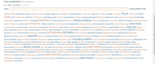
Portland 2-word tag cloud:

portland 2 word tag

Santa Barbara 2 word tag cloud (with phone numbers removed):

tag cloud numbers removed santa barbara

Some observations from these visualizations: 1) it’s cheaper to live in Portland ($600 vs $800) 2) People in Portland do in fact “cook meat” and tend to name their dog “Roxy” (or one person with a dog name Roxy mentions said dog numerous times in the same ad)  3) My perception that self-identified “420” posters in Portland were more prevalent appears to be wrong.  Of course, one of the caveats of this type of visualization is that it could be misleading.  It might say “no” before, and change the meaning, like in the following example of a Santa Barbara phrase net diagram:

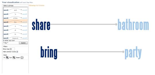
bring the party sb craigslist

Hmm.  Interesting.  It’s important to Santa Barbara Craigslist posters that you both “Share THE bathroom” and “Bring THE party”.  However, upon closer investigation, it’s actually “DON’T bring the pary”:

dont bring the party screen shot

So, there you go.  I guess sometimes data can be misleading (which we already knew).

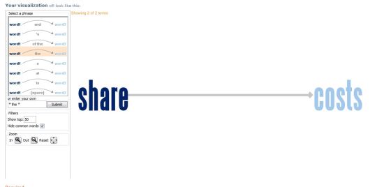
And just so you know, in Portland it’s important to:

share the costs portland

Share THE costs.

Did these visualizations help my friend find a house?  No.  But they were fun to make and she definitely appreciated the effort.  It also solidified in my mind the fact that the process can be just as important as the results, and that it has come to the point where I make visualizations for the amusement of myself and my friends (a good thing?  I hope so).

Said friend eventually found a room in a nice house with an amicable roommate; although, unfortunately her new place does not actually come with a dog named Roxy.

(Still) going with the flow…

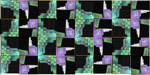
Last week, I posted a “quilt” of sorts, made by digitally stitching together images of both the English and Spanish History flow results for “José Agustín.”   The inspiration for that visualization was two-part: 1) an opportunity to play around with the History Flow tool more (which I have mentioned before and with which I have enjoyed creating beautiful and colorful designs) and 2) Creating some kind of graphic representation for the bicultural influences Agustín shows in his work.  In some of Agustín’s early novels, he incorporates elements of American Popular culture from the early 60s and in some interviews he has cited the Beat Generation as an influence in his work.  Thus, I wanted to demonstrate not only Agustín’s perspective as a young Mexican writer in the early 1960s witnessing the border crossing of different cultural elements, but also of my perspective as an American student in the 21st century looking at Agustín’s perspective as a young Mexican writer looking at….(you get my point).  Wikipedia seemed like a good starting point to find a collective “definition” of Agustín, and there are search options in both English and Spanish.  It is important to point out that I recognize that “English” Wikipedia does NOT equate “American” and similarly, that “Spanish” Wikipedia does NOT equate “Mexican.”  So yes, this may not be the most Scientific study in terms of my initial goals (i.e. creating a visualization in terms of examining different cultural elements), but, I believe it introduces interesting questions about the differences and similarities of both History Flow designs.  Here is a refresher of the History Flow results for Agustín:

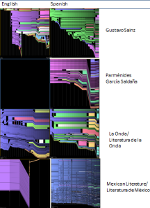
What do these results mean?  I can’t say for sure.  I could explain the different edits that have taken place, the arguments and deletions, and the creation of new secondary pages.  For example, in the English version, the page appears to lose a large amount of content about half-way on the x-axis.  This is because information about selected novels was deleted and re-posted on a newly created, linked page dedicated to the novels.  The black vertical gap on the Spanish result?  That is most likely vandalism, where the page was fully deleted by one editor.  Could we say that because there is evidence of vandalism on the Spanish result and not on the English, that Agustín has a more polemic presence in the Spanish-speaking world?  We could say that, but that is a big assumption, and there are many other factors at hand.  In fact, I would urge against any “conclusions” and instead look for any trends or patterns.  Comparing the Agustín pages piqued my curiosity about the English and Spanish results of other Wikipedia pages.  I decided to look at the results for other writers of the Onda (Gustavo Sainz and Parménides García Saldaña), the Literature of the Onda (searched by “La Onda” in English, and “Literatura de la onda” in Spanish) and just for fun, Mexican Literature (or, in the Spanish search, “Literatura de México).  Here are the results presented in a grid (x-axis L->R English, Spanish; y-axis Wikipedia search):

To me, what is of interest is: 1) Lack of entry for Parménides García Saldaña in English and 2) the English result for Mexican Literature: very few editors and changes, and then a big deletion.  I did not see any major trends or patterns save that the Spanish entries are more detailed.  This makes sense, I searched Mexican authors and topics.  This spurred my next comparison, American authors and novels.  I settled on Jack Kerouac (of the famed-Agustín-inspiring Beat generation) and “The Catcher in the Rye” (because I recently picked it up again, and comparisons have been drawn between some of Agustín’s first novels and this Salinger work):

Both the English and Spanish results for Kerouac and “The Catcher in the Rye” are similarly detailed and color-rich.  The global recognition of this particular author and this particular work is greater than that of the Onda writers, and it is important to take this fact into consideration.

Looking at all of the images, to me,  the English and Spanish versions of “The Catcher in the Rye” are the most similar.  They both seem to follow a similar pattern and have a similar amount of zig-zagging.   In contrast, The “Mexican Literature” results are the most different (excluding the García Saldaña page, for obvious reasons).

Earlier I advised against making conclusions, and I stand by that statement.  I think this particular exploratory exercise dwells more in the ludic, and less in the analytic, and I’m okay with that.

Summer days

It’s been a few days since I’ve had time to contribute.  I have many excuses (final exams to grade, graduation events, friends moving out of town), but I also think there’s still this child-like joy that one experiences at the beginning of summer that sends one outside, rather than inside by the computer.  However, this does not mean that I have shirked on my work on visualizations (I’ve just not been a good poster).  As Meaghan mentioned, we had our last seminar session and presented some of our work.  It was a great session, and I was really impressed with everyone’s work.

We started our own project with the knowingly simplified goal of creating a “pretty” visualization and a “useful” one.  However, as we worked both with and within our respective texts, we found that the most productive results came from the process of creating the visualizations and not from the actual visualizations themselves.

Yet, I still wanted to make a “pretty” visualization; holding strong to our original goal.  I wanted something that was separated from the text visually, but still have an underlying connection; an image one could look at and not immediately realize its association to José Agustín or La tumba.  As follows, I present this visualization:

Quilt made by stitching together History Flow results of the English and Spanish language results of José Agustín

I call it a quilt because I digitally stitched together repeating patterns of the History Flow results of “José Agustín” from both the English and the Spanish Wikipedia sites.  I think the result turned out “pretty,” but that is a subjective term.

When presenting this image, one of our classmates, Amanda, brought up the question of design, and how much that plays a role in our visualizations.  I thought it an interesting question.  Essentially, as LuAn has progressed, we aimed to create “pretty” visualizations that are also “useful”, which plays on design’s themes of aesthetics and functionality.

When I heard her question, I realized she was right, in that we should pay attention to design, or utilize some tenets of this field.  However, I also freaked out a bit.  Already with DH  you are expected to program, or at least know a bit about programming, you are expected be adept at traditional literary analysis, you should be able to use digital graphing programs and other tools.  In short, how multidisciplinary can one be?

This summer, in addition to finishing my dissertation of course, I plan to work on refreshing my long lost coding skills, familiarize myself with more “toys” in the toy chest, and now, read up a bit about design.  Any reading suggestions?

To each his (or her) own.

In this post, I would like to bring up something that I know Liz, Meaghan, and I have talked about in person, but have yet to discuss in LuAn (you know, the “cool” way to refer to our blog, Ludic Analytics).  The theme of today’s post:  Subjectivity.

Many of the visualizations that we create are based on a series of rules; regulations that each person as a visualization creator must invent before approaching the source to collect data.  In life, I tend to be a rule follower. I’m good at standing in lines, maybe not so good at coloring inside the lines, but overall I like structure.  The problem, however, is the fact that when one is creating the rules it’s a) easier to both follow and (occasionally) break said self-created rules and b) one person’s rules will be different from another’s.

I’ll give an example to help elucidate the point.  Liz and I both have worked on network graphing the dialog in the novels that we are studying (I believe she will post some interesting graphics on her work soon).  The other day, she mentioned the problem of judging what is, and what is not, dialog in a novel.

With certain genres, such as plays, this is less of a problem.  That’s why, I believe, many network graphs of literature are often done on theatrical works, especially Shakespeare (like Moretti’s work on Hamlet).  However, with novels, there are different types of dialog, and sometimes it is not as easy to grasp the flow of conversation.

I know that when I approached this problem, I resorted to making a list of rules.  I needed some structure to validate what I was doing.  I think, in a way, I wanted to make it more “scientific.”  Here are a few examples from my recent dialog network project:

1) It counts as dialog even if the protagonist talks to himself, as long as the comment is made “outloud” (in La tumba, this type of dialog is marked by a “-“, so it’s easier to see compared to some other novels)

2) If however, the comment is not “outloud” it does not count

3) Implied dialog does not count (if there is mention of two characters talking, but the reader doesn’t know what was said)

4) If the speaker is talking to more than one person, each listener will be listed

5) The first person who speaks is the speaker, and the other is the listener (meaning that directionally, the arrow representing the edge between the nodes will travel from speaker to listener, even if both actively participate in the conversation).

The list goes on.  Despite the fact that I created the list, I still found myself in the midst of grey areas.  To attempt to find more black/white territory and avoid the penumbra, I would make another rule.

This might be an extreme example; I got a bit carried away with the rule making.  Yet, anyone who has approached a text for this type of data classifying knows that it can be challenging to decipher different aspects of a text or in this case (to continue with the example) every instance of dialog.

In fact, almost all of the work done for this visualization was by hand (excepting, of course, the actual visualization); which, incidentally brings up the other issue of human vs. machine readings.  Could I have saved myself the work of manually mining the data?  Perhaps.  I’m sure some sort of program could be written to do the reading for me.  But, would the computer “know” who is talking?  Can the computer understand the context enough to fill in the character’s name if it were not mentioned?  Yes, but only if I “taught” the computer to do that, and even then, it might not always be right.  Also, while I may teach students daily, my methods for teaching a computer (i.e. programming) are not at the level where I could teach it to recognize specific characters.

In my case, it was easier to go through the book myself.  The result?  It was not as exciting as I had hoped, but I don’t know what I expected.  After all, in a first person narrative, most of the dialog does indeed revolve around the protagonist, with very few instances (just one in this case) of outside conversations.  However, the only slightly surprising factor was how many conversations there are.  Twenty-two nodes!  I know the novel is known for its use of dialog, but I had not realized how many different people are a part of these conversations with the protagonist.

Dialog Network for La Tumba

As for the subjectivity aspect of this post, it would be interesting to see someone else’s dialog network visualization of the same work (and based on his or her set of rules).  Would this somehow change the appearance of the graph?  I assume it would, considering even the presentation aspect was up to me.  I picked the color, yellow (seemed like a good choice at the time) and then changed the layout to better see the edges, so it was more aesthetically pleasing (at least to my eyes).

The more and more that I work with visualizations, the more I realize how much they are an extension of me: from my methodology in collecting the data, to my interpretation of the data, and finally to my presentation of it.  However much I strive to make a logical and objective product, I can never seem to separate it from being a form of (personal) expression.  Yet, I continually ask myself, is that a bad thing?  I think/hope not.

Research Slam: a review

I’d have to say, that from my (new) experience, the best way to enter a three-day weekend is by a casual yet intellectual exchange of ideas and projects.  The Research Slam, organized by the Transcriptions center here at UCSB, proved to be a successful event where I got to see what many of my peers are up to and was able to discuss and answer questions about my own work.  I had never been to this type of (un)conference before, and I liked the atmosphere.  Instead of scheduled presentations and different themes, the style was more “open house” and less “I’m going to read from a paper I just wrote while everyone sits quietly and listens.”  In fact, there wasn’t much “quiet” about this event, and I found that all of the discussing and sharing of ideas, made the Research Slam come alive.

Amanda Phillips, who is a 5 year veteran of the Slam, have given a much more detailed review of the event, so I’ll link you here:

Amanda’s Review

A few of our other classmates were able to come and participate, and I enjoyed hearing more about their projects for our Lit + class and other areas of interests on which they are working.  In particular, I’d like to give “blame” to one classmate for causing my strange dreams about cat/squirrel hybrids (you know who you are).

If you haven’t yet visited the class project page, there are many diverse and interesting research topics, check them out!:

“Literature +” project pages

Here’s a picture of me with my “glitter-free poster” (in the end, I decided maybe glitter was too much, however, I’m sure it would have jazzed it up a bit):


Overall, it was a great experience, and I look forward participating next year, and encourage others to do the same.  If you have any specific questions about the event, leave them in the comment box, and I will try my best to either a) answer b) direct you in the right direction.


And now, back to the third day of the three day weekend 🙂


the poster post.

I like school.  I’ve always liked school (which explains, incidentally, why I’m still in school).  Recently, I’ve had the opportunity to work on a poster, which immediately has taken me back to third grade book reports.  Ok, so, granted, my poster will not look like my third grade report on The Giver, (though Mrs. Burns, my 3rd grade teacher, did give me an A and a gold star), but it brings back the joy that is found in combining all of your research and presenting it in an aesthetic manner (which plays into our pretty/useful dichotomy).  It’s a chance to talk about all the things you find interesting and to exhibit your results of study.  ForThe Giver  I had a crayon drawing in the center in black and white with a red apple in the middle.  Surrounding the apple, I put quotes I found important that fell under one theme or another.  I think I also used glitter.  Third-grade Claire liked glitter.  I’m sure this poster is still in my parent’s basement.  This year’s poster, a mere 20 years later, will have less crayon and glitter (sadly); but plenty of visualizations.  I have included the color deformance of the novel, a few word trees (from Many Eyes), and a cool Phrase Net (also from Many Eyes, that I have yet to post on this site).  The poster is not done yet, I have two pending visualizations: 1) a timeline (I plan to post it once I finish it) and 2) a network graph that will be my “useful” visualization (more on this to come!)

Poster sessions are fairly new (to my knowledge) in the humanities.  I know many of my engineering friends frequent them at national and international conferences, and each time they talk about their posters, I still can’t get the glittered and construction papered images of my previous posters out of my head, despite the fact that their posters might be a bit more complex than those my 9 year-old self designed.  I see the introduction of poster sessions to many humanities conferences as a positive movement.   It creates an opportunity for more students to present and supports a more comfortable environment for communication and discourse.  It could be just my own work, but I feel there has been a shift towards a visual culture.  Because of this, the visualizations are not just ludic devices, but necessary for current study.


My poster is for the research slam (that Meaghan just posted about).  It is this Friday.  If you’re in the area, come see us!


(I make no promises about whether or not my poster will have glitter.  Some habits die hard.)

tangents and distractions: friends or foe?

I feel like I’ve been working really hard at making a beautiful visualization that is somehow connected to my research about La tumba.  However, I don’t have much to show for it.  Instead, I keep heading down a rhizomatic path that leads me far away from the productive path (with a destination) that I was once travelling.  At times, this is a good thing.  It’s kind of an exploratory adventure into the world of visualizations.  There’s no end in sight and every article I read and picture I see, leads to another article and another picture.  Basically though, I’m getting distracted.  However, it’s what I like to call “productive distractions.”  I’m not reading the latest gossip blog or checking my email (ok, perhaps, occasionally, that is what I am doing), but instead I’m checking out really interesting projects and discovering that this world of graphic representation is so much bigger than I first thought.  To put it plainly:  there are a lot of cool people out there, doing some really cool things with data.

Since I have alerted all of my friends about my recent research topics and goals, they have been sending me links to things they think I might find interesting (thanks, friends!).  This is excellent, but it continues to add to my distracted reading list.  Most recently, my good friend Nora was nice enough to send me a link to a book I will have to add to my Christmas in July list (I say 7/25 because I don’t know if I can wait until December).

http://spatialanalysis.co.uk/2012/05/information-graphics/

Please enjoy reading the review of the book, and make sure to add an additional hour or so  to browse the other posts.

of interest:

In a recent venture into the twitterverse, I saw a link to this article from a friend of a friend of a friend that was following someone who posted it.  Graphing Jane Austen seems right up our alley here at PVWWVP.  This review mentions ugly graphs, Victorian literature and my personal favorite, Jane Austen! (yes, I can study 20th century Mexican literature and still love all that is Austen)  Here’s the link to the review of this new book:

Review of Graphing Jane Austen:The Evolutionary Basis of Literary Meaning

go with the flow!

Well, I’ve been playing around with the History Flow tool, and I must say, it’s been quite fun.  At first I was confused (as I am beginning any project it seems these days).  I tried making a visualization of my work on my dissertation.  I knew it wouldn’t be as “interesting” as other visualizations that I saw in the various galleries online because it is not from a collaborative work, but from a single author (i.e. me).  However, I still thought it might create something at least a little bit visually pleasing.  This is the result:

Evolution of a chapter of my dissertation

So, there’s some color there.  But, alas, not much weave.  Also, because the file type was not what the program wanted, there’s a lot of gibberish on the right side.  I’d say it’s an okay visualization, however, it’s not that pretty and it’s not that useful.

Perhaps it would be best to see it compared to what it is meant to look like.  Here is a visualization of the wikipedia page on José Agustín site (on the Wikipedia in Spanish site):

The evolution of José Agustín’s page

This visualization shows much more depth and complexity of color and of edits.  Also, the correct text shows up in the window on the right.  I will continue playing around with this tool in attempts to make the outcome better when my input is not a wikipedia page (like a word doc, for example, or a number of word docs).

If you would like to play around, here are the tools:

The program to download

The how-to that I used

eye of the beholder…

As stated in my introduction, my first goal is to create a “pretty” visualization.  Many of the beautiful, artistic, and moving visualizations or representations (as some are musical, so therefore not exclusively seen), seem utterly unconnected to the text until you read the blurb that the artist provides telling you that each word type of a text  was assigned a specific color, or that each sequence of verb tenses represent different notes in a song.

I like these types of adaptations, however, I’m not sure how I can make one work for an entire novel like La tumba (despite the fact that it is a short novel).  Also, a problem that I’ve had in the past is that many of the tools I want to use don’t work with a Spanish text.

Recently, I’ve been checking out the tool history flow.  I like the images that it creates because it reminds me of the happy and brightly colored designer woven prints by Missoni.  Just imagine the possibilities if I could somehow print my visualization of La tumba  on fabric and wear it as a scarf or skirt.  I think it would take my dedication to the project up a notch.  At the next conference, not only would I be presenting with some cool visualizations, but also creating a fashion statement:  two birds with one stone.

Goals for the week:  see if I can get this tool working for me, because a novel is different then a wiki, and with out many edits, my cool weave would probably not be as colorful or complicated.  Perhaps I could map the edits on my work on La tumba? (note that I’m saving the “useful” visualization for later, as it seems more fun to start with the “pretty” one)

Questions to the dear readers:  Has anyone used a neat visualization tool that works with texts in Spanish?  Perhaps you would like to share a beautiful visualization to act as inspiration for my quixotic quest to create a purely “pretty” visualization.  (you know, “art for art’s sake”)