Revisiting the Social Networks of Daniel Deronda
My twitterstream overflowed, in the past few days, with tweets about the uses, misuses and limits of social networking.* Coincidentally (or perhaps not, given the identity of at least one retweeter), we discussed the role of social network graphs in humanistic inquiry in this week’s session of Alan Liu’s “Intro to Digital Humanities” class. For those of you following along, we are #engl236 on Twitter and, last week, we made graphs. So I am going to interrupt my glacial progress through the possible uses of R**and put the longer-form meditation on what I am trying to do with these experiments in statistical programming on hold in order to talk about my latest adventures in social network graphing.
As longtime readers of this blog will remember, this is not my first foray into Social Network graphing. Nor is it my second. This gave me a huge advantage over many of my colleagues (sorry!) because I had already spent hours collecting and formatting the data necessary to graph these kinds of social networks. Since I wasn’t going to map new content, I thought I would at least learn a new program to handle the data. So I returned to Gephi, the network visualization tool that I had failed to master 18 months ago.
And promptly failed again.
PSA: If you have Apple’s latest OS installed, Gephi will not work on your machine. I and two of my classmates discovered this the hard way. Fortunately, the computers in the Transcriptions Lab are–like most institutional machines–about an OS and a half behind and so I resigned myself to only doing my work on my work computer. After some trial and error, I figured out how I needed to format the csv file with all my Daniel Deronda data and imported it into Gephi. After some more trial, more error, and going back to the quickstart tutorial, I actually produced a graph I liked. 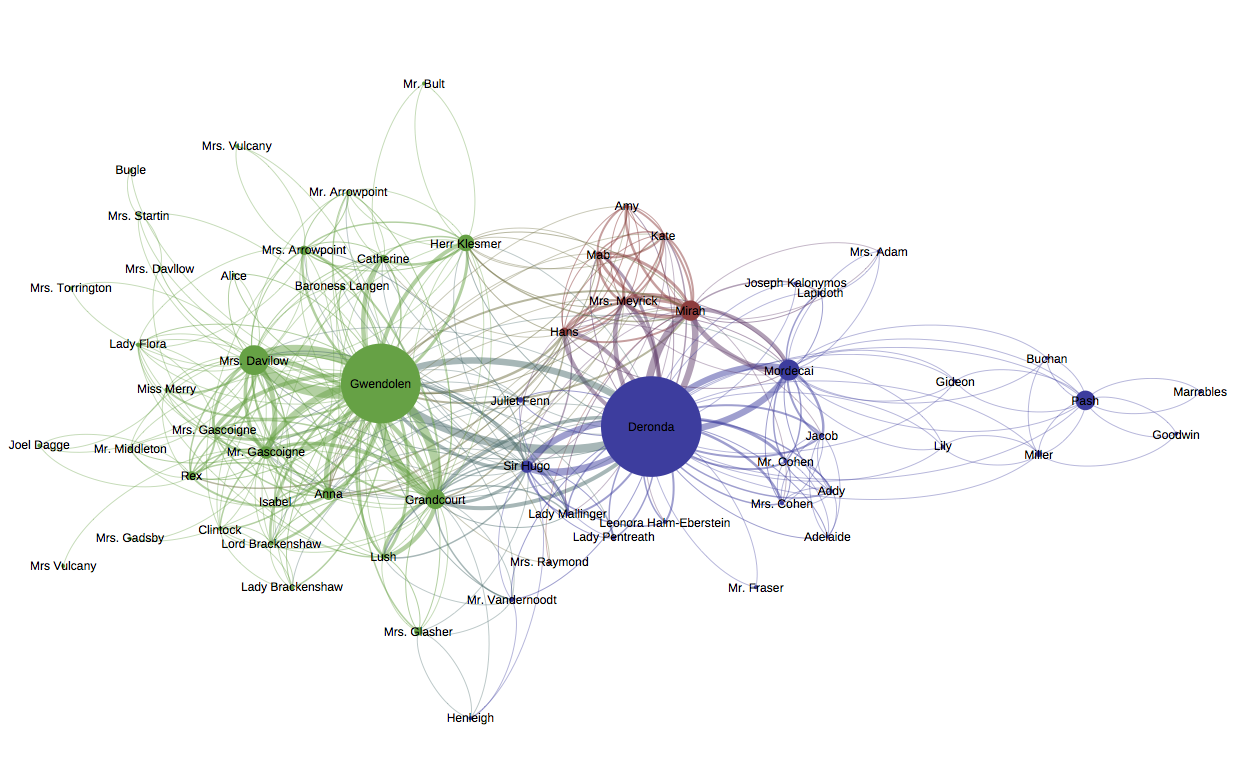
In this graph, size signifies “betweenness centrality” which is a marker of how important a circle is in the graph according to how many connections the node has and how often that node is necessary for getting places in the network (i. e., how often the shortest path between two other nodes is through this node), which means that the node’s size indicates how vital that person is to other people’s connections as well as how many connections they themselves have. Color signifies grouping. Nodes that are the same color are nodes that have been grouped together by Gephi’s modularity algorithm…which is Gephi’s function for dividing graphs into groups.
So here we see three groups, which can be very roughly divided into Gwendolen’s social circle, Deronda’s social circle and Mirah’s social circle. There’s something delightful about the fact that the red group is made up entirely of the members of the Meyrick family and the girl they took in (Mirah). So Mirah truly becomes a member of the Meyrick family.
As this is a comparative exercise, I’m less interested in close-reading this graph and more interested in thinking through how it compares to yEd.
Gephi is certainly more aesthetically pleasing than yEd, especially given the settings I was using on the latter. And, unlike yEd, Gephi can very easily translate multiple copies of the same interaction into more heavily weighted lines, which helps provide a better idea of who speaks to whom how often in the novel (something I had been struggling with last year). At the same time, yEd’s layout algorithms seem far more interesting to me than Gephi’s “play around with Force Atlas until it looks right” approach. So while the layout does, I think, do a decent job of capturing centrality and periphery, it is less interestingly suggestive than yEd.
The other failing that Gephi has is the lack of an undo button. This might seem trivial to some of you, but being able to click on a node, delete it from the graph and then quickly undo the deletion was what made it so easy for me to do “Daniel Deronda without Daniel (and, erm, Gwendolen)”. With Gephi, I have this paranoid fear that I will lose the data forever and it will automatically save and I’ll have to do all this work over again. After a while, I finally screwed my courage to the sticking place and deleted our main characters to produce the following three graphs.

Daniel Deronda without Daniel

Daniel Deronda without Gwendolen

Daniel Deronda without Daniel or Gwendolen
The results are interesting, although perhaps less interesting than the disk-shaped diagrams from yEd that demonstrated changes in grouping. yEd allowed for some rather fine-grained analysis about who was regrouped with whom. On the other hand, Gephi makes it clear that both Gwendolen and Deronda tie together groups that, otherwise, are more distinct, as shown by the sudden proliferation of color in the first and third graphs particularly. Gephi makes it easy to see Deronda’s importance in tying many of the characters together. His influence on the networks is far stronger than Gwendolen’s.
Now, for the sake of comparison, here are the Gephi and yEd graphs side by side.

I have not yet performed a more complete observational comparison of the layout, centrality measures and grouping algorithms in Gephi versus yEd (which, I admit, would begin with researching what they all mean) and the relationship between how data is presented and what questions the viewer can ask, but here are my preliminary reactions. Gephi does a far better job of pointing to Deronda’s importance within the text while yEd is better at portraying the upper-class social network in which Gwendolen in enmeshed. And while Gephi’s layout invites the viewer to think of its nodes in terms of centrality and periphery, yEd’s circular layout structures one’s thought along the lines of smaller groups within networks. Different avenues of inquiry appear based on which graph I look at.
This comparison produces three different questions.
- How do you know when to use which program? Can one tell at the outset whether the data will be more interesting and approachable in Gephi, e.g., or is this the perfect application of the “guess and check” approach where you always run them both and then decide which graph is more useful for the kinds of questions you want to ask. Are my conclusions here, about Gephi’s focus on centrality versus yEd’s focus on group dynamics, representative?
- How meaningful are the visual relationships one perceives in the network?
- Let’s take the graph above as an example and go for the low-hanging fruit. Young Henleigh, the illegitimate son of Grandcourt is way down at the bottom of the graph, connected unidirectionally to his father (his father speaks to him, but he does not speak back) and bidirectionally to his mother, with whom he converses. Gephi has colored him blue, indicating that, at least according to Gephi’s grouping algorithm, he is more closely associated with the other blue characters (a group made up predominantly of those who show up in Daniel’s side of the story and who I am valiantly resisting calling the Blue Man Group). Arguably, this is because those in Deronda’s circle talk slightly more about the boy since they have heard rumors of his existence, while those in Grandcourt’s social circle have not. And Henleigh’s repulsion distance is another indicator of how Grandcourt ignores his son and keeps his family at a distance.
- That is, I think, a fair reading of the book Daniel Deronda. My conclusions are borne out in the text itself and are justifiable within the larger narratives of Grandcourt’s treatment of others, a topic that I’ve written about several times over the course of my graduate career. But is it a fair reading of the graph? Am I taking accidents of layout as purposeful signals? Or are my claims, grounded as they are in edge distance and modularity, reasonable?
- In addition, did the graph actually tell me this information in a way that the book did not or did it simply remind me to look at what I already knew? This is part of an old and still unanswered question of mine – will the viewing of the social network graph ever really be useful or is it the decisions and critical moves that go into making the graph that produce results?
Obviously, this last question only applies to work like mine, where the graph is hand-coded and viewed as a model of an individual text. In cases where this work is mostly automated and several hundreds of novels are being studied for larger patterns of interactions, the question of whether the graph or the making thereof produces the information is irrelevant.
But the question of what kinds of meaning can be located in layout and pattern is still crucial, especially when one is comparing how different networks “look”. This may be a particularly pernicious problem in literary criticism and media studies: we’re trained to look at texts and images and treat them as…intentional. Words have meaning, pictures have meaning and we talk about this larger category of “media objects” in a way that assumes that their constituent parts have interpretable significance. This is not the same as claiming authorial intentionality, it’s simply an observation that, when we encounter a text, we take it as given that we can make meaning using any element of that text that impinges on our consciousness. There are no limits regarding what we can read into word choices, provided we can defend our readings and make sense out of them. Is that true of graphs? Are we entitled to make similar claims by reading interpretations into features of the layout and with the only test of said interpretation’s veracity our rhetorical ability to convince someone else to buy it? For example, could I claim that Juliet Fenn’s position on the graph between Deronda and Gwendolen shows that she, and all that she stands for, comes between them? My instinct is to say no. But the same argument about place applied to a different character makes perfect sense. Mordecai’s place is between Deronda and the group of Jewish philosophers on the far right is emblematic of how he connects Deronda to his nation and how he is the one who rouses Deronda’s interest in Zionism.
I can think of three off-the-cuff responses to this problem. The first is to say that location is a fluke and, when it corresponds to meaning, that’s an accident. This feels unsatisfying. The second is to say that there is something about Juliet Fenn that I’m missing and, were I to apply myself to the task, I could divine the reason behind her placement. This is differently unsatisfying, not because I don’t think I can come up with a reason, but because I am afraid that I can.*** And if I succeed in making a convincing argument, is that because I unearthed something new about the book or because I’m a human being who is neurologically wired to find patterns, a tendency exacerbated by my undergraduate and graduate training in the art of rhetorical argument? In short, the position that all claims that “can” be made can be taken seriously is only marginally less absurd than the claim that all layout elements are always meaningless and, consequently, any meaning we make or find is insignificant. The third response heads off in a different direction. Perhaps my discomfort with reading these networks lies not in the network, but in my own lack of knowledge. I have not been trained in network interpretation and I need to stop thinking like a literary theorist and start thinking like a social scientist. I need to learn a new mode of reading. This, while perhaps true, also leaves me dissatisfied. I am not, fundamentally, a social scientist. I am not looking for answers, I’m looking for interesting questions/interpretive moves/ideas worth pursuing. While it would be very cool to show, in graph form, how Mordecai’s ideology spreads to Daniel and how ideas act as a kind of positive contagion in this novel, that theory is not stymied if there is insufficient data to prove it. I can take imaginative leaps that social scientists responsible for policy decisions must absolutely eschew.
Which means it is time to think about a fourth position. If we, as scholars of media in particular, are going to continue doing such work, then we need a set of protocols for understanding these visualizations in a manner that both embraces the creativity and speculative nature of our field while articulating the ways in which this model of the text corresponds to the actual text. Such a set of guidelines would be useful not only as a as a series of trail markers for those of us, like me, who are still new to this practice and unsure of where we can step, but also as a touchstone that we can use to justify (mis)using these graphs. If the sole framework currently in existence is one that does not account for our needs, we may find ourselves accused of “doing it wrong” and, without an articulated, alternative set of guidelines, it becomes exponentially more difficult to respond. On the most basic level, this means having resources like Ted Underwood’s explanation of why humanists might not want to follow the same steps that computer scientists do when using LSA available for network analysis. Underwood explains how the literary historian’s goal differs from the computer scientist’s and how that difference affects one’s use of the tool. Is there a similar post for networks? Is there an explanation of how networks within media differ from networks outside of media and advice on how to shift our analytic practice accordingly? Do we even have a basic set of rules or best practices for this act of visualizing? And, if not, can we even claim these tools as part of our discipline without actually sitting down and remaking them in our image?
I don’t want to spend the rest of my scholarly career just borrowing someone else’s tools. I want Gephi and yEd…and MALLET and Scalar and, yes, even R to feel like they belong to us. Because right now, for all that I’ve gotten Gephi to do what I want and even succeeded in building a dynamic graph of the social network of William Faulkner’s Light in August (which told me nothing I did not already know from reading the book), I still feel like I’m playing in someone else’s sandbox.
—
*Granted, this is Twitter and so three posts, each retweeted several times, can make quite a little waterfall.
**I will say that the R learning curve made figuring out Gephi seem nearly painless by comparison.
***In the interest of proving a point, a short discussion of Juliet Fenn: Juliet Fenn’s location between Deronda and Gwendolen and at the center of the graph is significant precisely because she is the character who represents what each of them is not. Juliet is of the more aristocratic circle defined by Sir Hugo and his peers and, unlike Daniel, actually belongs there by birth. She beats Gwendolen in the archery contest, which proves her authenticity both in terms of talent and, again, aristocracy. Were either Daniel OR Gwendolen authentically what they present themselves as (and, coincidentally, who their co-main-character perceives them to be), Juliet Fenn would be Gwendolen’s mirror and Deronda’s ideal mate. As neither Gwendolen nor Daniel are, in fact, who they seem to be, Juliet is neither. She is merely a short blip during the early chapters of the book who can be easily ignored until her graphic location discloses the subtle purpose of her character–the idea of a “real” who Gwendolen cannot be and Deronda cannot have. Of course, neither character explicitly wants or wants to be Juliet. This isn’t meant to be explicit, merely to color our understanding of the otherness of Deronda and Gwendolen. It’s not that Juliet Fenn keeps them apart per se, but the discrepancies between who she is and who they are, as illustrated by the graph, is what makes any relationship between Gwendolen and Deronda impossible.


