Playful Visualizations at Work, Working Visualizations at Play

Archive for October, 2013

Bar Graphs and Human Selectiveness

Two weeks worth of struggling with R and putting in my own texts (feel free to guess which one I used) has left me feeling less accomplished than I would have liked, but less filled with encroaching terror as well. I am capable of following instructions and getting results, so while the art of doing new things (and really understanding the R help files) is still beyond me, I think I have enough material to start talking about Daniel Deronda again.

Daniel Deronda is a text that seems split into two halves. One of the things I discover when I reread this book is that there are many more chapters than I remember with both Deronda and Gwendolen “on screen together”. So are these two separate stories or are they two utterly intertwined texts?

In order to test how separate the two storylines are, I looked at the word frequencies of both “Deronda” and “Gwendolen” in each chapter to see whether they were correlated. So, in this case, a positive value means that Deronda showing up in a chapter increases the likelihood of Gwendolen showing up while a negative correlation means the opposite.

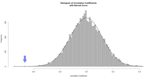
The correlation between Deronda and Gwendolen is -0.465. (As a reminder, correlations run from 1 to -1). So that’s actually pretty high, given that book chapters are complex objects and I know that they interact a fair amount over the course of the book. But there’s actually a better way to test for significance. We can look at the likelihood of this correlation having occurred by random. Again, drawing on Text Analysis with R, by Matthew Jockers, I had R rearrange the appearance 10,000 times and then generate a plot of what the correlations were. Unsurprisingly, it looks like a normal curve:

Deronda_Gwendolen_Histogram

So if the frequency of each name per chapter was distributed randomly, you would be statistically likely to see little correlation between them. For those interested in some more specific numbers, the mean is -0.001858045 and the standard deviation is 0.1200705, which puts our results over 3 standard deviations away from the mean. That little blue arrow is -0.465.

All that says, of course, is that it’s highly unlikely that these results occurred by chance and that they are, in some sense, significant.* Which, to be fair, no kidding. My initial, subjective reading told me they were negatively correlated as well. And there has to be a better reason to do this kind of work than just to prove one’s subjective reading was right.

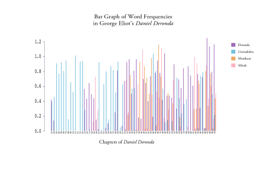
Which is where our next graph comes in. Now that I know that the two are negatively correlated, I can turn to the actual word frequency per chapter and see what the novel looks like if you study character appearance.

And, for fun, I threw in two other characters who I see as central to the plot to see how they relate.

Final Bar Graph of Name Frequencies


I highly recommend clicking on the graph to see a larger view.

Here’s where things get interesting to the human involved. The beginning of the novel happened exactly as expected – Eliot starts the story in medias res and then goes back to first tell us Gwendolen’s history and then Deronda’s. And then the name game gets more complicated about halfway through when Mirah and Mordecai** enter the picture. By the last few chapters, there is very little Gwendolen and the story has settled firmly around Deronda, Mirah and Mordecai. All of this, again, makes sense. But it is nice to see the focus of the book plotted out in such a useful manner and it invites two kinds of questions.

The first is based on the results; going to chapters with a surprisingly high mention of a certain character, like Deronda’s last few chapters, and attempting to figure out what might be going on that causes such results. Why, after all, is Daniel the only one to venture up into the 1.2% frequency? Is there something significant about the low results around 50 and 51? What’s going on there?

The second kind of questions that this graph invites are questions about me. Why did I choose these four characters? I think of them as the four main characters in the story and yet there’s certainly a good argument to be made for at least one other character to be considered “main”.

If you’ve read the book, feel free to guess who.

Why did I leave out the frequency data for Henleigh Mallinger Grandcourt?

Honestly, I completely forgot he was important. It’s not that I don’t remember that the Earl of Grantham had an evil streak in his youth, it’s simply that I don’t think of Grandcourt as a main character in the book. That might be because one doesn’t usually think of the villain as “the main character” or it might be because I am more interested in the story of Deronda and 19th century English Jewry.

As it happens, I noticed Grandcourt’s absence because of that odd little gap in Chapter 12 where absolutely no one is mentioned. What was going on there?

I went on Project Gutenberg, checked the chapter and said “Oh. Oops.” This is the only chapter entirely (and possibly at all) from Grandcourt’s perspective, hence no mention of any other character. So why didn’t I redo the graph with Grandcourt included, given that he’s important enough to have his own chapter?

Okay, yes, sheer laziness is part of the answer, but there is another reason. Chapter 12 is the chapter in which Grandcourt announces his intention to marry Gwendolen. And notice whose name entirely fails to appear in the chapter…

This data doesn’t exactly tell us anything new – we have ample proof from Eliot that Grandcourt is one of the nastiest husbands in the British canon. But this detail invites a way of looking at people’s interactions categorized by recognizing another person by the simple act of naming them, which makes this the second time that randomly playing around with visualizations has led me towards the question interpersonal interpellation as related to empathy. 

So what do you all think? What does the graph say to you? Do you think this is a valuable way of approaching a text? And am I getting kinda hung up on this question of simply naming as a measure of empathy?

Comment below!

* With the obvious caveat that this was a book written by a woman rather than a random letter generator so of course its results did not occur by chance, what this graph really lets us see is whether the negative correlation between the two characters allows for meaningful critical discourse. Anything under -0.5 is not really considered significant in scientific terms, primarily because it’s not useful for predictive validity, but because we’re not interested in predictive validity, we’re interested in the possibilities of storyline division, the graph validates the hunch that there’s some kind of distinction.

**SPOILER ALERT – Mordecai is actually the combined occurrence of the names Mordecai and Ezra, for reasons obvious to anyone who has read the book.
 

I Blog Therefore I Am Doing Something

There’s not much to report on the visualization front this week. I have created a couple of elementary (actually, closer to Kindergarten) graphs in R by following the instructions in Matthew Jockers’ excellent book, Text Analysis with R for Students of Literature, which is currently in draft form, but an excellent resource nonetheless. So I have learned some things about the relative frequencies of the words “whale” and “Ahab” and, more importantly, I’m gaining some insight into what else I could do with my newfound knowledge of statistical programming. But my studies in R are still very much at the learning stage and I have yet to reach a point where I can imagine using it in a more playful, exploratory sense. While this is not true of every tool, R is one of the ones that must be mastered before it can be misused in an interesting manner. Which is not to say that it cannot be used badly – I am getting good at that – but the difference between using a tool badly and playfully is a critical distinction. A playful framework is one that eschews the tool’s obvious purpose in order to see what else it can produce; a framework that validates a kind of “What the hell, why not?” approach to analysis. Playfulness exists when we search for new ways to analyze old data and disconcerting methods for presenting it. It can be found in the choice to showcase one’s work as a large-scale three dimensional art-project and in the decision to bring the history of two Wikipedia articles about the author into one’s examination of the text. It is not, more’s the pity, found in code that fails to execute.*

All this adds up to an apology: I have no intriguing word clouds for you this week. I don’t even have any less-than-intriguing word clouds this week. But I do have some thoughts about the nature of this blogging endeavor, nearly a year and a half after it was started.

This blog began as a way to record our visualization experiments in a forum where we could treat them as part of a larger group and where we would be forced to engage with them publicly. It was a way to hold ourselves accountable to our professor, to each other and to ourselves. At the same time, it was a way to provide all our visualizations (even the ones that did not make it into our final seminar papers) with a home and a life beyond our hard drives and walls.

The class has ended and the blog lives on. Last year, it was a place for me to think through a social-network graph of William Faulkner’s Light in August; a project that grew out of the work I did on Daniel Deronda. This year, it’s serving as a repository for experiments that I perform as part of my work in UCSB’s Transcriptions Center.

And throughout those different iterations, one element of common purpose stands out to me. The blog is a place for scholarly work-in-progress. It’s where projects that need an audience, but are not meant for traditional publication can go. It’s where projects that have reached a dead end in my mind and require a new perspective can be aired for public consumption. It is, at its most basic level, a way of saying “This work that I am in the process of doing is meaningful”.

And that, I think, is the real key to why I find maintaining this blog – despite my sporadic updating during my exam year – so valuable. Blogging about my work gives me a reason to do it. This might sound absurd, if not simplistic, but bear with me for a moment. Academia is a goal-oriented endeavor. We begin with the understanding that we finish our readings on time in order to have meaningful conversation about them in order do well in a course. We do our own research in order to write a paper about it in order, once again, to do well in a course or in order to present it at a conference. (Obviously, I’m not arguing that the only reason that anyone reads anything is for a grade, but the fact that graduate students turn said research into a well-argued paper within a reasonable time-frame is tied to the power of the grade.)  The books we read, the programs we learn, the courses we teach are oriented towards the dual goals of spreading knowledge in the classroom and publishing knowledge in the form of an article or monograph.

So where does practical knowledge within the digital humanities fit in? In the goal-oriented culture of academia, where is the value in learning a program before you have a concrete idea of what you will use it for? Why learn R without a specific project in mind? Why topic model a collection of books if you’re not really interested in producing knowledge from that form of macroanalysis? My experience with academia has not really encouraged a “for the hell of it” attitude and yet a number of the tools used specifically within the digital humanities require one to invest time and practice before discovering the ways in which they might be useful.

There are several answers to the above question. One that is used to great effect in this department and that is becoming more popular in other Universities as well is the Digital Humanities course. I am thinking in particular of Alan Liu’s Literature+ course, the seminar for which this blog was originally created. By placing digital training within the framework of a quasi-traditional class, we as students are introduced to and taught to deploy digital forms of scholarship in the same manner that we learn other forms of scholarly practice. If we master close-reading in the classroom, we should master distant reading in it as well.

And yet, what does one do when the class is over? Styles of human reading are consistently welcome in graduate seminars in a way that machinic readings are not. And there are only so many times one can take the same class over and over again, even assuming that one’s institution even offers a class like Literature+.

The alternative is to take advantage of blogging as a content-production platform. The blog takes over as the goal towards which digital training is oriented. Which is a very long way of saying that I blog so that I have something to do with my digital experiments and I perform digital experiments so that I have something to blog about. Which seems like circular logic (because it is), but the decision to make blogging an achievement like, albeit not on the same level as, producing a conference paper is one that allows me, once again, to hold myself accountable for producing work and results.

This year, “Ludic Analytics” will be my own little Literature+ class, a place where I record my experiments in order to invest them with a kind of intellectual meaning and sense of achievement. Learning to count incidences of “Ahab” and “Whale” in Moby Dick may not be much, but just wait until next week when I start counting mentions of “Gwendolen” and “Deronda”…

*I apologize for the slight bitterness, I spend half an hour today combing through some really simple code trying to find the one mistake. There was a “1” instead of an “i” near the top.

MALLET redux

I considered many alternative titles for this post:

“I Think We’re Gonna Need a Bigger Corpus”

“Long Book is Long”

“The Nail is Bigger, but the MALLET Remains the Same”

“Corpo-reality: The Truth About Large Data Sets”

(I reserve the right to use that last at some later date). But there is something to be said for brevity (thank you, Twitter) and, after all, the real point of this experiment is to see what needed to be done to generate better results using MALLET. The biggest issue with the previous run–as is inevitably the case with tools designed for large-scale analysis–was that I was using a corpus that consisted of one text. So my goal, this time around, is to see what happens when I scale up. So I copied the largest 150 novels out of collection of 19th and early 20th century texts that I happened to have sitting on my hard drive and split them into 500 word chunks. (Many many thanks to David Hoover at NYU, who had provided me with those 300 texts several years ago as part of his Graduate Seminar on Digital Humanities.. As they were already stripped of their metadata, I elected to use them.) Then I ran the topic modeling command in MALLET and discovered the first big difference between working with one large book and with 150. Daniel Deronda took 20 seconds to model. My 19th Century Corpus took 49 minutes. (In retrospect, I probably shouldn’t have used my MacBook Air to run MALLET this time.)

Results were…mixed. Which is to say that the good results were miles ahead of last time and the bad results were…well, uninformative. I set the number of topics to 50 and, out of those 50 topics, 21 were not made up of a collection of people’s names from the books involved.*  I was fairly strict with the count, so any topic with more than three or so names in the top 50 words was relegated to my mental “less than successful” pile. But the topics that did work worked nicely.

So here are two examples. The first is of a topic that, to my mind, works quite well and is easily interpretable. The second example is of a topic that is the opposite of what I want though it too is fairly easy to interpret.

Topic #1

First

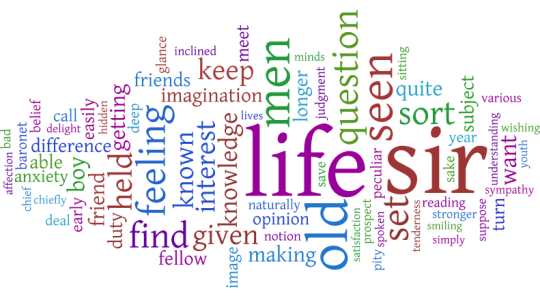
So, as a topic, this one seems to be about the role of people in the world. And by people, of course, we mean MEN.

Topic #2:

Second

Now, this requires a some familiarity with 19th century literature. This topic is “Some Novels by Anthony Trollope”. While, technically accurate, it’s not very informative, especially not compared to the giant man above. The problem is that, while it’s a fairy trivial endeavor to put the cast of one novel into a stop list, it’s rather more difficult to find every first and last name mentioned in 150 Victorian novels and take them out. In an even larger corpus (one with over 1,000 books, say), these names might not be as noticeable simply because there are so many books. But in a corpus this size, a long book like “He Knew He Was Right” can dominate a topic.

There is a solution to this problem, of course. It’s called learning how to quickly and painlessly (for a given value of both of those terms) remove proper nouns from a text. I doubt I will have mastered that by next week, but it is on my to do list (under “Learn R” which is, as with most things, easier said than done).

In the meantime, here are six more word clouds culled from my fifty. 5 of these are from the “good” set and one more is from the “bad”.

Topic #3:

Third

Topic #4:

Fourth

(I should note, by the way, that party appears in another topic as well. In that one, it means party as a celebration. So MALLET did dinstinguish between the two parties.)

Topic #5:

Fifth

Topic #6:

Sixth

Topic #7

Seventh

Topic #8:

Eighth

There are 42 more topics, but since I’m formatting these word clouds individually in Many Eyes, I think these 8 are enough to start with.

So the question now on everyone’s mind (or, certainly on mine) is what do I do with these topic models? I could (and may, in some future post) take some of the better topics and look for the novels in which they are most prevalent. I could see where in the different novels reading is the dominant topic, for example. I could also see which topics, over all, are the most popular in my corpus. On another note, I could use these topics to analyze Daniel Deronda and see what kinds of results I get.

Of course, I could also just stare up at the world clouds and think. What is going on with the “man” cloud up in topic 1? (Will it ever start raining men?). Might there be some relationship between that and evolving ideas of masculinity in the Victorian era? Why is “money” so much bigger than anything else in topic #6? What does topic #7 have to say about family dynamics?

And, perhaps the most important question to me, how do you bring the information in these word clouds back into the texts in a meaningful fashion? Perhaps that will be next week’s post.

*MALLET allows you to add a stopwords list, which is a list of words automatically removed from the text. I did include the list, but it’s by no means a full list of every common last name in England. And, even if it was, the works of Charles Dickens included in this list would leave it utterly stymied.

Portland Craigslist vs. Santa Barbara Craigslist

Seeing Liz’s post yesterday reminded me that it has been awhile since I have posted here on LuAn.  Surely, I thought, there must be something I could include about my current work, as I’ve missed frequenting this friendly space.  And while I could dedicate a post about some of my students’ projects from the course I taught this summer or a few of the new visualizations I’ve created about La tumba (if you recall, Agusín’s La tumba to me is like Daniel Deronda to Liz—our default textual subjects), something else came to mind:

My good friend just moved to Portland, Oregon.

A random thought, indeed, but I plan to show how it is connected to this world of Ludic Analytics (or perhaps, how this world has taken over my mind and it now affects how I relate to any and all texts I come across).  Since my friend was new to the Portland area, she was looking for a place to live and would send me craigslist ads to get my opinion on possible new roommates.  She would also send me some of the ads she found crazy or ridiculous (of which, there were shockingly many…it’s probably more a “craigslist thing” than a “Portland thing”).  Then to help out, I began to search the Portland craigslist ads for her, in an effort to find her the perfect place to live in her new city.

It’s been a few years since I have looked for housing, so, I was not up to date on my local craigslist ad situation, but it seemed to me that the Portland posters had some common themes that kept popping up and were distinctly “Portland” compared to the “Santa Barbara” ads to which I was more aware.  Primarily, the Portland posters needed evidence that you were employed or had a steady job–which is definitely a good quality in a roommate. It seemed to me, however, that this statement was disproportionally included in the Portland ads.   The other commonalities that I perceived from reading the ads were that there were more vegetarians and self-identified “420 friendly” posters in Portland than in Santa Barbara.  However, I wondered: is my sense about this correct?  I decided to investigate by creating some visualizations of the ads and comparing the results.  (Thank you Many eyes).

Keep in mind that this is not the most scientific of experiments, but I was just curious, and I had the tools at the ready (focus more on the ludic here than the analytic).  I compared text from the first 11 posts from each city, Portland, Oregon and Santa Barbara, California.  In these ads, people were looking for roommates to fill their house.  Someday it might be fun to do a more formal analysis (with a bigger sample set, and more rigorous methodologies), but until then, consider these word clouds:

Portland:

portland word cloud

Santa Barbara:

santa barbara word cloud

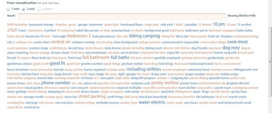
“Room”  and “House” are (logically) prominent in both clouds. “Kitchen” is more evident in Santa Barbara, while “Work” or “working” does seem to have a higher prevalence in the Portland as I suspected. However, the “420” is actually bigger in the Santa Barbara cloud.  School related terms are also more present in the Santa Barbara cloud, perhaps suggesting the large population of students in our much-smaller-than-Portland town.

The clouds did not allude to as much information as I had hoped (despite looking cool) so I decided to check out some more visualizations:

Portland 2-word tag cloud:

portland 2 word tag

Santa Barbara 2 word tag cloud (with phone numbers removed):

tag cloud numbers removed santa barbara

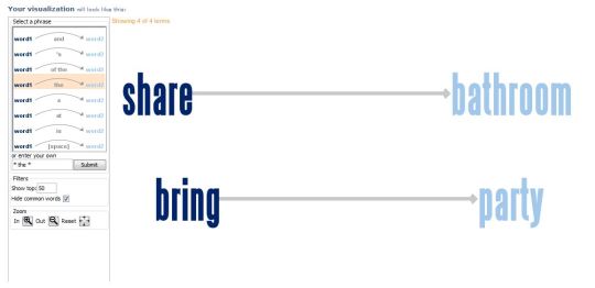
Some observations from these visualizations: 1) it’s cheaper to live in Portland ($600 vs $800) 2) People in Portland do in fact “cook meat” and tend to name their dog “Roxy” (or one person with a dog name Roxy mentions said dog numerous times in the same ad)  3) My perception that self-identified “420” posters in Portland were more prevalent appears to be wrong.  Of course, one of the caveats of this type of visualization is that it could be misleading.  It might say “no” before, and change the meaning, like in the following example of a Santa Barbara phrase net diagram:

bring the party sb craigslist

Hmm.  Interesting.  It’s important to Santa Barbara Craigslist posters that you both “Share THE bathroom” and “Bring THE party”.  However, upon closer investigation, it’s actually “DON’T bring the pary”:

dont bring the party screen shot

So, there you go.  I guess sometimes data can be misleading (which we already knew).

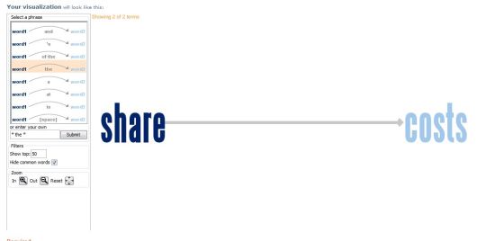
And just so you know, in Portland it’s important to:

share the costs portland

Share THE costs.

Did these visualizations help my friend find a house?  No.  But they were fun to make and she definitely appreciated the effort.  It also solidified in my mind the fact that the process can be just as important as the results, and that it has come to the point where I make visualizations for the amusement of myself and my friends (a good thing?  I hope so).

Said friend eventually found a room in a nice house with an amicable roommate; although, unfortunately her new place does not actually come with a dog named Roxy.

Hammering at Daniel Deronda

This time, we are using a MALLET!

(I apologize for the pun, but it does not seem to get old).

MALLET stands for MAchine Learning for LanguagE Toolkit and is proof that, among other things, there is no such thing as an impossible acronym. MALLET is a Java-based package designed for multiple kinds of natural language processing/machine learning, including what I used it for – Topic Modeling.

So what is Topic Modeling? Well, let’s say that texts are made up of a number of topics. How many? That depends on the text. So every word in that text (with the exception of common words like “an” ) should be related to one of those topics. What MALLET does in topic modeling mode is it divides a set of texts up into X number of topics (where X is your best guesstimate on how many there should be) and outputs all the words in that topic, with a shorter list of top words for each topic. Your job, as the human, is to guess what those topics are.

For more on the idea behind topic modeling, check out Matthew Jockers’ Topic Modeling Fable for the decidedly non-technical version or Clay Templeton’s Overview of Topic Modeling in the Humanities.

Now for the second question – why am I doing it? Beyond the “well, it’s cool!” and “because I can,” that is, both of which are valid reasons especially in DH. And my third reason is a subset of the second, in a way. I want to test the feasibility of topic modeling so that, as this year’s Transcriptions Fellow*, I can help others  use it in their own work. But in order to help others, I need to first help myself.

So, for the past two weeks or so, I’ve been playing around with MALLET which is fairly easy to run and, as I inevitably discovered, fairly easy to run badly. Because of the nature of topic modeling, which is less interested in tracking traditional co-occurrences of words (i. e. how often are two specific words found within 10 words of each other) and more interested in seeing text segments as larger grab-bags of words where every word is equidistant from every other**, you get the best topic models when working with chunks of 500-1000 words. So after a few less-than useful results when I had divided the text by chapters, I realized that I needed a quick way to turn a 300,000+ word text file into 300+ 1000 word text files. Why so long a text? Well, George Eliot’s Daniel Deronda is in fact a really long text. Why Daniel Deronda? Because, as the rest of this blog demonstrates, DD has become my go-to text for experimenting with text analysis (and, well, any other form of analysis). So I have MALLET, I have Daniel Deronda, I now also have a method for splitting the text thanks to my CS friends on Facebook and, finally, I have IBM’s “Many Eyes” visualization website for turning the results into human-readable graphics. All that’s missing is a place to post the results and discuss them.

I knew Ludic Analytics would not let me down. So, without further ado, I present the 6 topics of Daniel Deronda, organized into word clouds where size, as always, represents the word’s frequency within the topic:

Topic 1:

Topic1

Topic 2:

Topic2

Topic 3:

Topic3

Topic 4:

TOPIC4

Topic 5:

Topic5

Topic 6:

Topic6


You will notice that the topics themselves do not yet have titles, only identifying numbers. Which brings us to the problem with Topic Modeling small text sets – too few examples to really get high quality results that identify what we would think of as topics. (Also, topic modeling is apparently better when one uses a POS (parts of speech) tagger and even gets rid of everything that isn’t a noun. Or so I have heard.)

Which is not to say that I will not take a stab at identifying them, not as topics, but as people. (If you’ve never read Daniel Deronda, this may make less sense to you…)

  1. Daniel
  2. Mordecai
  3. Society
  4. Mirah
  5. Mirah/Gwendolen
  6. Gwendolen

I will leave you all with two questions:

Given the caveat that one needs a good-sized textual corpus to REALLY take advantage of topic modeling as it is meant to be used, in what interesting ways might we play with MALLET by using it on smaller corpora or single texts like this? Do the 6 word clouds above suggest anything interesting to you?

And, as a follow-up. what do you make of my Daniel Deronda word clouds? If you’ve never read the text, what would you name each topic? And, if you have read the text, what do you make of my categorizations? 

*Oh, yes. I’m the new Graduate Fellow at the Transcriptions Center for Literature & the Culture of Information. Check us out online and tune in again over the course of the next few weeks to see some of the exciting recent developments at the Center. Just because I haven’t gotten them up onto the site yet doesn’t mean they don’t exist!

**This is a feature, not a bug. Take, for example, a series of conversation between friends and, in every conversation, they always reference the same 10 movies although not always in the same order. MALLET would be able to identify that set of references as one topic–one that the human would probably call movies–while collocation wouldn’t be able to tell that the first movie and last movie were part of the same group. By breaking a long text up into 500-1000 word chunks, we are approximating how long something stays on the same topic.