Sefaria II: The Map, the Territory and the Sukkah
My first post in this series dealt with the possibilities of Sefaria and what mapping such a system would look like at all. This, my second post, will jump to the opposite end of the spectrum. What are the limits of this kind of work and, perhaps more crucially, how do we make those limits work for us?
But first, a status update:
As many of you probably already noticed, the previous post in this series was featured in Wired’s science blog. You can find it here: The Network Structure of Jewish Texts. I was thrilled to have the work featured and I am so glad to see The Sefaria Project getting this kind of recognition.
Speaking of the project, a recent update to the database has increased the number of links from ~87,000 to over 150,000. This is incredibly exciting (obviously!) because it not only marks Sefaria’s continued growth, but also means that I have more data. So future posts in this series will draw on that new dataset as well and I’m looking forward to some comparative visualizations as well.
But enough about the future. Let us return to the past and the other visualizations I created with the first data set.
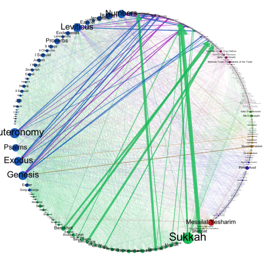
After negotiating with the 100,000+ nodes, I decided that I wanted something on a slightly more humanly sensible scale. I took the dataset I used for the previous visualizations and combined the nodes so that each node no longer represented a verse or a small section, but an entire book. This meant I only had ~400 nodes, a far more legible graph (at least by my standards).
So this is the map, arranged in a circle according to the category of text. The size of the node corresponds to the degree (how many connections it has) while the color corresponds to the kind of node. Edge weight or line thickness corresponds to how many connections exist between each node. The thicker the edge, the more references between the source node and the target.
Here is the key to the map:
- Blue: Biblical texts
- Green: The Talmud
- Red: Mussar
- Indigo: Mishnah
- Yellow: Midrash
- Green: Philosophy
- Magenta: Halacha
- Purple: Commentaries and Exegeses
This image tells a very different story than the map in the last post. That map was a big data artifact (for a given value of big); it worked on the micro level to create macro sized connections. This graph is human scaled, which makes it more interesting to interpret, but perhaps less interesting to discuss observations about.
The strongest connections (by which I mean the thickest edges) are between the individual books of the Talmud and Rashi’s commentary on that book. Almost as thick are the connections between the five books of the Torah and their commentaries. This is not surprising. Rashi is the exegetical commentator for the Talmud; his commentary appears on the inside of every page and, as Haym Soloveitchik points out in his essay on the printed of the Talmud page, Rashi democratized the Talmud. Rashi is an indispensable learning aid, which also explains why Sefaria might make it a high priority to have all those links in place. This tracing of explicit references is the area in which Sefaria excels. Of course, there are other kinds of connections.
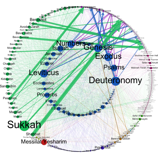
The Bible, specifically the five books of the Torah, are an interesting case study in what the current database can and cannot display. The most interesting piece of information, at least to me, is the paucity of connections between the Biblical books themselves. My immediate reaction was “Of course there are so few links!” After all, the network of reference and commentary relies on the presence of texts further along the timeline that can speak of the earlier texts. And the Bible does not make a practice of citing its own chapter and verse (especially because the chapters as we know them were introduced over 1,000 years after the closing of the canon). Figure 2 gives a better sense of what I’m talking about.
Here, you can see all the books of the Bible in the inner circle and, while there are some connections between the individual books (most notably the 5 books of the Torah to texts in Prophets and Writings), those edges seem scarce compared to the suffusion of green that encroaches from the Talmud’s corner and that signifies the interconnectedness of the Talmudic tractates.
Yet assuming that the Bible is not self-referential would be another kind of mistake. Many of the prophets speak about the covenant between God and Abraham, the exodus from Egypt, the calamities that might befall a recalcitrant king as they did that king’s father. And those are just the obvious, semantic references. The poetry of the prophets, the psalms and the language of the 5 megillot are just some examples of texts that use literary allusion and similarities of language to reference one another. So the network of references within the biblical texts are present, but they are not really the kind of references that Sefaria is set up to import wholesale. This is where the crowd-sourced nature of Sefaria really has a chance to shine; in a few years, it can become a repository of all the different possible connections between texts – an archive of what people think they see and how readers work with the texts. Sefaria has this capability built in – there is an option to add “allusion”s between one text and another, but those have to be added manually and individually. So check back in a few years.
This leads towards the point I allude to in my title. The graph is not really a record of Jewish texts as such, but a record of these texts as they are integrated into Sefaria. To borrow a well-known quote from Alfred Korzybski, “the map is not the territory”. Bearing this useful adage in mind, we can turn to what was my biggest question when looking at this graph. What is going on with Sukkah?
Sukkah is one of the 37 tractates of the Gemara*. It is neither the longest nor the shortest, not the most complex to grasp, nor the simplest. Based purely on my knowledge of the Talmud, I can’t think of a single reason why Sukkah should be far and away the largest of the tractates present.
And yet there it is. There are two possible kinds of answers. The first is that there is something special about Sukkah that sets it apart from the other tracates. Maybe there is something that I am not aware of or maybe this is a fascinating new discovery about the tractate itself. The second possibility is that something happened during the creation of this dataset to give Sukkah significantly more edges as compared to the other tractates.
The practical distinction between these two answers is that the former assumes that Sukkah is an actual outlier that is referenced significantly more often than the other tractates. The latter assumes that Sukkah is actually representative of what all the tractates should look like and the extra edges that it possesses represent data that has only been entered for Sukkah, but should eventually be added for the rest. (The third possibility is a data error. I’m discounting that because I looked back at the actual data and, as I’ll get to in a minute, it’s pretty clear that it’s not an error. But it is always wise to assume human error first.)
So which is it? How does one pinpoint which of the possibilities is more likely? Well, this is how I did it.
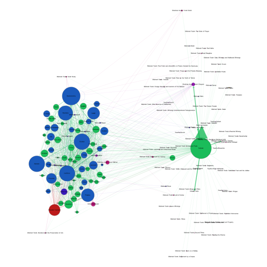
I created an ego graph of tractate Sukkah. The ego graph is a graph that shows only the nodes that connect to a specific node. So this graph shows all the nodes that connect, one way or another, to Sukkah.
The giant green blob in the hat is Sukkah. The collection on the left are all the biblical, Talmudic and halachic sources that refer to or are referenced in Sukkah. But what’s interesting is the cloud of small nodes surrounding Sukkah on the right. Those nodes are almost entirely from Maimonides’ Mishneh Torah, one of the foremost works of halachic literature and, more crucially for our purposes, a text that references pretty much every tractate of Talmud. There should be edges between the Mishneh Torah and each and every green node here. The absence of those edges suggests that it is the dataset that is incomplete and that Sukkah, rather than an outlier, is the node that most closely represents the textual connections that exist.
So that’s cool. By looking at the node as an extraordinary case, we uncover evidence of its ordinariness. That leaves us with an entire different set of questions. What happened to Sukkah? Why did someone take the time to add all these edges to Sukkah?
I can think of several possibilities.
- Daf Yomi. Daf Yomi is the practice of learning one folio (front and back) of Gemara a day and, in 7 1/2 short years, completing the entire Talmud. About 6 months ago, Daf Yomi covered tractate Sukkah. It’s possible that some Daf Yomi scholar discovered Sefaria right when he (statistically speaking, Daf Yomi scholars are he) started Sukkah and decided that, as part of his daily study, he would add the connections between the Talmud and the Mishneh Torah. This doesn’t explain why he stopped after Sukkah – there have been four tractates since Sukkah – but it’s a start.
- Pedagogy. An educator decided to introduce the concept of the halachic chain of tradition using digital tools and assigned their students to collaboratively edit Sukkah by adding the connections between the section they were learning and the halachic literature. So, as part of a classroom module, these students entered this data. This seems like a lot of data for students to enter manually, but it is certainly a possibility.
- It was a test of an automatic importing system. The powers that be were testing to see whether they could import the edges between the Talmudic texts and their halachic commentaries . Sukkah just happened to be the one they tested.
There are probably more possibilities, but I think that covers the basic kinds of users – the scholar, the educator, the technologist. Each of whom could be responsible for this anomaly. (By the way, if any of my readers have inside knowledge and knows what actually happens, I would appreciate anything you have to say.) When looking at a dataset like this, I find that my inclination is to start asking about the data. What would it mean to ask instead about the users and the development of the dataset? Or, to indulge in both my impulses, how can we study the data and the dataset in tandem? How do we mediate between the impulse to assign meaning to the data and the equally compelling impulse to assign it to the dataset? What exactly should I be studying?
And that is the question with which I leave you with and to which I invite your responses. What intrigues you about these visualizations? What would you like to talk about? In the crowd-sourcing spirit of Sefaria, I would like to augment my questions with yours. What would you like to know?
—
*Brief technical note – the Mishnah and the Gemara together make up the Talmud. However, both the term “Talmud” and “Gemara” are colloquially used to refer to the tractates that include the Mishnaic text and the Gemara that accompanies it.


