Playful Visualizations at Work, Working Visualizations at Play

Welcome to the final post in this Ludic Analytics series on Sefaria. While my research itself is ongoing, this part of the project where experiment with the images I can make and ponder their value, has come to a close.

This post is distinct from the previous ones, which can be found here: part 1, part 2, and part 3, in that I’m finally going to move away from looking at the images themselves and focus instead on what their larger purpose is. But before I get to that, an important announcement.

All the data from this project – all three datasets, the .gexf files, the .csv exportable versions and some of the high res images are now available on my Github page for the Sefaria Visualization project. Sefaria is serious about its commitment to an open repository and I share that commitment with them. So if you want to grab any of these datasets and play around with them, please do so and I would very much like to see what you do with them.

A word of caution, however. These datasets are large and Gephi requires a lot of memory. All three datasets, but especially the August and September ones, will take forever to run on a computer with less than 8GB of RAM. Run them in the background on a machine that can handle it and assume that any layout algorithm other than plotting data points on a 2D plane will take some time to render. So, if you’re like me, and started doing this on a 2011 MacBook Air with 4GB of memory…don’t. And if you are familiar with software other than Gephi and prefer to use that, be my guest and do let me know about it.

All the data can be found here: Sefaria Data Visualization Project.

And now, onwards!

What is the value of this research?

As we all know, answering broad and general questions is difficult, so let’s break this one down a bit.
1. How does this kind of work – making visualizations and thinking about networked Jewish text – enhance the traditional experience of studying Jewish texts in a Jewish environment?
2. How can an academic researcher make use of these visualizations and to what degree does she need to become an expert in network theory to do so?

There. That’s much less intimidating.

Going in order, the first question really asks whether this kind of work has value within the traditional classroom. Given that the teaching of Jewish texts often focuses on the micro level and dwells on one topic for a very long time, this kind of visualization work seems like an important counterpoint to that kind of study. If students, as part of their explorations of Jewish texts, are learning how to trace a legal ruling from its source in the Bible to the modern day responsa on the topic, turning that unbroken line of tradition into a network that they can see could be really interesting. Rather than thinking linearly, they can look at specific ideas as clusters. And, starting with one of those groups, students could begin to think in terms of idea clusters – what groups of legal decisions come from verses that are right next door to one another.

None of this is new information and all of it could, in theory, be taught without the aid of images at all. But the images make it much easier to to think in a networked way.

And this is reflective also of the change that has come about with giant repositories like the Bar Ilan CD that contain an extraordinary number of sources or even Sefaria itself. We have access to the legal system as a whole in a way that really did not exist before the age of the computer. We’re going to have to think about how we want to access that system in a way that is both true to traditional forms and takes advantage of technology.1

The goal of teaching students about Jewish texts is only partially to familiarize them with the narratives they hear in synagogue and the laws that structure their lives. The other, more difficult job is to create a bond between the student and the text(s). And we do that by making the books tangible and meaningful, but we can also do that by making the text network tangible (metaphorically speaking). If we create emotional connections through interacting with texts and those connections have a profound influence on what we learn and how,2 we should be able to build on those connections through even less traditional forms of interaction. Such as making a graph.

So why is this kind of work useful in the classroom? Because it provides another way of accessing meaningful texts, one that can help students make connections they could not otherwise see and connect with the text in a way that deepens their appreciation for it.

Yes, this approach might make understanding a particular section of Jewish law a bit easier. But I’m much more interested in the way that it reshapes our relationship with all the texts as a whole. Not exactly what we can see, but how it changes the way that we look.

Which brings me to my second question, which I have partially answered in previous posts on this topic. How does an academic make use of this research?

I’ve given several examples of using the graphs as pointers towards interesting features in the texts. The strangeness of tractate Sukkah that I addressed here and the connections in the 18th chapter of Tanna Debei Eliyahu that I discussed last time are good examples. Both of these are interesting features noticeable only when examining the graph and each leads to a very different kind of research. As Sara pointed out in the comments, the results I was seeing for Sukkah came from the work her Talmud students did with Sefaria. So while not a feature of the text itself, this node opens up a conversation about using Sefaria in the classroom and data collection in a large, open-source project. Conversely, research into the 18th chapter of TDE would require a very different approach as the question, as far as I can determine, involves investigating why it has a disproportionate number of prooftext, whether the topic at hand requires so many texts or, as might always be the case, something else is at work.

And this might even be enough. If a literary critic with little or know network training can use these network graphs to discover new regions of research potential and new questions to ask about the construction of corpora, then perhaps this work has already achieved its goal.

But that feels like such a weak note on which to end. Not only because it absolves us from having to learn anything new about the networks themselves, but also because there should be so much more to do with this technology other than generate ideas and make pretty pictures.
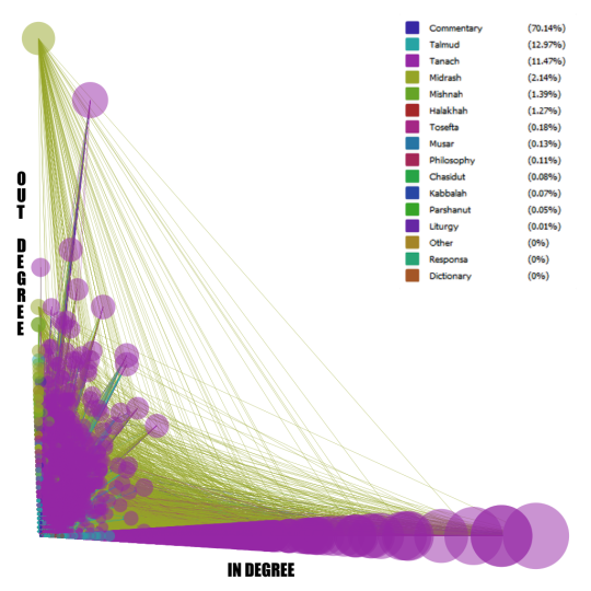
A circular graph of all the nodes in the September database, arranged by name

Sefaria 9-22-14

Not to discount either generating ideas or making art. The practice of displaying information in an unreadable form purely for its aesthetic appeal is valuable as an act of artistic creation. If another value of this work is a set of awesome looking pictures to hang by my desk…far be it from me to complain. They’ll look great next to the embroidered TARDIS. I said that I was in this for the visceral joy of working with texts and the delight in making things the with which I think. But I will concede that not everyone wants what I want. I think we—the academic community—see the artistic values of our work as byproducts and, overall, would prefer research methods that generate answers rather than questions. So I will address that approach as well.

I realize that, in this conversation, I’m leaving out large swathes of digital research up to and including the WhatEvery1Says topic modeling project going at UCSB right now under the leadership of the 4Humanities group there. Using digital tools to interpret literary texts, while not free from controversy, has a pretty impressive track record and allows us to think anew about what we know and how we know it. But for many of these approaches, the images are secondary. They are elegant methods of displaying the information detailed in the critical literature itself. I’m talking about the actual value of taking information and transforming it into a visualization as a way of answering questions about a work or a corpus. To put the question another way, when is it better to see information than to read it?

And here’s where I think we start to see the value in making visualizations and knowing network theory. This kind of research is useful for destroying the linear thinking that narrative naturally invites. Database thinking (see Manovich in Language of New Media and Hayles in How We Think) has similar results in theory, but is comparatively useless to us as human beings in practice. We can’t read databases. We have tools that can, but what we end up reading or, realistically, seeing is the visual representation of the connections that are not apparent when traversing the work. Visualization breaks narrative. And sometimes, that’s what we want.

We want to break out of a narrative approach to, for example, the corpus of Jewish texts as a way of rethinking the legal, cultural and social influences that the texts have on one another. Here are some questions that, I hope, work like this might aspire us to answer.

  • How accurate is the vision of the Jewish legal system as a ladder with each subsequent generation relying on the scholarship that came beforehand? Do more recent writers hearken back to the earlier legal scholars or do they go straight to the Talmud or do they skip the legal sources in their own writing and rely entirely on the Biblical texts? What, in short, does a community of scholars look like?
  • Do scholars in different eras work differently? Are scholars more likely to refer to their predecessors in certain times than in others?
  • How interconnected are the commentaries? How often do they quote one another?
  • How interconnected is the corpus as a whole? Can you start anywhere and get back to Genesis 1:1? Which texts are inaccessible and do they share any features?
  • How much of the corpus is a dead end? And are dead ends characterized by any specific features?

We can’t read this information in the texts, but we can see it by looking at the visualizations. Which brings me to the end of this series, but to the beginning, I hope, of much research. All this data is available at Github and I welcome you to use it as you see fit.

As for me? Well, I’ve a dissertation to write and the data-viz work that I’ve been doing here is going to be a big part of that. And while my next post won’t be about Sefaria per se, let’s just say I still have a lot more to talk about when it comes to making meaning using network graphs.


  1. Last year, there was a…controversy over a specific decision made by a school principal when two of his students asked him to rule on a matter of law for them. I don’t want to get into the details of the controversy, but one of the loudest objections came from a rabbi who argued that simply having access to the sources to back up one’s opinion (he noted the Bar Ilan CD in particular) did not give someone the right to rule when more prominent rabbis disagreed with that ruling.
    Leaving aside that the principal in question is absolutely not the kind of person who would scour a database for one minor dissenting opinion rather than using his own knowledge to rule as he sees fit, this argument points to a more pervasive fear within all scholarly culture.
    Has the database replaced human memory? And can you really claim mastery over a topic if the mastery you have is, in fact, over the information seeking in the database?
    Conversely, can you claim mastery without the database? One of the points that I think the Sefaria graph makes elegantly is that there is really is (and always has been) “Too Much to Know,” to borrow the title of Ann Blair’s book on the subject. Is human knowledge of the canonical sources better than having a functioning database of every source? How do we rank knowledge without a canon?
    Given that my attitude towards technology can very broadly be summed up as “technology you do not like will not go away because you do not like it, so the only choice is to make it better”, I would argue that we need to train Jewish legal scholars in both forms of study. Legal precedent (unlike literature) has a better argument for the maintenance of the canon, but I think we do our laws and ourselves a disservice if we don’t take advantage of what technology can do and realize a system for using it to better understand and, yes, rule on Jewish law.
    Still, this point applies to relatively few people – the rabbis and not-rabbis responsible for handing down legal rulings. So let’s return to pedagogy. 
  2. A claim I don’t quite have the space to back up here, but I’m working on something that will address it. It’s called my dissertation. 

In the last few months, Sefaria.org has added several tens of thousands of new links to the site, mostly through judiciously crawling the wikitexts archive. The combination of human-scale translations and data-scale linkings is fascinating – the sheer number of links would take ages for a person to do, but as time progresses, we must be approaching the maximum number of links that can be added algorithmically. I’d mentioned, in a previous post, that there’s a huge difference between collecting exact quotes and subtle allusions. It would be interesting to see what happens to Sefaria as it moves towards discovering the latter.[1]
However, it’s also pretty interesting to see the evolution of the former.

Before I return to the circle of text, special thanks to Josh, who recently got a new desktop and donated his old one to me after putting in a new solid state drive. It has become my official work machine (when not also being used to play Portal. Again.)

So, when last we left Sefaria, they were at 87,000 or so links between texts. By August 25nd, they had over 150,000. By September 22nd, they were up to 300,000. So my first question, as you might imagine, is as follows: assuming that I use the same layout algorithms for each, how do the graphs compare to one another?

image1
Open Ord graphs of May, August and September

These three graphs were all created using the force directed OpenOrd layout algorithm in Gephi, mostly because it’s the only layout other than isometric that can really handle this much data.

Arguably, the first thing we’ve proved is that Alexander Galloway is right in The Interface Effect, “Only one visualization has ever been made of an information network, for there can only be one” (84). Galloway observes that the style and structure of network visualizations all look the same or, more accurately, all use the same aesthetic codes to say the same things and what they tend to say is that this object is big and interconnected—each image fundamentally exists as a symbol of the network without any kinds of representation.

Which leaves me, as a reader and student, with two series of questions. The first—which I am going to hold off on answering until my final post in which I plan to discuss questions of worth—asks what the aesthetic and poetic value of these visualizations are? What, in the strongest sense of the term, do we do with them as objects that speak about an archive or even as objets d’art?[2]

But we’ll get to that later. In the mean time, let us ask a different kind of question. If we take each graph as the symbolic representation of algorithm working on data, how do we use that representation to reorient more traditional forms of inquiry? This is part of the humanities’ continued break with what I think of as the ordinary uses of data visualization wherein the purpose of the image is to convey to the human eye what the algorithm has learned. It’s a method of displaying new knowledge that has been interpreted by virtue of having been computationally mediated. But these visualizations work slightly differently. While their job is still to show us Sefaria’s output in a manner readable to our eyes and brains, they exist as the starting point in humanist inquiry rather than the purpose of it. I see these graphs as pointers, methods of discovering or uncovering areas in the network that are of interest to scholarship. The visualizations, taken separately and together, are a way of telling us to look here.[3] Why is this node different from all other nodes? When we line up these three images, which look more and more like the multicolored Eye of Sauron, how do they draw our attention and what inquiries do they suggest?

With that in mind, here are some questions I thought of:
– What is the node that looks like a lens flare on the right-hand visualization?
– Why do each of this images have a halo?
– Is the largest node the same in each of these images?
– Why do I only remember to check the repository at the end of the month?

So these are questions we can answer, except perhaps that last. I will take on the first two. The lens flare, interestingly enough, is a single chapter from Tanna Debei Eliyahu Rabbah. If you were expecting something a bit more well-known and your response was “who now?” rest assured, you’re not alone. I was surprised too.
Tanna Debei Eliyahu is a work of midrash, which means that it uses biblical verses to craft narratives and make arguments about the nature of the world (rather than, say, use them as prooftexts for legal decisions). David Stern describes it as an “exposition of themes and ideas, but one whose coherent presentation is always being sidetracked by the lure of exegesis” in his book, Parables in Midrash.

So why does its 18th chapter have so many edges stretching out of it?
Here, by the way, is what it looks like when graphed isometrically:

image2
Isometric Graph of the September Dataset

As to why, the simplest answer is because that chapter refers to an astounding 113 different verses in the Bible. Nothing else, as the graph shows us, comes close. The passage in question begins with an exegesis of a verse from Lamentations and can be found here. For context, the other chapters have between 3 and 35 biblical quotations in each section.

So there’s a research project for someone interested in Midrash. Is there something unique about the contents of this chapter that matches the odd data we’ve gleaned about it? Why does this section require so many prooftexts? Are those texts similar across the entire section or is there an evolution of their content? Of course, I’m not in the business of interpreting Midrash, at least not at this point in my career. The rather serendipitous revelations of this research remain as pointers.

So much for micro-level drilling down. Now let’s go back and take this opportunity to look at the evolution of the archive. This graph is a testament to Sefaria’s growth, but more importantly to us, it shows what the database looks like as it approaches a more accurate representation of the interconnectedness of Jewish texts.

What strikes me as interesting, at least in this network, are the regions of growth. The centers become denser and more intricately connected while the halo around the outside remains the same diffuse constellation it had been more or less since the beginning. According to that view, the nodes around the outside remain the same, while new nodes add themselves in to the central cluster. Given the scale of the images versus their pixel density, I went back to Gephi itself to check the compositions of each one.

Here’s the image again, just as a refresher:

image1
Open Ord graphs of May, August and September

In the May graph, the outermost ring is composed of less prominent Biblical verses and their commentaries, along with the occasional Talmudic fragment that comments on them. The inner ring, on the other hand, comprises the Talmudic pages that lack links to anything other than their own commentaries. The August graph works on the same obscurity principle and, despite appearances, the presence of a text in the inner or outer ring is determined by how many edges it has. The inner ring is made of texts with several connections to other texts that make up their own little clusters, mostly fragments of the Talmud or biblical verses. On the other hand, the texts in the outer ring tend to have only two or three edges. They’re just packed more closely together, which is what leads to the thicker looking band of color. Whether a cluster ends up in the inner sphere or in one of these outer rings is determined by both the number of edges and whether one of those edges connects to the massive nodes in the center. And, finally, we reach the September graph. Again, same basic principle, but the contents are slowly shifting inwards. Nodes that, in previous graphs, appeared in the outer circles have now gained access to the inner sphere (where they have been indoctrinated in the secret mysteries of graphs practices, no doubt), while the outer ring includes commentaries on and translations of biblical verses (which tend to only have one edge, to the verse they are translating).

This suggests that, as new nodes are added, earlier nodes with fewer edges make more connections and gravitate towards the center of the graph while some of the newer, more obscure nodes, take their place on the outskirts. Alternatively, the nodes themselves retain the same number of connections, but the nodes to which they are connected gain more edges and they are drawn to the center by that connection. One very popular biblical verse can draw in an extraordinary number of commentaries, each of which only connect back to that verse. There is a point at which this will have to stop; the nodes currently in the outer circle are quite unlikely to build sudden networks of communications, given that the Aramaic translations, for example, are rarely referenced within the literature.

I’m not surprised to discover that Sefaria’s database was built up in this fashion; the earlier iterations were more interested in setting up the database with texts that readers would likely want to reference. Pseudo-Jonathan was probably not a priority. If the previous question drew our attention towards the anomalously overconnected, this question turns our gaze towards the obscure. Texts like the Aramaic translations catch my eye because they are precisely the kinds of texts I would expect to find in the far outer reaches of the graph. What else is out there? Are there any similarities between the texts with few connections? And what kinds of similarities might we look for?

The appeal of big data (for a given value of big) is that it promises us the possibility of looking at the ordinary en masse rather than extraordinary exemplars. The problem is deciding what to do with the ordinary now that we’ve found it.

I considered looking at only the nodes with 20 edge or fewer, but that turns out to be 99.2% of the nodes. My next step was to reevalute my definition of “a few edges” and I went back to the graph with what I thought was a more reasonable number. Going down to 4 edges brought me all the way to 92% of the nodes visible, but less than 20% of the edges. And, finally, 75% of the nodes on the graph only have one edge. That’s about 228,000 nodes out of 305,000. As a note, fewer than 5% of the edges are part of this graph, which means that 25% of the nodes are responsible for 95% of the edges.

My original goal, for those who remember, was to look at these nodes with few connections and see what they have to say for themselves. This is where Gephi becomes less useful and so I ended up back in Excel, messing around with spreadsheets. (Yes, I know, there are better methods. But I know how to use excel!)

image3
A log graph of the number of nodes with one degree in each category

Percentage-wise, most of the commentaries are dead ends. Which is to say, they have one edge and that edge connects to the biblical verse upon which they are commenting. Interestingly enough, the same is true for the Halakhic writings. 70% of those texts only have one edge. Which suggests a chain of transmission that only references the conclusions of a previous work and that only has its conclusions referenced by the next in the chain. And given that we are working with with individual verses in the Bible and sections of sections in Halakhic literature, it’s not surprising to find such divisions.

On the other hand, only 3% of the Mishnaic nodes have just one edge. Given the rest of the graph, that is rather an anomaly.[4] My first impulse was to blame the Babylonian Talmud (as one does) except that only accounts for 37 of the 60 tractates. Then I remembered that the absence of the Jerusalem Talmud from my scholarly interests does not disqualify it from having an effect on the graph. And yet both the Babylonian and the Jerusalem Talmud leave out the entire order “Taharot” with the exception of one Tractate. If one sixth of the Mishnah remains uncommented, shouldn’t the number of nodes with only one edge be higher?

Apparently not. I was still inclined to blame the Gemara’s selective nature for this particular graph, but it pays to be thorough. I checked the list of the Mishanyot with only one edge and, while the majority of them were from the minor tractates not discussed in the Babylonian Talmud, there were still random sections of the Mishnayot even in the more well known tractates, such as those dealing with marriage, damages, ethics. So there’s another question for another researcher. What is so strangely uninteresting about these sections of the Mishnah?

Finally, I want to return to Tanach as I found those results to be anomalous in a different direction. I found it hard to believe that 37% of the verses in Tanach have only one edge, which is to say that only one commentator or translator has taken the time to interpret them.

My instinct was right in this case. Sefaria counts translations as part of “Tanach” rather than as commentaries, despite the translators Onkelos and Jonathan taking full advantage of translation as a form of interpretation. So when I checked how many of the Tanach nodes were actually translations, I found that the number was roughly 33%. Conveniently, when I excluded the translations, I found only 4% of Tanach nodes had one edge. So the math works out nicely and there’s our 37%.

Some off the cuff Sefaria testing also suggests that some of these numbers are not accurate. There are some verses listed in my 1 degree column that clearly have more than one connection on the site itself. But that may be an artifact of the work that continues to be done on the site. Current stats from the site say that they’re up to 400,000 edges.
Perhaps it’s time for another multicolored Eye of Sauron.

As my readers have undoubtedly noticed, these forays into visualization are not focused on specific research agendas. I’m using this space to figure out what it means to work with visualizations in the humanities, what kind of work they can do and what we can ask of them. I don’t want answers, I simply want new and interesting questions. And I want to work with the texts on a visceral level, something that makes creating these visualizations surprisingly rewarding. I know that all the work we do is about creating knowledge, but it feels more visceral when I can watch the shape and size of the textual representations change on the screen. Taking ownership and making knowledge in full technicolor is what we’re all about here.


  1. Alternatively, one could ask whether we could build a program that looks for biblical allusions. Especially within the 24 books of the Bible, the language is constrained enough that we might be able to manage it. It would be interesting to note, first of all, how many of those linguistic connections were already set out in the Talmud and Midrash using the rules of “hekeish” or the recurrence of root words. And to compare those with the ones generated by a machine.  ↩

  2. The problem of art is a tricky one, because we don’t see ourselves as in the business of creating beauty. We study it and, if we can, we create it in addition to our critical analysis. But that’s not quite the same thing.  ↩

  3. image4 “Hey! Listen!”  ↩

  4. For the purposes of this conversation, I’m leaving out the categories “Other”, “Response” and “Dictionary” as they make up a total of 6 nodes out of 305,000.  ↩

Read the rest of this entry »

My first post in this series dealt with the possibilities of Sefaria and what mapping such a system would look like at all. This, my second post, will jump to the opposite end of the spectrum. What are the limits of this kind of work and, perhaps more crucially, how do we make those limits work for us?

But first, a status update:

As many of you probably already noticed, the previous post in this series was featured in Wired’s science blog. You can find it here: The Network Structure of Jewish Texts. I was thrilled to have the work featured and I am so glad to see The Sefaria Project getting this kind of recognition.

Speaking of the project, a recent update to the database has increased the number of links from ~87,000 to over 150,000. This is incredibly exciting (obviously!) because it not only marks Sefaria’s continued growth, but also means that I have more data. So future posts in this series will draw on that new dataset as well and I’m looking forward to some comparative visualizations as well.

But enough about the future. Let us return to the past and the other visualizations I created with the first data set.

After negotiating with the 100,000+ nodes, I decided that I wanted something on a slightly more humanly sensible scale. I took the dataset I used for the previous visualizations and combined the nodes so that each node no longer represented a verse or a small section, but an entire book. This meant I only had ~400 nodes, a far more legible graph (at least by my standards).

Figure 1

So this is the map, arranged in a circle according to the category of text. The size of the node corresponds to the degree (how many connections it has) while the color corresponds to the kind of node. Edge weight or line thickness corresponds to how many connections exist between each node. The thicker the edge, the more references between the source node and the target.

Here is the key to the map:

  • Blue: Biblical texts
  • Green: The Talmud
  • Red: Mussar
  • Indigo: Mishnah
  • Yellow: Midrash
  • Green: Philosophy
  • Magenta: Halacha
  • Purple: Commentaries and Exegeses

This image tells a very different story than the map in the last post.  That map was a big data artifact (for a given value of big); it worked on the micro level to create macro sized connections. This graph is human scaled, which makes it more interesting to interpret, but perhaps less interesting to discuss observations about.

The strongest connections (by which I mean the thickest edges) are between the individual books of the Talmud and Rashi’s commentary on that book. Almost as thick are the connections between the five books of the Torah and their commentaries. This is not surprising. Rashi is the exegetical commentator for the Talmud; his commentary appears on the inside of every page and, as Haym Soloveitchik points out in his essay on the printed of the Talmud page, Rashi democratized the Talmud. Rashi is an indispensable learning aid, which also explains why Sefaria might make it a high priority to have all those links in place. This tracing of explicit references is the area in which Sefaria excels. Of course, there are other kinds of connections.

The Bible, specifically the five books of the Torah, are an interesting case study in what the current database can and cannot display. The most interesting piece of information, at least to me, is the paucity of connections between the Biblical books themselves. My immediate reaction was “Of course there are so few links!” After all, the network of reference and commentary relies on the presence of texts further along the timeline that can speak of the earlier texts. And the Bible does not make a practice of citing its own chapter and verse (especially because the chapters as we know them were introduced over 1,000 years after the closing of the canon). Figure 2 gives a better sense of what I’m talking about.

Figure 2

Figure 2

Here, you can see all the books of the Bible in the inner circle and, while there are some connections between the individual books (most notably the 5 books of the Torah to texts in Prophets and Writings), those edges seem scarce compared to the suffusion of green that encroaches from the Talmud’s corner and that signifies the interconnectedness of the Talmudic tractates.

Yet assuming that the Bible is not self-referential would be another kind of mistake. Many of the prophets speak about the covenant between God and Abraham, the exodus from Egypt, the calamities that might befall a recalcitrant king as they did that king’s father. And those are just the obvious, semantic references. The poetry of the prophets, the psalms and the language of the 5 megillot are just some examples of texts that use literary allusion and similarities of language to reference one another. So the network of references within the biblical texts are present, but they are not really the kind of references that Sefaria is set up to import wholesale. This is where the crowd-sourced nature of Sefaria really has a chance to shine; in a few years, it can become a repository of all the different possible connections between texts – an archive of what people think they see and how readers work with the texts. Sefaria has this capability built in – there is an option to add “allusion”s between one text and another, but those have to be added manually and individually. So check back in a few years.

This leads towards the point I allude to in my title. The graph is not really a record of Jewish texts as such, but a record of these texts as they are integrated into Sefaria. To borrow a well-known quote from Alfred Korzybski, “the map is not the territory”. Bearing this useful adage in mind, we can turn to what was my biggest question when looking at this graph. What is going on with Sukkah?

Sukkah is one of the 37 tractates of the Gemara*. It is neither the longest nor the shortest, not the most complex to grasp, nor the simplest. Based purely on my knowledge of the Talmud, I can’t think of a single reason why Sukkah should be far and away the largest of the tractates present.

And yet there it is. There are two possible kinds of answers. The first is that there is something special about Sukkah that sets it apart from the other tracates. Maybe there is something that I am not aware of or maybe this is a fascinating new discovery about the tractate itself. The second possibility is that something happened during the creation of this dataset to give Sukkah significantly more edges as compared to the other tractates.

The practical distinction between these two answers is that the former assumes that Sukkah is an actual outlier that is referenced significantly more often than the other tractates. The latter assumes that Sukkah is actually representative of what all the tractates should look like and the extra edges that it possesses represent data that has only been entered for Sukkah, but should eventually be added for the rest. (The third possibility is a data error. I’m discounting that because I looked back at the actual data and, as I’ll get to in a minute, it’s pretty clear that it’s not an error. But it is always wise to assume human error first.)

So which is it? How does one pinpoint which of the possibilities is more likely? Well, this is how I did it.

I created an ego graph of tractate Sukkah. The ego graph is a graph that shows only the nodes that connect to a specific node. So this graph shows all the nodes that connect, one way or another, to Sukkah.

Figure 3

Figure 3

The giant green blob in the hat is Sukkah. The collection on the left are all the biblical, Talmudic and halachic sources that refer to or are referenced in Sukkah. But what’s interesting is the cloud of small nodes surrounding Sukkah on the right. Those nodes are almost entirely from Maimonides’ Mishneh Torah, one of the foremost works of halachic literature and, more crucially for our purposes, a text that references pretty much every tractate of Talmud. There should be edges between the Mishneh Torah and each and every green node here. The absence of those edges suggests that it is the dataset that is incomplete and that Sukkah, rather than an outlier, is the node that most closely represents the textual connections that exist.

So that’s cool. By looking at the node as an extraordinary case, we uncover evidence of its ordinariness. That leaves us with an entire different set of questions. What happened to Sukkah? Why did someone take the time to add all these edges to Sukkah?

I can think of several possibilities.

  1. Daf Yomi. Daf Yomi is the practice of learning one folio (front and back) of Gemara a day and, in 7 1/2 short years, completing the entire Talmud. About 6 months ago, Daf Yomi covered tractate Sukkah. It’s possible that some Daf Yomi scholar discovered Sefaria right when he (statistically speaking, Daf Yomi scholars are he) started Sukkah and decided that, as part of his daily study, he would add the connections between the Talmud and the Mishneh Torah. This doesn’t explain why he stopped after Sukkah – there have been four tractates since Sukkah  – but it’s a start.
  2. Pedagogy. An educator decided to introduce the concept of the halachic chain of tradition  using digital tools and assigned their students to collaboratively edit Sukkah by adding the connections between the section they were learning and the halachic literature. So, as part of a classroom module, these students entered this data. This seems like a lot of data for students to enter manually, but it is certainly a possibility.
  3. It was a test of an automatic importing system. The powers that be were testing to see whether they could import the edges between the Talmudic texts and their halachic commentaries . Sukkah just happened to be the one they tested.

There are probably more possibilities, but I think that covers the basic kinds of users – the scholar, the educator, the technologist. Each of whom could be responsible for this anomaly. (By the way, if any of my readers have inside knowledge and knows what actually happens, I would appreciate anything you have to say.) When looking at a dataset like this, I find that my inclination is to start asking about the data. What would it mean to ask instead about the users and the development of the dataset? Or, to indulge in both my impulses, how can we study the data and the dataset in tandem? How do we mediate between the impulse to assign meaning to the data and the equally compelling impulse to assign it to the dataset? What exactly should I be studying?

And that is the question with which I leave you with and to which I invite your responses. What intrigues you about these visualizations? What would you like to talk about? In the crowd-sourcing spirit of Sefaria, I would like to augment my questions with yours. What would you like to know?

*Brief technical note – the Mishnah and the Gemara together make up the Talmud. However, both the term “Talmud” and “Gemara” are colloquially used to refer to the tractates that include the Mishnaic text and the Gemara that accompanies it.

How do you visualize 87,000 links between Jewish texts?

The answer, at least when one is working on an ordinary iMac, is very slowly.

The better–by which I mean more accurate and productive–question is: How do you meaningfully visualize the relationships between over 100,000 individual sections of Jewish literature as encoded into Sefaria, a Living Library of Jewish Texts?

The key term for me is meaningfully – working at this scale means I have to get out of my network comfort zone and move from thinking about the individual nodes and their ego networks towards a holistic appreciation of the network as a structural entity. I’m not able to do that quite yet, at least not in this post. This is the first post in a series of explorations  – what kinds of graphs can I make with this information and what information can I get from it (or read into it)?

This project and, perforce, this series is another side of the research questions that I’m currently grappling with – how do the formal attributes of digital adaptations affect the positions we take towards texts? And how do they reorganize the way we perceive, think about and feel for/with/about texts?

Because this is Ludic Analytics, the space where my motto seems to be “graph first, ask questions later,” it seemed an ideal place to speculate about what massive visualizations can do for me.

Let’s begin with a brief overview of Sefaria. Sefaria is a comparatively new website (launched in 2013) that aims to collect all the currently out-of-copyright Jewish texts and not only provide access to them through a deceptively simple interface, but also crowd-source the translations for each text and the links between them. For example, the first verse of Genesis (which we will return to later) is quoted in the Talmud (one link for every page that quotes it), has numerous commentaries written about it (another link for every commentary), is occasionally referenced in the legal codes and so on. Here’s a screenshot of the verse in Sefaria.

Genesis 1:!

Sefaria Screenshot

You can see, along the sides, all the different texts that reference this one and, of course, if you visit the website, you can click through them and follow a networked thread of commentaries like a narrative. Or like a series of TVTropes articles.

Sefaria did not invent the hyperlinked page of Rabbinic text. Printed versions of the Bible and the Babylonian Talmud and just about every other text here–dating all the way back to the early incunabula–use certain print conventions to indicate links between texts and commentaries, quotations and their sources. The Talmud developed the most intricate page by far, but the use of printing conventions such as font, layout and formal organization to show the reader which texts are connected to which and how is visible in just about every text here.

What Sefaria does (along with any number of other intriguing things that are not the topic of this post) is turns print links into hyperlinks and provides a webpage (rather than a print page) that showcases the interconnectedness of the literature. Each webpage is a map of every other text in Sefaria that connects to the section in question, provided that someone got around to including that connection. Thus we see both the beauty and the peril of crowdsourcing.

So the 87,000 links to over 100,000 nodes that I was given (thank you @SefariaProject!) are not exactly a reflection of over 2,000 years of Jewish literature as such, but a reflection of how far Sefaria has come in crowdsourcing a giant digital database of those 2,000 years and how they relate to one another. That caveat is important and it constrains any giant, sweeping conclusions about this corpus (not that I, as a responsible investigator, should be making giant sweeping conclusions after spending all of two weeks Gephi-wrangling). Having said that, the visualizations are not only a reflection of Sefaria’s growth, but also a way to reflect on the process of building this kind of crowd-sourced knowledge.

But before subsequent posts that analyze and reflect and question can be written, this post in all its multicolored glory must be completed.

To return to my very first question,  how do you visualize 87,000 links?

Like this:

Sefaria in OpenOrd

Figure 1


This is Sefaria. Or a cell under a microscope. It’s hard to tell. Here’s the real information you need. This graph was made using the Gephi plugin for OpenOrd graphing, a force directed layout optimized for large datasets.* The colors signify the type of text. Here’s the breakdown.

Blue – Biblical texts and commentaries on them (with the exception of Rashi). Each node is a verse or the commentary by one author on that verse.

Green – Rashi’s commentaries. Each node is a single comment on a section

Pink – The Gemara. Each node is a single section of a page.

(Note – these first 3 make up 87% of the nodes in this graph. Rashi actually has the highest number of nodes, but none of them have very many connections)

Red – Codes of Law. Each node is a single sub-section.

Purple – The Mishnah. Each node is a single Mishnah.

Orange – Other (Mysticism, Mussar, etc.)

The graph, at least as far as we can see in this image, is made up almost entirely of blue and pink nodes and edges. So the majority of connections that Sefaria has recorded occur between Biblical verses and the commentaries, the Gemara and Biblical references and the Gemara referencing itself.

Size corresponds to degree – the more connections a single node has, the larger it is. The largest blue node is the first verse of Genesis.

On the one hand, there is an incredible amount of information embedded in this graph. On the other hand, it’s almost impossible to read. There are some interesting things going on with the patterns of blue nodes clustering around pink nodes (the biblical quotations and their commentaries circling around the pages of the Gemara that reference them, perhaps?), but there are so many nodes that it’s hard to tell.

There’s also a ton of information not encoded into the graph. Proximity is the biggest one. There is absolutely nothing linking the first and second verses of Genesis, for example. Arguably, linear texts should connect sequentially and yet the data set I used does not encode that information. So this data set conveys exclusively links across books without acknowledging the order of sections within a given book.

But, as I told my students this quarter, the purpose of a model is not to convey all the information encoded in the original, but to convey a subset that makes the original easier to manage. This model, then, is not a model of proximity, It is purely a model of reference. Let’s see what happens when we look at it another way.

Sefaria All X-InD Y-OutD BC Book

Figure 2

Gephi does not come with a spatial layout function, but there are user-created plugins to do this kind of work. This is the same dataset as above, except arranged on a Cartesian plane with the X axis corresponding to In Degree (how many nodes have that node as a target for their interactions) and the Y axis corresponding to Out Degree (how many nodes have that node as a source for their interactions).** The size corresponds to a node’s Betweenness Centrality – if I were to try and reach several different nodes by traveling along the edges, the bigger nodes are the nodes I am more likely to pass through to get from one node to another.

The outlier, obviously, is Genesis 1:1. It has far and away the most connections and, especially based on its height, is the source for the greatest number of interactions. (That probably means that, out of all the information Sefaria has collected so far, the first verse of Genesis has the most commentaries written about it). It’s not the most quoted verse in Sefaria, that distinction belongs to Exodus 12:2 (the commandment to sanctify the new moon, for those who are wondering). Second place goes to Deuteronomy 24:1 (the laws of divorce) and third goes to Leviticus 23:40 (the law of waving palm branches on Succot).*** So for this data set, most quoted probably signifies most often quoted in the legal codes in order to explicate matters of law. And while the commentaries tend to focus on some verses more than others, the codes seem to rely almost exclusively on a specific subset of verses that are related to the practices of mitzvoth. I think I was aware of this beforehand, but the starkness of the difference between Genesis 1:1 and Exodus 12:2 is still surprising and striking.

Working with Betweenness Centrality as a measure of size was interesting because it pointed towards these bridge texts – statistically speaking, Genesis 1:1 is the Kevin Bacon of Sefaria. You are more likely to be within 6 degrees of it than anything else.

There are a few other interesting observations I can make from this graph. The first is that the Gemara is ranged primarily along the Y axis, suggesting that the pages of the Gemara are more rarely the target for interactions (which is to say that they are not often quoted elsewhere in Sefaria) ,but more often the sources and, as such, quote other texts often and have substantial commentaries written about them. Because one of the texts quoted on a page of Gemara is often another page of Gemara, you do see pages along the X axis, but none range as far along the X axis as along the Y. While there are texts that are often the target of interactions, the Gemara is, overall, the source.

This is in contrast to the Biblical sections, which occupy the further portions of the X axis (and all the outliers are verses from the five books of the Torah). So the graph, overall, seems to be shading from pink to blue.

Which brings me to another limitation in my approach. Up until now, I have been thinking about these texts as they exist in groups, using that as a substitute for the individual nodes that would ordinarily be the topic of conversation. So what happens when I create a version of the graph that uses color to convey a different kind of meaning and no longer distinguishes between types of texts?

Sefaria All X-InD Y-OutD BCsize Dcolor

Figure 3

Sefaria, taste the rainbow.

In this graph, color no longer signifies the kind of text, but the text’s degree centrality. The closer to the purple end of the rainbow, the higher number of connection the node has. Unsurprisingly, Genesis 1:1 is the only purple node.

It’s interesting to note that the highly connected nodes on the right of the graph are all connected to a large number of lower level nodes. There are no connections between the greens and yellows near the top of the page and the blues down on the right. Why is there such a distinction between nodes that reference and nodes that are referenced? Why is the upper right quadrant so entirely empty? Does this say something about the organization of the texts or about the kinds of information that the crowd at large has gotten around to encoding? Or is it actually a reflection of the corpus – texts that cite often are not cited in turn unless they are in the first book of the Torah?

If you have any questions, thoughts, explanations, ideas for further research with this data set or these tools, suggestions for getting the most out of Gephi, please leave your comments below.

Coming soon (more or less): What happens when we look at connections on the scale of entire books rather than individual verses?

Bonus Graph: A Circular graph with Genesis 1:1 as the sun in what looks like a heliocentric solar system. Why? Well, it seemed appropriate.

Genesis 1-1 Concentric Graph Book MC

One note on this graph. You can see the tiny rim of green all around the right edge – those are the tiny nodes that represent Rashi’s commentaries and make up more than 1/3 of all the nodes in the graph. The inner rings, at least what we can see of them, tend towards Biblical verses and their commentaries. The Gemara is almost all on the outside. Of course, those distances are artifacts of deliberately placing Genesis 1:1 at the center, but they are interesting nonetheless.

*Force directed, to provide a very brief summary, means that the graph is designed to create clusters by keeping all the edges as close to the same length as possible. Usually it works by treating edges as attractive forces that pull nodes together and the nodes themselves as electrically charged particles that repulse one another.

**At least in this data set, the source is the text under discussion, so if one were to look at the connection between Genesis 1:1 and Rashi’s commentary on Genesis 1:1, the Biblical verse is the source and the commentary the target. Conversely, if one were looking at a quotation from Genesis in a page of the Gemara, the page of Gemara would be the source and the verse in Genesis the target.

***Based on further explorations of the data set according to less fine-grained divisions, I am convinced that anything having to do with the holiday of Succot is an outlier in this dataset. More on that in another post.

I am not exactly sure that the metaphor of my subtitle will uphold everyone’s expectations, but I thought I needed something jazzy to start the new year (yes…17 days and 1 MLA conference after the new year has started).  I’m switching up my normal post format today–and no, it’s not  because I am actually posting something–but rather, I wanted to share some links of interest.

If you were not at the MLA in Chicago last weekend, you were most likely warmer than I was.  More importantly, however, check out some post-conference comments on the presence of DH at the MLA .  As this Inside Higher Ed article points out (as well as Mark Sample does here earlier in September) about 10% of all of the convention lots had some digital connection.  As DH is such a big umbrella, and difficult to define (as seen in Define DH 2012 and 2013) it was exciting to see so many projects and tools in one (albeit cold) place.

While my own current work deals more with small data, and using digital tools to approach a single novel (or a small group of craigslist ads just for fun), there is a “big movement”  towards “big data” that I’ve been noting over the past few years, and this was also evident at the conference.

Speaking of “big data” and “internet wanderings”, Maria Popova’s site, Brain Pickings, recently posted a review of sorts of Erez Aiden and Jean-Baptiste Michel’s new book, Uncharted.  

Other news of importance, specifically for those interested in DH in the Spanish speaking world (like myself), RED HD (Red de Humanidades Digitales- a DH organization in Mexico City) has extended their call for participation until Jan. 20!  There’s still time!

Enjoy the links, stay warm, and happy 2014.


I’m not usually a prolific tweeter. I tend to find between 1 and 5 interesting tweets each day (or every other week when I get distracted) and retweet them. But Tuesday, as those of you who follow me might have noticed, was an exception. I decided to try my hand at live tweeting the end-of-quarter project presentations in Alan Liu’s ENGL 236 class, “Introduction to the Digital Humanities”. The assignment: write up a detailed grant proposal for a Digital Humanities project and, if possible, provide a small prototype . The results were spectacular and I know I did not do them justice in 420 characters (I limited myself to three tweets per project – two for the presentation and one for the Q&A). But this is not a post about my first experience live tweeting, which was quite an experience and a really valuable exercise in attention and brevity. This is a post about the assignment itself and the kinds of ideas that it generated.

First, though, I should probably speak about my place in this class. I wasn’t in it. I wasn’t even officially auditing it. I just showed up every week because it was held in my* lab in between my office hours and because I was deeply curious what exactly an introduction to the digital humanities was. Additionally, as my lab responsibilities include holding office hours and providing support for those engaged in digital and new media projects, it seemed wise to remain abreast of what the class was interested in doing.

That meant, however, that while everyone else was gearing up to present their final projects, I was relaxing because there was no assigned reading for the week. In one sense, I did not actually have to be there. In another sense, this was the most important class of the term.

This was the class about imagining the future. This was the moment when my colleagues–many of whom probably still would not define DH as one of their fields–advanced proposals for projects that they thought were interesting, that they would find useful in their scholarly work and in whose creation they would like to participate.

What is so interesting about these projects is that they represent a microcosm of the kinds of projects humanist scholars would like to see available. If we make the assumption that we design imaginary projects that we wish exist for our research–a fair assumption, especially given how often the presenter related their project to dissertation work in progress–then these mock prospectuses become a window into what humanists would do with DH if they had “world enough and time.”

Obviously, this is not a representative sample, but it is an interesting starting point. What points of intersection appear in these projects? What elements of digital inquiry have been left out entirely? What kinds of things do my peers want to be able to do?

If you missed the tweets, I’ve Storified them here (or you can just check #engl236). If you would like to see the actual proposals rather than simply my summaries, they can be found at Project Prospectuses along with the full text of the assignment.

So here’s my take on the projects as a whole.

First, the people want databases. Eleven of the fourteen projects began with the creation and maintenance of a database. Often, they proposed a database of media, sometimes crowdsourced, where as many examples as feasible of that media would be located and available for comparison.

That was the second thing in common with nearly all of these database projects. Built in to the database itself were the tools necessary to sort, reorganize and analyze the data. This isn’t just about making it easy to track down the media the make up large scale analyses, it’s about making it easy to perform the analyses themselves.

For example, Percy proposed a database of legal documents with a built-in stop list that specializes in sorting out the excessively common legal terms that pepper court documents, but would be meaningless from a semantic standpoint. This kind of project makes it easy for someone with little legal training to go in and work with these texts. The “hard work” of figuring out how to cope with reams of legalese has already been done.

Here’s another example. Dalia and Nicole suggested a database of fairy tales called Digitales that aims to collect multiple versions of each fairy tale–both published and crowd-sourced versions in order to try and maintain a sense of transmission and orality–and includes tools that compare different versions of the same story as well as tools to compare the same figure across multiple tales. One could, I imagine, discover once and for all, “what does the fox say?” There are tools for this kind of analysis out there and similar kinds of databases as well. But a nontrivial amount of effort goes in to finding, cleaning and uploading the text…and then debugging the analyses. And, because all the systems in place to disseminate pre-cleaned texts are still invisible to the average scholar, this process is either repeated every time a new student wishes to study something or dismissed as too complex.** A project like this makes it easy to do research that, as of now, is still something of a pipe dream for most scholars.

Digitales will also include a timeline element so that the user can trace the evolution of a particular story over the ages. This is one of several projects (5, if I recall correctly) that are interested in spatializing and temporalizing knowledge. Nissa’s project, DIEGeo, aims to not only collect data on early 20th century, expatriated writers from the paper trails they leave behind, but also create an interactive timeline that displays which writers were where at what point in time. As with the fairy tale database, DIEGeo wants to literalize the way we “see” connections between authors. We can observe how the interwar authors move through time and space (without the use of a TARDIS), which opens up new avenues of charting influence and rethinking interactions.

Display, see, watch…these are are the verbs that make up these projects. I’ll throw in one more–look. These projects change the way we look at knowledge production. They prioritize organizing the texts and images and (meta)data that make up our cultural and textual artifacts in such a way that it becomes easy to ask new questions merely by looking at them. Because the preliminary research is already done (mapping all of French New Wave cinema in real and imaginary space, e.g.), it becomes possible to start asking larger scale questions that investigate more complex forms of interaction.

So here are the questions that humanists would be asking if the infrastructure was up to it. These are all projects that are buildable in theory (and, in Gabe’s case, in practice), but that require serious computational and infrastructural support. A lone scholar could never build one of these and, even having built it, afford to maintain it. But, these projects seem to say, just think of the critical and pedagogical opportunities that would arise if we had these databases at our disposal.

Now for the flip side of the question. What is absent?

With the very notable exception of Juan’s ToMMI  (pronounced toe-me) tool for topic modeling images, there were no analytic tools proposed. Many of the databases incorporated already extant tools (and, in a larger sense of the term, one could argue that the database itself is a tool). Still, in retrospect, I’m surprised to see so few suggestions for text analysis tools or, even better, text preparation tools. Why?

And here’s the bit where I extrapolate from insufficient data. I think it’s harder to conceptualize and defend a tool than a database. Many of the text analysis tools already exist and why write an $80,000 grant proposal for something that someone else has already done?

On the other hand, how do you conceptualize a tool that hasn’t been invented yet? What would an all-in-one text prep tool look like?*** And would it even be possible to create one? And, even if you did, could you easily defend why it was interesting until you actually used it to produce knowledge? I can make an argument for the particular kind of knowledge that each of these projects creates/uncovers/teaches. But the tools that we need to make text analysis approachable are difficult to argue for because the argument comes down to “this makes text analysis easy and that will, hopefully, provide interesting data”.

As Jeremy Douglass, the head of Transcriptions, points out, many digital projects begin with the goal of answering critically inflected questions about the media they study and quickly become investigations into the logistics of building the project. This is, arguably, a feature rather than a bug. As Lindsay Thomas and Alan Liu pointed out at Patrik Svensson’s talk on “Big Digital Humanities”, our problem with data isn’t that it’s big, it’s that it’s messy. So, to apply Jeremy’s articulation of the situation in a way that hits close to home for me, the first question one must answer when transforming one or several novels into social network graphs is not “what patterns of interactions do we find?” but, “does staring at someone count as an interaction?” 19th century heroes do a lot of staring. Is that a different kind of interaction from speaking? Can and should I code for that? Will a computer be able to recognize this kind of interaction? Does that matter to me? At that point, two years might have gone by and one has an article about how to train a computer to recognize staring in novels, but has barely begun thinking about the interpretive moves one had planned to make regarding patterns of interactions. This is a critical step in thinking. It helps us answer questions we never even thought to ask. It changes the way we think about and approach texts. It forces us to stretch different muscles because technological (and sociological and economic) affordances matter and constraints, as the OuLiPo movement argues, may be necessary to do something innovative.

The downside is that we get caught up in answering the questions we know how to answer. Which is what is so fantastic about these project proposals and why I find them so compelling. They get to grapple with these problems without losing sight of why they do so. Corrigan dealt with this explicitly when presenting on MiRa, her mixed race film database. How, she asks, do we construct a database of mixed race when race itself is constructed? The project becomes a way of thinking about material and cultural constructions through the making of this database that is itself both a form of critical inquiry and an object of it.

I see all these proposals as the first steps in answering Johanna Drucker’s article in the most recent DHQ, where she offers suggestions towards “a performative approach to materiality and the design of an interpretative interface. Such an interface,” she argues, “supports acts of interpretation rather than simply returning selected results from a pre-existing data set. It should also be changed by acts of interpretation, and should morph and evolve. Performative materiality and interpretative interface should embody emergent qualities.”

Now all we need to do is get them built. But that, I think, is a task for another day. Winter break is about to begin.

~~~

*For a given definition of the term.

**I will easily grant that there are a number of problems with making texts that have been chunked, lemmatized, stripped of all verbs, de-named, etc. available and that doing so will open them up to misuse. I also think that the idea of a TextHub based off of Github (or even using Github for out of copyright materials) where different forms of text preparation are forked off of the original and clearly documented should be embraced by the DH community.

***I may be showing my hand here, but I really want one of these.

My twitterstream overflowed, in the past few days, with tweets about the uses, misuses and limits of social networking.* Coincidentally (or perhaps not, given the identity of at least one retweeter), we discussed the role of social network graphs in humanistic inquiry in this week’s session of Alan Liu’s “Intro to Digital Humanities” class. For those of you following along, we are #engl236 on Twitter and, last week, we made graphs. So I am going to interrupt my glacial progress through the possible uses of R**and put the longer-form meditation on what I am trying to do with these experiments in statistical programming on hold in order to talk about my latest adventures in social network graphing.

As longtime readers of this blog will remember, this is not my first foray into Social Network graphing. Nor is it my second. This gave me a huge advantage over many of my colleagues (sorry!) because I had already spent hours collecting and formatting the data necessary to graph these kinds of social networks. Since I wasn’t going to map new content, I thought I would at least learn a new program to handle the data. So I returned to Gephi, the network visualization tool that I had failed to master 18 months ago.

And promptly failed again.

PSA: If you have Apple’s latest OS installed, Gephi will not work on your machine. I and two of my classmates discovered this the hard way. Fortunately, the computers in the Transcriptions Lab are–like most institutional machines–about an OS and a half behind and so I resigned myself to only doing my work on my work computer.  After some trial and error, I figured out how I needed to format the csv file with all my Daniel Deronda data and imported it into Gephi. After some more trial, more error, and going back to the quickstart tutorial, I actually produced a graph I liked. Daniel Deronda in Gephi

In this graph, size signifies “betweenness centrality” which is a marker of how important a circle is in the graph according to how many connections the node has and how often that node is necessary for getting places in the network (i. e., how often the shortest path between two other nodes is through this node), which means that the node’s size indicates how vital that person is to other people’s connections as well as how many connections they themselves have. Color signifies grouping. Nodes that are the same color are nodes that have been grouped together by Gephi’s modularity algorithm…which is Gephi’s function for dividing graphs into groups.

So here we see three groups, which can be very roughly divided into Gwendolen’s social circle, Deronda’s social circle and Mirah’s social circle. There’s something delightful about the fact that the red group is made up entirely of the members of the Meyrick family and the girl they took in (Mirah). So Mirah truly becomes a member of the Meyrick family.

As this is a comparative exercise, I’m less interested in close-reading this graph and more interested in thinking through how it compares to yEd.

Gephi is certainly more aesthetically pleasing than yEd, especially given the settings I was using on the latter. And, unlike yEd, Gephi can very easily translate multiple copies of the same interaction into more heavily weighted lines, which helps provide a better idea of who speaks to whom how often in the novel (something I had been struggling with last year). At the same time, yEd’s layout algorithms seem far more interesting to me than Gephi’s “play around with Force Atlas until it looks right” approach. So while the layout does, I think, do a decent job of capturing centrality and periphery, it is less interestingly suggestive than yEd.

The other failing that Gephi has is the lack of an undo button. This might seem trivial to some of you, but being able to click on a node, delete it from the graph and then quickly undo the deletion was what made it so easy for me to do “Daniel Deronda without Daniel (and, erm, Gwendolen)”. With Gephi, I have this paranoid fear that I will lose the data forever and it will automatically save and I’ll have to do all this work over again. After a while, I finally screwed my courage to the sticking place and deleted our main characters to produce the following three graphs.

Daniel Deronda without Daniel inGephi

Daniel Deronda without Daniel

Daniel Deronda without Gwendolen

Daniel Deronda without Gwendolen

Daniel Deronda without Either

Daniel Deronda without Daniel or Gwendolen

The results are interesting, although perhaps less interesting than the disk-shaped diagrams from yEd that demonstrated changes in grouping. yEd allowed for some rather fine-grained analysis about who was regrouped with whom. On the other hand, Gephi makes it clear that both Gwendolen and Deronda tie together groups that, otherwise, are more distinct, as shown by the sudden proliferation of color in the first and third graphs particularly. Gephi makes it easy to see Deronda’s importance in tying many of the characters together. His influence on the networks is far stronger than Gwendolen’s.

Now, for the sake of comparison, here are the Gephi and yEd graphs side by side.

Daniel Deronda Gephi and yEd Comparison

I have not yet performed a more complete observational comparison of the layout, centrality measures and grouping algorithms in Gephi versus yEd (which, I admit, would begin with researching what they all mean) and the relationship between how data is presented and what questions the viewer can ask, but here are my preliminary reactions. Gephi does a far better job of pointing to Deronda’s importance within the text while yEd is better at portraying the upper-class social network in which Gwendolen in enmeshed. And while Gephi’s layout invites the viewer to think of its nodes in terms of centrality and periphery, yEd’s circular layout structures one’s thought along the lines of smaller groups within networks. Different avenues of inquiry appear based on which graph I look at.

This comparison produces three different questions.

  1. How do you know when to use which program? Can one tell at the outset whether the data will be more interesting and approachable in Gephi, e.g., or is this the perfect application of the “guess and check” approach where you always run them both and then decide which graph is more useful for the kinds of questions you want to ask. Are my conclusions here, about Gephi’s focus on centrality versus yEd’s focus on group dynamics, representative?
  2. How meaningful are the visual relationships one perceives in the network?
    1. Let’s take the graph above as an example and go for the low-hanging fruit. Young Henleigh, the illegitimate son of Grandcourt is way down at the bottom of the graph, connected unidirectionally to his father (his father speaks to him, but he does not speak back) and bidirectionally to his mother, with whom he converses. Gephi has colored him blue, indicating that, at least according to Gephi’s grouping algorithm, he is more closely associated with the other blue characters (a group made up predominantly of those who show up in Daniel’s side of the story and who I am valiantly resisting calling the Blue Man Group). Arguably, this is because those in Deronda’s circle talk slightly more about the boy since they have heard rumors of his existence, while those in Grandcourt’s social circle have not. And Henleigh’s repulsion distance is another indicator of how Grandcourt ignores his son and keeps his family at a distance.
    2. That is, I think, a fair reading of the book Daniel Deronda. My conclusions are borne out in the text itself and are justifiable within the larger narratives of Grandcourt’s treatment of others, a topic that I’ve written about several times over the course of my graduate career. But is it a fair reading of the graph? Am I taking accidents of layout as purposeful signals? Or are my claims, grounded as they are in edge distance and modularity, reasonable?
  3. In addition, did the graph actually tell me this information in a way that the book did not or did it simply remind me to look at what I already knew? This is part of an old and still unanswered question of mine – will the viewing of the social network graph ever really be useful or is it the decisions and critical moves that go into making the graph that produce results?

Obviously, this last question only applies to work like mine, where the graph is hand-coded and viewed as a model of an individual text. In cases where this work is mostly automated and several hundreds of novels are being studied for larger patterns of interactions, the question of whether the graph or the making thereof produces the information is irrelevant.

But the question of what kinds of meaning can be located in layout and pattern is still crucial, especially when one is comparing how different networks “look”. This may be a particularly pernicious problem in literary criticism and media studies: we’re trained to look at texts and images and treat them as…intentional. Words have meaning, pictures have meaning and we talk about this larger category of “media objects” in a way that assumes that their constituent parts have interpretable significance. This is not the same as claiming authorial intentionality, it’s simply an observation that, when we encounter a text, we take it as given that we can make meaning using any element of that text that impinges on our consciousness. There are no limits regarding what we can read into word choices, provided we can defend our readings and make sense out of them. Is that true of graphs? Are we entitled to make similar claims by reading interpretations into features of the layout and with the only test of said interpretation’s veracity our rhetorical ability to convince someone else to buy it? For example, could I claim that Juliet Fenn’s position on the graph between Deronda and Gwendolen shows that she, and all that she stands for, comes between them?  My instinct is to say no. But the same argument about place applied to a different character makes perfect sense. Mordecai’s place is between Deronda and the group of Jewish philosophers on the far right is emblematic of how he connects Deronda to his nation and how he is the one who rouses Deronda’s interest in Zionism.

I can think of three off-the-cuff responses to this problem. The first is to say that location is a fluke and, when it corresponds to meaning, that’s an accident. This feels unsatisfying. The second is to say that there is something about Juliet Fenn that I’m missing and, were I to apply myself to the task, I could divine the reason behind her placement. This is differently unsatisfying, not because I don’t think I can come up with a reason, but because I am afraid that I can.*** And if I succeed in making a convincing argument, is that because I unearthed something new about the book or because I’m a human being who is neurologically wired to find patterns, a tendency exacerbated by my undergraduate and graduate training in the art of rhetorical argument? In short, the position that all claims that “can” be made can be taken seriously is only marginally less absurd than the claim that all layout elements are always meaningless and, consequently, any meaning we make or find is insignificant. The third response heads off in a different direction. Perhaps my discomfort with reading these networks lies not in the network, but in my own lack of knowledge. I have not been trained in network interpretation and I need to stop thinking like a literary theorist and start thinking like a social scientist. I need to learn a new mode of reading. This, while perhaps true, also leaves me dissatisfied. I am not, fundamentally, a social scientist. I am not looking for answers, I’m looking for interesting questions/interpretive moves/ideas worth pursuing. While it would be very cool to show, in graph form, how Mordecai’s ideology spreads to Daniel and how ideas act as a kind of positive contagion in this novel, that theory is not stymied if there is insufficient data to prove it. I can take imaginative leaps that social scientists responsible for policy decisions must absolutely eschew.

Which means it is time to think about a fourth position. If we, as scholars of media in particular, are going to continue doing such work, then we need a set of protocols for understanding these visualizations in a manner that both embraces the creativity and speculative nature of our field while articulating the ways in which this model of the text corresponds to the actual text. Such a set of guidelines would  be useful not only as a as a series of trail markers for those of us, like me, who are still new to this practice and unsure of where we can step, but also as a touchstone that we can use to justify (mis)using these graphs. If the sole framework currently in existence is one that does not account for our needs, we may find ourselves accused of “doing it wrong” and, without an articulated, alternative set of guidelines, it becomes exponentially more difficult to respond. On the most basic level, this means having resources like Ted Underwood’s explanation of why humanists might not want to follow the same steps that computer scientists do when using LSA available for network analysis. Underwood explains how the literary historian’s goal differs from the computer scientist’s and how that difference affects one’s use of the tool. Is there a similar post for networks? Is there an explanation of how networks within media differ from networks outside of media and advice on how to shift our analytic practice accordingly? Do we even have a basic set of rules or best practices for this act of visualizing? And, if not, can we even claim these tools as part of our discipline without actually sitting down and remaking them in our image?

I don’t want to spend the rest of my scholarly career just borrowing someone else’s tools. I want Gephi and yEd…and MALLET and Scalar and, yes, even R to feel like they belong to us. Because right now, for all that I’ve gotten Gephi to do what I want and even succeeded in building a dynamic graph of the social network of William Faulkner’s Light in August (which told me nothing I did not already know from reading the book), I still feel like I’m playing in someone else’s sandbox.

*Granted, this is Twitter and so three posts, each retweeted several times, can make quite a little waterfall.

**I will say that the R learning curve made figuring out Gephi seem nearly painless by comparison.

***In the interest of proving a point, a short discussion of Juliet Fenn: Juliet Fenn’s location between Deronda and Gwendolen and at the center of the graph is significant precisely because she is the character who represents what each of them is not. Juliet is of the more aristocratic circle defined by Sir Hugo and his peers and, unlike Daniel, actually belongs there by birth. She beats Gwendolen in the archery contest, which proves her authenticity both in terms of talent and, again, aristocracy. Were either Daniel OR Gwendolen authentically what they present themselves as (and, coincidentally, who their co-main-character perceives them to be), Juliet Fenn would be Gwendolen’s mirror and Deronda’s ideal mate. As neither Gwendolen nor Daniel are, in fact, who they seem to be, Juliet is neither. She is merely a short blip during the early chapters of the book who can be easily ignored until her graphic location discloses the subtle purpose of her character–the idea of a “real” who Gwendolen cannot be and Deronda cannot have. Of course, neither character explicitly wants or wants to be Juliet. This isn’t meant to be explicit, merely to color our understanding of the otherness of Deronda and Gwendolen. It’s not that Juliet Fenn keeps them apart per se, but the discrepancies between who she is and who they are, as illustrated by the graph, is what makes any relationship between Gwendolen and Deronda impossible.

Two weeks worth of struggling with R and putting in my own texts (feel free to guess which one I used) has left me feeling less accomplished than I would have liked, but less filled with encroaching terror as well. I am capable of following instructions and getting results, so while the art of doing new things (and really understanding the R help files) is still beyond me, I think I have enough material to start talking about Daniel Deronda again.

Daniel Deronda is a text that seems split into two halves. One of the things I discover when I reread this book is that there are many more chapters than I remember with both Deronda and Gwendolen “on screen together”. So are these two separate stories or are they two utterly intertwined texts?

In order to test how separate the two storylines are, I looked at the word frequencies of both “Deronda” and “Gwendolen” in each chapter to see whether they were correlated. So, in this case, a positive value means that Deronda showing up in a chapter increases the likelihood of Gwendolen showing up while a negative correlation means the opposite.

The correlation between Deronda and Gwendolen is -0.465. (As a reminder, correlations run from 1 to -1). So that’s actually pretty high, given that book chapters are complex objects and I know that they interact a fair amount over the course of the book. But there’s actually a better way to test for significance. We can look at the likelihood of this correlation having occurred by random. Again, drawing on Text Analysis with R, by Matthew Jockers, I had R rearrange the appearance 10,000 times and then generate a plot of what the correlations were. Unsurprisingly, it looks like a normal curve:

Deronda_Gwendolen_Histogram

So if the frequency of each name per chapter was distributed randomly, you would be statistically likely to see little correlation between them. For those interested in some more specific numbers, the mean is -0.001858045 and the standard deviation is 0.1200705, which puts our results over 3 standard deviations away from the mean. That little blue arrow is -0.465.

All that says, of course, is that it’s highly unlikely that these results occurred by chance and that they are, in some sense, significant.* Which, to be fair, no kidding. My initial, subjective reading told me they were negatively correlated as well. And there has to be a better reason to do this kind of work than just to prove one’s subjective reading was right.

Which is where our next graph comes in. Now that I know that the two are negatively correlated, I can turn to the actual word frequency per chapter and see what the novel looks like if you study character appearance.

And, for fun, I threw in two other characters who I see as central to the plot to see how they relate.

Final Bar Graph of Name Frequencies


I highly recommend clicking on the graph to see a larger view.

Here’s where things get interesting to the human involved. The beginning of the novel happened exactly as expected – Eliot starts the story in medias res and then goes back to first tell us Gwendolen’s history and then Deronda’s. And then the name game gets more complicated about halfway through when Mirah and Mordecai** enter the picture. By the last few chapters, there is very little Gwendolen and the story has settled firmly around Deronda, Mirah and Mordecai. All of this, again, makes sense. But it is nice to see the focus of the book plotted out in such a useful manner and it invites two kinds of questions.

The first is based on the results; going to chapters with a surprisingly high mention of a certain character, like Deronda’s last few chapters, and attempting to figure out what might be going on that causes such results. Why, after all, is Daniel the only one to venture up into the 1.2% frequency? Is there something significant about the low results around 50 and 51? What’s going on there?

The second kind of questions that this graph invites are questions about me. Why did I choose these four characters? I think of them as the four main characters in the story and yet there’s certainly a good argument to be made for at least one other character to be considered “main”.

If you’ve read the book, feel free to guess who.

Why did I leave out the frequency data for Henleigh Mallinger Grandcourt?

Honestly, I completely forgot he was important. It’s not that I don’t remember that the Earl of Grantham had an evil streak in his youth, it’s simply that I don’t think of Grandcourt as a main character in the book. That might be because one doesn’t usually think of the villain as “the main character” or it might be because I am more interested in the story of Deronda and 19th century English Jewry.

As it happens, I noticed Grandcourt’s absence because of that odd little gap in Chapter 12 where absolutely no one is mentioned. What was going on there?

I went on Project Gutenberg, checked the chapter and said “Oh. Oops.” This is the only chapter entirely (and possibly at all) from Grandcourt’s perspective, hence no mention of any other character. So why didn’t I redo the graph with Grandcourt included, given that he’s important enough to have his own chapter?

Okay, yes, sheer laziness is part of the answer, but there is another reason. Chapter 12 is the chapter in which Grandcourt announces his intention to marry Gwendolen. And notice whose name entirely fails to appear in the chapter…

This data doesn’t exactly tell us anything new – we have ample proof from Eliot that Grandcourt is one of the nastiest husbands in the British canon. But this detail invites a way of looking at people’s interactions categorized by recognizing another person by the simple act of naming them, which makes this the second time that randomly playing around with visualizations has led me towards the question interpersonal interpellation as related to empathy. 

So what do you all think? What does the graph say to you? Do you think this is a valuable way of approaching a text? And am I getting kinda hung up on this question of simply naming as a measure of empathy?

Comment below!

* With the obvious caveat that this was a book written by a woman rather than a random letter generator so of course its results did not occur by chance, what this graph really lets us see is whether the negative correlation between the two characters allows for meaningful critical discourse. Anything under -0.5 is not really considered significant in scientific terms, primarily because it’s not useful for predictive validity, but because we’re not interested in predictive validity, we’re interested in the possibilities of storyline division, the graph validates the hunch that there’s some kind of distinction.

**SPOILER ALERT – Mordecai is actually the combined occurrence of the names Mordecai and Ezra, for reasons obvious to anyone who has read the book.


There’s not much to report on the visualization front this week. I have created a couple of elementary (actually, closer to Kindergarten) graphs in R by following the instructions in Matthew Jockers’ excellent book, Text Analysis with R for Students of Literature, which is currently in draft form, but an excellent resource nonetheless. So I have learned some things about the relative frequencies of the words “whale” and “Ahab” and, more importantly, I’m gaining some insight into what else I could do with my newfound knowledge of statistical programming. But my studies in R are still very much at the learning stage and I have yet to reach a point where I can imagine using it in a more playful, exploratory sense. While this is not true of every tool, R is one of the ones that must be mastered before it can be misused in an interesting manner. Which is not to say that it cannot be used badly – I am getting good at that – but the difference between using a tool badly and playfully is a critical distinction. A playful framework is one that eschews the tool’s obvious purpose in order to see what else it can produce; a framework that validates a kind of “What the hell, why not?” approach to analysis. Playfulness exists when we search for new ways to analyze old data and disconcerting methods for presenting it. It can be found in the choice to showcase one’s work as a large-scale three dimensional art-project and in the decision to bring the history of two Wikipedia articles about the author into one’s examination of the text. It is not, more’s the pity, found in code that fails to execute.*

All this adds up to an apology: I have no intriguing word clouds for you this week. I don’t even have any less-than-intriguing word clouds this week. But I do have some thoughts about the nature of this blogging endeavor, nearly a year and a half after it was started.

This blog began as a way to record our visualization experiments in a forum where we could treat them as part of a larger group and where we would be forced to engage with them publicly. It was a way to hold ourselves accountable to our professor, to each other and to ourselves. At the same time, it was a way to provide all our visualizations (even the ones that did not make it into our final seminar papers) with a home and a life beyond our hard drives and walls.

The class has ended and the blog lives on. Last year, it was a place for me to think through a social-network graph of William Faulkner’s Light in August; a project that grew out of the work I did on Daniel Deronda. This year, it’s serving as a repository for experiments that I perform as part of my work in UCSB’s Transcriptions Center.

And throughout those different iterations, one element of common purpose stands out to me. The blog is a place for scholarly work-in-progress. It’s where projects that need an audience, but are not meant for traditional publication can go. It’s where projects that have reached a dead end in my mind and require a new perspective can be aired for public consumption. It is, at its most basic level, a way of saying “This work that I am in the process of doing is meaningful”.

And that, I think, is the real key to why I find maintaining this blog – despite my sporadic updating during my exam year – so valuable. Blogging about my work gives me a reason to do it. This might sound absurd, if not simplistic, but bear with me for a moment. Academia is a goal-oriented endeavor. We begin with the understanding that we finish our readings on time in order to have meaningful conversation about them in order do well in a course. We do our own research in order to write a paper about it in order, once again, to do well in a course or in order to present it at a conference. (Obviously, I’m not arguing that the only reason that anyone reads anything is for a grade, but the fact that graduate students turn said research into a well-argued paper within a reasonable time-frame is tied to the power of the grade.)  The books we read, the programs we learn, the courses we teach are oriented towards the dual goals of spreading knowledge in the classroom and publishing knowledge in the form of an article or monograph.

So where does practical knowledge within the digital humanities fit in? In the goal-oriented culture of academia, where is the value in learning a program before you have a concrete idea of what you will use it for? Why learn R without a specific project in mind? Why topic model a collection of books if you’re not really interested in producing knowledge from that form of macroanalysis? My experience with academia has not really encouraged a “for the hell of it” attitude and yet a number of the tools used specifically within the digital humanities require one to invest time and practice before discovering the ways in which they might be useful.

There are several answers to the above question. One that is used to great effect in this department and that is becoming more popular in other Universities as well is the Digital Humanities course. I am thinking in particular of Alan Liu’s Literature+ course, the seminar for which this blog was originally created. By placing digital training within the framework of a quasi-traditional class, we as students are introduced to and taught to deploy digital forms of scholarship in the same manner that we learn other forms of scholarly practice. If we master close-reading in the classroom, we should master distant reading in it as well.

And yet, what does one do when the class is over? Styles of human reading are consistently welcome in graduate seminars in a way that machinic readings are not. And there are only so many times one can take the same class over and over again, even assuming that one’s institution even offers a class like Literature+.

The alternative is to take advantage of blogging as a content-production platform. The blog takes over as the goal towards which digital training is oriented. Which is a very long way of saying that I blog so that I have something to do with my digital experiments and I perform digital experiments so that I have something to blog about. Which seems like circular logic (because it is), but the decision to make blogging an achievement like, albeit not on the same level as, producing a conference paper is one that allows me, once again, to hold myself accountable for producing work and results.

This year, “Ludic Analytics” will be my own little Literature+ class, a place where I record my experiments in order to invest them with a kind of intellectual meaning and sense of achievement. Learning to count incidences of “Ahab” and “Whale” in Moby Dick may not be much, but just wait until next week when I start counting mentions of “Gwendolen” and “Deronda”…

*I apologize for the slight bitterness, I spend half an hour today combing through some really simple code trying to find the one mistake. There was a “1” instead of an “i” near the top.

MALLET redux

I considered many alternative titles for this post:

“I Think We’re Gonna Need a Bigger Corpus”

“Long Book is Long”

“The Nail is Bigger, but the MALLET Remains the Same”

“Corpo-reality: The Truth About Large Data Sets”

(I reserve the right to use that last at some later date). But there is something to be said for brevity (thank you, Twitter) and, after all, the real point of this experiment is to see what needed to be done to generate better results using MALLET. The biggest issue with the previous run–as is inevitably the case with tools designed for large-scale analysis–was that I was using a corpus that consisted of one text. So my goal, this time around, is to see what happens when I scale up. So I copied the largest 150 novels out of collection of 19th and early 20th century texts that I happened to have sitting on my hard drive and split them into 500 word chunks. (Many many thanks to David Hoover at NYU, who had provided me with those 300 texts several years ago as part of his Graduate Seminar on Digital Humanities.. As they were already stripped of their metadata, I elected to use them.) Then I ran the topic modeling command in MALLET and discovered the first big difference between working with one large book and with 150. Daniel Deronda took 20 seconds to model. My 19th Century Corpus took 49 minutes. (In retrospect, I probably shouldn’t have used my MacBook Air to run MALLET this time.)

Results were…mixed. Which is to say that the good results were miles ahead of last time and the bad results were…well, uninformative. I set the number of topics to 50 and, out of those 50 topics, 21 were not made up of a collection of people’s names from the books involved.*  I was fairly strict with the count, so any topic with more than three or so names in the top 50 words was relegated to my mental “less than successful” pile. But the topics that did work worked nicely.

So here are two examples. The first is of a topic that, to my mind, works quite well and is easily interpretable. The second example is of a topic that is the opposite of what I want though it too is fairly easy to interpret.

Topic #1

First

So, as a topic, this one seems to be about the role of people in the world. And by people, of course, we mean MEN.

Topic #2:

Second

Now, this requires a some familiarity with 19th century literature. This topic is “Some Novels by Anthony Trollope”. While, technically accurate, it’s not very informative, especially not compared to the giant man above. The problem is that, while it’s a fairy trivial endeavor to put the cast of one novel into a stop list, it’s rather more difficult to find every first and last name mentioned in 150 Victorian novels and take them out. In an even larger corpus (one with over 1,000 books, say), these names might not be as noticeable simply because there are so many books. But in a corpus this size, a long book like “He Knew He Was Right” can dominate a topic.

There is a solution to this problem, of course. It’s called learning how to quickly and painlessly (for a given value of both of those terms) remove proper nouns from a text. I doubt I will have mastered that by next week, but it is on my to do list (under “Learn R” which is, as with most things, easier said than done).

In the meantime, here are six more word clouds culled from my fifty. 5 of these are from the “good” set and one more is from the “bad”.

Topic #3:

Third

Topic #4:

Fourth

(I should note, by the way, that party appears in another topic as well. In that one, it means party as a celebration. So MALLET did dinstinguish between the two parties.)

Topic #5:

Fifth

Topic #6:

Sixth

Topic #7

Seventh

Topic #8:

Eighth

There are 42 more topics, but since I’m formatting these word clouds individually in Many Eyes, I think these 8 are enough to start with.

So the question now on everyone’s mind (or, certainly on mine) is what do I do with these topic models? I could (and may, in some future post) take some of the better topics and look for the novels in which they are most prevalent. I could see where in the different novels reading is the dominant topic, for example. I could also see which topics, over all, are the most popular in my corpus. On another note, I could use these topics to analyze Daniel Deronda and see what kinds of results I get.

Of course, I could also just stare up at the world clouds and think. What is going on with the “man” cloud up in topic 1? (Will it ever start raining men?). Might there be some relationship between that and evolving ideas of masculinity in the Victorian era? Why is “money” so much bigger than anything else in topic #6? What does topic #7 have to say about family dynamics?

And, perhaps the most important question to me, how do you bring the information in these word clouds back into the texts in a meaningful fashion? Perhaps that will be next week’s post.

*MALLET allows you to add a stopwords list, which is a list of words automatically removed from the text. I did include the list, but it’s by no means a full list of every common last name in England. And, even if it was, the works of Charles Dickens included in this list would leave it utterly stymied.