Playful Visualizations at Work, Working Visualizations at Play

Archive for the ‘Meaghan’ Category

Documentation


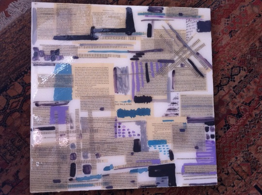
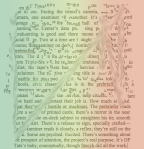
See? I really WAS doing an art project. Here are three (iphone camera) images of the semi finished product of my Pale King resin adventure. As I’ve said in other posts, I was inspired by thinking about processes of reading, especially at the high academic level where there are certain things that one consciously and unconsciously takes into the reading process (different things from everyone else?). I was also inspired by my struggles and productive mishaps with computer software like Pixelmator and GIMP. This is a good link to other versions of Open Source Photoshop-like programs. I generally hesitate to photograph epoxy art, because of the glare and the impossibility of capturing the depth that makes these pieces so interesting in my opinion. This particular work is about ten layers of epoxy, text, and acrylic paint on a wooden panel. Epoxy is a fascinating material, caustic and scientific (well, you wear gloves and have to measure accurately, it FEELS scientific) and fantastic for creating two dimensional art with a lot of thickness and profundity. I should probably mention that it is very expensive (this four foot squared painting used about $150 worth), and also that I happen to get it for free from a wonderful patron who is part of my family. System Three, the epoxy/resin company, also provides epoxy to a very talented artist in Seattle named Alan Fulle.

This project is finished for now, which means it will go on a wall and I will look at it until I get more epoxy and decide to take it down from the wall and keep working on it. This interim period sometimes takes a couple of years, depending on my academic workload. It has been very interesting for me to do a project for school that took so many forms, a true protean adventure that stretched my brain and reinvigorated my attachment and engagement to the book that started it all. Let me know what you think, and if you we know one another (or someone I know knows you) , you can always email me to come see any of my work in person.

Cleaning House

I was procrastinating today, which in this case meant cleaning up and organizing my computer. I thought it might be fun to post some of the many many images created in the course of the quarter. In thumbnail form, it almost looks like a quilt as well! Many of the forms created here have informed my epoxy project, as well.

How this year changed me

Although it’s been less than two weeks since the academic quarter ended, I find myself missing all things school related. That said, I am writing this post from my office on campus, so it’s not like I’ve left. Everyone else has though, that’s for sure. Campus becomes a bit of a ghost town in the summer, and this week is even more quiet because summer classes have yet to start. I most miss the pressure of the quarter system, which allowed/compelled me to write ten blog posts on LuAn within a very short period of time. I guess I just miss the pressure in general. I am currently in an awkward and new position of having nothing but my dissertation to work on for half of a year. I know that I’ve written here before about how tangential our digital endeavors are to my dissertation project, but over the last week I’ve gravitated more and more toward my computer, and not just Word, as I play around with my enormous project. For one, I have decided to create a website/wiki for the project, that will most likely only be open to a small number of colleagues and my committee until the dissertation is finished. I’ve been thinking a lot about sharing information and ideas freely, and I really do want to make as many parts of my work available online as possible. What that will do to/for me once I go on the job market is unclear, but as a young scholar I am still idealistic enough to imagine my thoughts might help someone else and no one will appropriate them in any sort of damaging way. We shall see. Stephen Ramsay’s blog is an excellent example of a site which shares a lot of phenomenal academic work free of charge. I really can’t say enough about how his blog and book have changed my way of thinking this year.

I have also been using presentation and modeling software to try to make sense of some organizational issues I’m having. To summarize in an unsatisfactory way, my dissertation looks at corporate spaces and individual resistances within, through readings of a handful of contemporary novels that engage with theories of power and management. There are some films thrown into the bag, and I am also looking at new media. Organizing the general chapters has been a bear. I initially wanted to write four chapters, each focusing on a main book. I was then encouraged to try to organize according to types of corporate spaces I have found in my research (spaces of boredom, networked spaces, etc), and finally we have come somewhat full circle back to the book by book organization. One of my committee members suggested I think of each chapter as a constellation, an idea I’ve always found very elegant since my readings of Benjamin. Yet, since I’m not writing The Arcades Project, I am struggling with how a constellation becomes a dissertation chapter. Enter Prezi. I am doing some mapping that may in part be a way of putting off the inevitable–writing–but seems to be helping me make sense visually of my thoughts. I thought about posting some of them, but for now I will reserve them for my private site, and will continue to tinker and refine in the hopes that at some point I will be able to share them with you all.

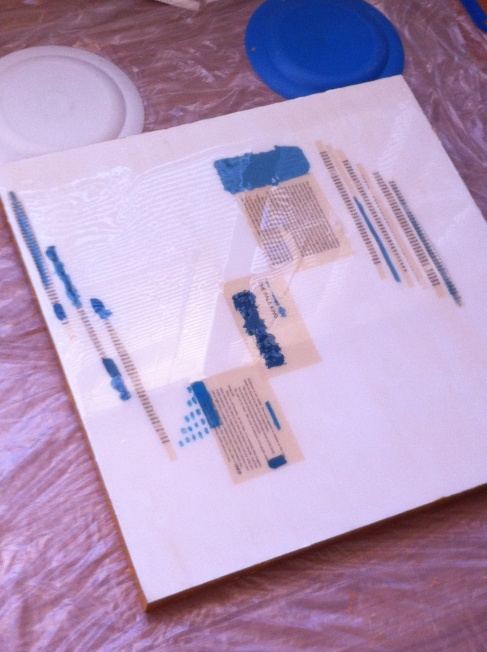
My resin/Pale King manual art project is also coming along, and I thought I might share a picture of one of the first layers of work. What you can see is my plastic drop cloth (epoxy does not attach to plastic, thankfully), the interesting looking discs are actually just plates to prop up the frame because I do not live in a level house, and the first layer of painting/text (acrylic paint, and the text is glued down to the wood with elmer’s). I will perhaps post other pictures showing the progression, I have been considering making an animation of the process as well. Image

Interdisciplinarity and Collaboration

Yesterday was the final meeting of the seminar which encouraged us to create this blog. During the three hours of our meeting, each of the four groups presented their respective projects and we had small amounts of time to ask questions and comment on their work. I was sincerely blown away by a) the amount of work everyone (this group included) had done, and b) the fascinating range of interests and directions the projects demonstrated. It seems necessary to say a few more words about this seminar, especially for those of you who are either not part of the seminar (hopefully more of you will be in this boat as our readership widens) or who have not clicked on the links to Alan’s beautiful home site for the seminar. Unbeknownst to me (before March of 2012), the digital humanities community on UCSB’s campus is a thriving and productive group of fascinating professors and students. Our professor, Alan, is definitely in the foreground of this group, and his carefully designed seminar engages with a good deal of important DH theory, and centers on a collaborative student project that uses digital tools to engage with some type of text, be it a novel, poem, video game, television show, or film. Our project is mostly available on this blog site, but the seminar site which is linked to above also provides a bit more information about us, our reading lists, and our academic interests. This seminar has allowed me to grow and mutate in directions I had never envisioned as a scholar. Deformance, textual analysis, and visualizations were foreign to me (okay, I was actually familiar with McGann and Samuels, but everything else is true) as scholarly and pedagogical tools. I emerge from this seminar with a reawakened energy for scholarship and a long list of blogs and books to read, people to watch, and projects to undertake. I am deeply indebted to Alan for creating this incredible course, and to my fellow graduate students for their fascinating projects and their enthusiasm in general. I would sincerely encourage you all to examine the course page, especially the project pages from the other groups. Amanda, Tom, Mary Jane, Hannah, and Alston have done incredible work that demonstrates the flexibility of the course and the extremely exciting diversity of minds within the various departments represented in our seminar. I am thrilled to have met them and learned about their work.

This is writing itself like a farewell, but in fact I have two other posts in the works that return to essays I read earlier this year, and other posts will follow as my brain spins. Keep reading, because all three of us want to keep sharing our thoughts! And pictures. Below is a link to my final reflections on our course and project, it’s a longer read (eight pages, not too bad) but might be interesting for those of you who are curious about the parameters of the seminar.


Reflection Paper

The Blurry King

I wanted to post my latest image without any kind of narrative, but it’s nearly impossible for me to share something without one or two sentences. So, the text within the image is taken from a number of reviews of The Pale King, found in Times Magazine, The New Yorker, and STL Magazine. There are also excerpts from user reviews from Amazon, and short excerpts from chapter 14 of the novel. Don’t try to read them. Or, read them if you want to. I don’t want to tell you what to do with it.

Artist Analyst

As we get closer to the end of the academic quarter, and thus the end of the grade-motivated production of our dialogue in our wonderfully exciting, structured seminar, I am reading more and more and feeling more and more excited by the anticipated art of this coming summer and how -fun- and -exhilarating- it will be to work through some of my photoshop/pixelmator frustrations and limitations using my hands and paint and epoxy and physical texts. I’m not anti-technology, and this seminar has certainly encouraged me to learn more and do more with my computer, but I can’t wait to be outside with just my hands and some supplies. I am going to spend one more week playing with pixelmator, but am certainly going to spend the next days, months, and years thinking about a number of ideas generated by our blog. One thought in particular that I want to note today was sparked by Liz’s most recent post in which she wrote:

This brings me back to something I had discussed earlier, which is that our data always seems to be more useful for ourselves than for our readers. This may explain why the scholarly article and book have had such a long life; they don’t simply convey understanding, they enact it as well. Close reading recreates, in the article, the process through which we imbue texts with meaning. The act of applying historical research to a volume of literature mimics the act of research and the flash of understanding that comes when one grasps how a specific historical fact is relevant to the text at hand. Articles are processes, they are a temporal movement towards the end of an argument. Visualizations, however, lack that sense of journey. They are always, already, at the end even when you, the reader, are still at the beginning.

Wow. One issue I’ve always had with writing is I can never quote quite enough of the brilliance I see in other people’s work. Luckily, no one is grading my blog (at least, I hope that my writing skills are not under serious scrutiny here as I rarely read over what I publish), so I get to copy Liz’s paragraph in all its glory. The value of a process versus the product has been a concern of mine for the past few months. I have hopped and skipped and (mostly) stumbled through a wide variety of text analysis tools, all kinds of word generators and algorithms that changed my text input into hilarious explosions of letters. As you have seen in my posts, I also spent quite a bit of time in Microsoft Office.  However, there is no single product of this play that to me says that, here, I’ve found something breathtakingly new and spectacularly beautiful/useful for my greater purposes of understanding David Foster Wallace’s last work. That said, I now have an intimacy with chapter 14 of The Pale King that I have with few other texts on the planet. When I think of other works I know as well, I can only come up with a handful: Julio Cortázar’s “El otro cielo,” Sophocles’ Antigone, Harry Potter books 5-7, and André Gide’s L’Immoraliste. What’s interesting about this list, in terms of what Liz wrote above, is that my closeness to this list of highly varied texts is derived from an equally varied list of practices of reading. Harry Potter I’ve read four to five times. That type of intimacy is easily understood, right? I teach Antigone every year to undergraduates. I wrote one of my senior theses in college on Cortázar’s “cielo.” I painted sections of L’Immoraliste in a similar way to the pictures of a painting I posted recently in the entry entitled “l’art pour l’art.” Liz’s statement, that the visualization lacks a sense of journey, really intrigues me. I think she is right, at least about a lot of types of visualizations. Temporally, writing an essay on Wallace demands more time than copying part of his novel into Many Eyes and seeing what types of visuals can be created from it. Additionally, the process, or the parts of the process we do not edit out of the final product, are more transparent. What I want to know, or to think about, is what the difference might be between the journey depicted in an article or conference presentation, and what one can see in a piece of art. As with a visualization like a graph or word cloud, it is difficult to see a process when looking at one of my paintings. I can see the process, of course, as the artist, but it is not immediately visible to an audience. Our relationship to our own work is, necessarily, so different from what anyone else might be able to take away from it. I like that with an essay, it is easier to trace or unpack the levels of research that have gone into constructing an argument. But, I also like that my art can stand alone, and that there are an infinite number of ways for an audience to evaluate, think about, or create from what I’ve done.

Mesostic Madness

Another interesting thing that came of my conversation with Harry Reese was my introduction to the mesostic poem. Reese’s work is influenced by composer John Cage’s invention of the mesostic poem, which is derived from a (series of) word(s) that constitute the spine of the poem, around which a poem is formed. Essentially these poems are like acrostics, except each line does not necessarily begin with the letter that is part of the spine. Someone with more coding experience than I has created an algorithm that generates mesostics: the mesostomatic! Below is my generated text, which I created by typing in The Pale King, leaving the site setting at CNN (which will make sense if you go to the site), stripping punctuation marks, and asking the program to write five iterations of the poem. It came out a little funky, and I left it as is for the purpose of posting here. Go make your own!

 wea Ther
Home
 pag E” cnnsectionname=”cnn
 nbs Pus
 intern Ational
 h Ln
 hom E
 smac Kdown
 lat Ino
Not
Get
 presiden Tial
 c Hild
 brid E
 nbs P
 r Avi
 peop Le
End
Kill
 l Ist
Nbsp
 brid Ge
 mi T
Help
 cofound Er
 mashu P
 f Aa
 emp Loyees
Edwards
Knocks
 s I
New
 blo G
 wa Tson
 appalac Hia
 r Enowned
 flat Picking
And
 fingersty Le
 t Echnique
King
 w Ill
 a Nthony
 cor Gi
 wa Tch
Hillarys
Everest
Pm
 m Ay
 possib Le
Et ac360
King
 l Ine your
 mo Ney state
Gps reliable

l’art pour l’art

As I move toward the part of the experiment/project where I will try to create a visually appealing -something- I am thinking a lot about my manual art. In my spare time when I have enough money for supplies, I make big paintings that use printed text as borders or incorporate the text within the image itself. Unfortunately, I’ve been struggling to photograph the work in a way that makes the text visible or gives a good idea of what the art looks like or what my style is if I have one. These two images are from one 5′ by 7′ painting and they will have to do for now.


These pictures were taken of an unfinished painting that currently hangs in my living room. The text is the Julio Cortázar story  La autopista del sur (Spanish text here, English text isn’t readily available online but some very interesting reading notes are here ). The text winds itself around the cars/buildings/rectangles on the painting and is a visual analysis of the structure and thematic content of the story. I left the painting unfinished (to finish would mean finding another copy of the text, cutting it into lines, and buying some epoxy) but may return to it at some point. Other texts I’ve painted include some Baudelaire poems and Gide’s L’Immoraliste but these paintings are hard to photograph in a way that would show you anything about them.

Revisiting an idea I’ve already mentioned in other posts, I’m fascinated by Ramsay’s discussion of how DHers can blur the lines between art and critical analysis. I would argue, as of 5 PM today, that this painting does just that. However, for our current project, I will begin the critical and artistic process from my laptop. The reason I started thinking about these ideas/questions at 5 pm (about ninety minutes before that, in fact) is a meeting I had with Harry Reese, who shared many invaluable books, ideas, and information about his current projects with me. It was one of those meetings that left me giddy, and extremely grateful for the incredibly talented faculty within my reach at UCSB. We all need to get out and talk to people more! Among the many things we discussed, Harry showed me a very interesting project done by Ann Hamilton. The project is called Stylus, and within the project is a section called Concordances. Here is the introductory link, it’s a beautiful, tricky, labyrinthine site that is worth exploring. Hamilton used newspapers (current during the 2010-2011 run of the exhibit) and within them generated concordances between the text and a given group of words within the text. On the website, users can create their own concordances within her corpus, mine is below using the words ‘abstain,’ ‘journalist,’ and ‘many.’

The “spine” words within the text create an interesting visual that seems to relate to other aspects of her project (duh) in which she explores all kinds of things including sound.

Reese and I also spent a lot of time talking about publishing and the organization of text on the page, as he is a publisher who is working on some incredible projects (including one that uses Calvino’s Invisible Cities as a point of departure and really blew me away). We flipped through some beautiful books (including Edward Tufte’s Visual Explanations, wow this is an amazing book) and Avital Ronell’s Telephone Book. Our conversation helped me distill some of my questions that I want to address in the next phases of my project on DFW’s The Pale King.  Whatever I create will in some ways remain part of the narrative being constructed by this blog. That said, I want to create something that will also be able to stand alone, in the same way that the art on my walls does not explain itself, nor do I stand next to it and explain my process to everyone who walks by (let’s face it, we don’t entertain very often). Within this facet of my project, intentionality is becoming more persistent than it was within my Excel play. As I am more comfortable with a canvas than a spreadsheet, I have more purpose, and I have a solid process that I have evolved over a long period of time. While the initial experiments within the class, which are most likely what will be turned in for the project, are going to be created on the computer using Gimp and Pixelmator, these images will be starting points for large, messy, manual art projects. I will do my best to share them with you when I finish them this summer. For now, here is an image that was initially a Word document screenshot of a descriptive passage of The Pale King. It became something else within Pixelmator. I will only say that it is an image of the information that any informed DFW reader enters the text knowing, combined with the text, combined with important literal “background” information, superimposed critical opinions, and some color for good measure. While this type of process would involve lots of layers of epoxy in a real project, here the layers are simply different files piled on top of one another. It’s a start.


Can you see me?

DFW Pale King Excel Sheets

This link will allow you to download my spreadsheets, I think, so check it out! Please comment if you have any other ideas about how to mess around with Excel that might be interesting for the project.

Excel-lent

Sorry about my title. I’ve been playing with Excel a lot this week, most significantly because my Text Art aspirations hit some major walls in terms of time and knowledge constraints. However, amazingly, my Excel products are not only USEFUL, but seem to be as visually EXCITING (okay, ALMOST) as the text art I was imagining I might create. And it was all an accident. The only lingering frustration is that the final product of my Excel work this week is going to be difficult to share online. I will talk about it now, show my exciting product at the research slam on Friday, and work on figuring out ways to add it to this sight in something other than screen shot form. Let me tell you about my process.

If you are a good reader of the blog, you already know that I initiated my exploration of Excel because it seems like the “useful” tool par excellence, and I envisioned being able to do interesting things with spreadsheets because I’ve used them before in very different contexts, like real jobs and such. However, any potential interesting experiments or visualizations had to wait for me to copy and paste the chapter of The Pale King, sentence by sentence, into a spreadsheet. I found the slow, meticulous, brainless work very enjoyable and it proved to be a much needed break from my extreme workload that should abate by the end of this week. Fast forward some hours, and the Excel sheet was ready to go. And then, I pushed the dollar sign button, because it was the first button that amused me, and immediately broke my spreadsheet. I have since learned that it is in fact possible to recover a spreadsheet even if it has not been saved, but I didn’t know this last week. So, copy and paste and repeat. This next time, after maniacally saving the spreadsheet three or seven times, I began to push other buttons on the top panel of the program. As most spreadsheets contain data that is numerical, using the same functions on a text spreadsheet either transformed most of the text into illegible symbols, or deleted large parts of what I had entered in the rows. That said, I tried out all of the functions, tried unsuccessfully to have Excel create any graphs for me, and then stopped.

I have to admit here that I came into the Excel experiment with some theories, and a certain motivation as well. I admit this because what I have described up to this point was play. Fun play, certainly, but I wanted to move toward an idea suggested to me by Claire earlier this quarter. Because The Pale King is an unfinished work, whose organization into what was published was implemented by an editor, I was initially very interested in making a larger network visualization of the different components of the text and proposing other forms of organization. That said, for the purpose of the current project, I felt compelled to limit myself to one chapter of the novel, and it turned out to be a chapter that encourages a similar investigation of order and organization. Within this chapter, there are transcriptions of a number of unnamed characters being interviewed by the IRS, in which each character is identified only by social security number. I decided that looking at the lengths of the sentences might be a way to examine the differences in speech pattern in the separate interviews. The first spreadsheet of the text, organized in chronological order (taken directly from the novel) already demonstrates speech patterns within the interviews and makes the different characters more visually distinguishable than they are within the text. The first deformance of the text I performed was to rearrange the text alphabetically. This was not difficult, since there are buttons in Excel that alphabetize automatically. More interesting visually and technically was the next experiment. I wanted to organize the spreadsheet according to how many characters were in each line, which meant searching the internet for formulas to throw into the graph. I assume this part would have taken anyone truly proficient in Excel less than five minutes. I won’t tell you how long it took me to write a correct formula, but it was longer than five minutes. The searching was worth it, however, when the spreadsheet was transformed into a shape that was very exciting on a large screen. I headed to a print shop (two, actually) to create tangible visualizations of these spreadsheets. With these printouts, I’ve created visuals for Friday’s slam, and I will do my best to figure out a way to share them with you as well. This may be material for another post, but what I am most interested in doing with these visuals at the slam is raising questions like:

-Can these visualizations stand alone? Do they always need a narrative to explain them to others?

-Aside from the speech pattern visualization described above, how else are these visuals interesting, helpful, attractive?

-How do these visualizations interact with our questions about usefulness, and beauty? (I find these visuals to be very exciting to look at, I could see blowing them up and putting them on a wall, even!)

In any event, my next move is to figure out Photoshop. Ha! We will see if it can help me advance with my word art plans.