Playful Visualizations at Work, Working Visualizations at Play

Archive for May, 2012

What Are We Doing With Our Visualizations?

A colleague of mine pointed me towards the following post about Shock and Awe Graphs in the Digital Humanities. The author, Adam Crymble, makes some decidedly thought-provoking points about what graphs are meant to be doing and how data visualization can sometimes work as a tool of intimidation as well as elucidation.

So before you publish a visualization, please take a moment and step back. As in the cult classic, Office Space, ask yourself: Is this Good for the Company?

Is this Good for Scholarship?

Or am I just trying to overwhelm my reviewers and my audience?

The authors of the blog Clioviz respond to Crymble’s question with a post In Praise of Shock and Awe, which also (and unsurprisingly) has some very good points to make about the value of disseminating information via visualization. They note that a certain amount of “shock and awe” in inevitable in fields like ours where the mere existence of plotted data points is enough to give some scholars palpitations. The main thrust of their argument, however, is that complex, beautiful and awe-inspiring graphs are not inherently a bad thing when they are usable. If a graph is complex to the point of unreadability, that is usually because the graph-er was attempting a kind of elegant complexity and failed. (This, of course, returns us to one of the basic problems of DH: we’re doing things we were never trained to do and the success of being able to do them at all blinds us to the necessity of doing them well.)

Both pieces make certain assumptions that I think we, as the Ludic Analytics group, are not willing to make. The first is that visualizations exist to convey information to the reader and the second that visualizations must have some immediately identifiable utility. The visualization presented at the beginning of Crymble’s piece is meant as a joke, but because a) he doesn’t provide any more serious examples and b) the point I’m trying to make works just as well, I am going to pretend it is real and assume that if I can answer his reductio ad absurdum with logic, then said logic can surely be applied to more reasonable work. Like others of its ilk, this image a piece of art I would frame and hang on my wall rather than a readable graph. It offers very little in the way of interpretation to the untrained viewer and is, as Crymble says with his tongue firmly in his cheek, about 18th century cattle’s preference for south facing barns. Crymble is frustrated when asked to view graphs like this as proof. However, were there no image whatsoever–had he merely read a paper that claimed to have looked at the data and found that cattle preferred south-facing barns–I would imagine he would have had less trouble with the assertion. This visualization exists because it can, not because it makes any particular point. It is there to be beautiful. And were it real, it would also show that the researchers engaged with the data to the extent necessary to produce such a graph. It would not be proof of point, but proof of process. And I would imagine that the task of creating such a visualization and dealing with the information would give the researchers a better understanding of their data, even if the visualization lacks a trickle-down effect of understanding to the reader.

This brings me back to something I had discussed earlier, which is that our data always seems to be more useful for ourselves than for our readers. This may explain why the scholarly article and book have had such a long life; they don’t simply convey understanding, they enact it as well. Close reading recreates, in the article, the process through which we imbue texts with meaning. The act of applying historical research to a volume of literature mimics the act of research and the flash of understanding that comes when one grasps how a specific historical fact is relevant to the text at hand. Articles are processes, they are a temporal movement towards the end of an argument. Visualizations, however, lack that sense of journey. They are always, already, at the end even when you, the reader, are still at the beginning.

I can think of several possible solutions to this problem. One is to accompany visualizations with detailed descriptions of their genesis (Stephen Ramsay does this to good effect in his article “In Praise of Pattern”). Another is to create dynamic visualizations that can operate on a temporal as well as spatial scale. For example, imagine a social network graph where you can watch the edges build up between the different nodes while the nodes move around to create different groupings as the networks grow over the course of a novel. You could even have edges fade slightly if a connection has not been mentioned for over ten chapters, for example. As might be evident, I find this idea truly exciting and would love to imagine a novel performed as a network graph. A third option would be to use the visualization not as proof of theory, but as a starting point for the reader to form her own conclusions about the topic. The visualization becomes a way to share data rather than results and the reader is invited to tell her own story with it (I am drawing this idea from N. Katherine Hayles’s new book, How We Think). The data, and database, are an interface where textual exploration can happen rather than a static image of exploration someone else has already done.

These last two solutions require a somewhat radical rethinking of data presentation. Putting the visualization in as “(fig. 3)” on page 6 of the printed article is no longer going to cut it. Articles are very good at what they do, which is provide a forum in which to recreate traditional practice so that the reader can experience it along with the author. If we want our readers to experience our non-traditional readings along with us, we’re going to need non-traditional modes of delivery to do it.

Mesostic Madness

Another interesting thing that came of my conversation with Harry Reese was my introduction to the mesostic poem. Reese’s work is influenced by composer John Cage’s invention of the mesostic poem, which is derived from a (series of) word(s) that constitute the spine of the poem, around which a poem is formed. Essentially these poems are like acrostics, except each line does not necessarily begin with the letter that is part of the spine. Someone with more coding experience than I has created an algorithm that generates mesostics: the mesostomatic! Below is my generated text, which I created by typing in The Pale King, leaving the site setting at CNN (which will make sense if you go to the site), stripping punctuation marks, and asking the program to write five iterations of the poem. It came out a little funky, and I left it as is for the purpose of posting here. Go make your own!

 wea Ther
Home
 pag E” cnnsectionname=”cnn
 nbs Pus
 intern Ational
 h Ln
 hom E
 smac Kdown
 lat Ino
Not
Get
 presiden Tial
 c Hild
 brid E
 nbs P
 r Avi
 peop Le
End
Kill
 l Ist
Nbsp
 brid Ge
 mi T
Help
 cofound Er
 mashu P
 f Aa
 emp Loyees
Edwards
Knocks
 s I
New
 blo G
 wa Tson
 appalac Hia
 r Enowned
 flat Picking
And
 fingersty Le
 t Echnique
King
 w Ill
 a Nthony
 cor Gi
 wa Tch
Hillarys
Everest
Pm
 m Ay
 possib Le
Et ac360
King
 l Ine your
 mo Ney state
Gps reliable

l’art pour l’art

As I move toward the part of the experiment/project where I will try to create a visually appealing -something- I am thinking a lot about my manual art. In my spare time when I have enough money for supplies, I make big paintings that use printed text as borders or incorporate the text within the image itself. Unfortunately, I’ve been struggling to photograph the work in a way that makes the text visible or gives a good idea of what the art looks like or what my style is if I have one. These two images are from one 5′ by 7′ painting and they will have to do for now.


These pictures were taken of an unfinished painting that currently hangs in my living room. The text is the Julio Cortázar story  La autopista del sur (Spanish text here, English text isn’t readily available online but some very interesting reading notes are here ). The text winds itself around the cars/buildings/rectangles on the painting and is a visual analysis of the structure and thematic content of the story. I left the painting unfinished (to finish would mean finding another copy of the text, cutting it into lines, and buying some epoxy) but may return to it at some point. Other texts I’ve painted include some Baudelaire poems and Gide’s L’Immoraliste but these paintings are hard to photograph in a way that would show you anything about them.

Revisiting an idea I’ve already mentioned in other posts, I’m fascinated by Ramsay’s discussion of how DHers can blur the lines between art and critical analysis. I would argue, as of 5 PM today, that this painting does just that. However, for our current project, I will begin the critical and artistic process from my laptop. The reason I started thinking about these ideas/questions at 5 pm (about ninety minutes before that, in fact) is a meeting I had with Harry Reese, who shared many invaluable books, ideas, and information about his current projects with me. It was one of those meetings that left me giddy, and extremely grateful for the incredibly talented faculty within my reach at UCSB. We all need to get out and talk to people more! Among the many things we discussed, Harry showed me a very interesting project done by Ann Hamilton. The project is called Stylus, and within the project is a section called Concordances. Here is the introductory link, it’s a beautiful, tricky, labyrinthine site that is worth exploring. Hamilton used newspapers (current during the 2010-2011 run of the exhibit) and within them generated concordances between the text and a given group of words within the text. On the website, users can create their own concordances within her corpus, mine is below using the words ‘abstain,’ ‘journalist,’ and ‘many.’

The “spine” words within the text create an interesting visual that seems to relate to other aspects of her project (duh) in which she explores all kinds of things including sound.

Reese and I also spent a lot of time talking about publishing and the organization of text on the page, as he is a publisher who is working on some incredible projects (including one that uses Calvino’s Invisible Cities as a point of departure and really blew me away). We flipped through some beautiful books (including Edward Tufte’s Visual Explanations, wow this is an amazing book) and Avital Ronell’s Telephone Book. Our conversation helped me distill some of my questions that I want to address in the next phases of my project on DFW’s The Pale King.  Whatever I create will in some ways remain part of the narrative being constructed by this blog. That said, I want to create something that will also be able to stand alone, in the same way that the art on my walls does not explain itself, nor do I stand next to it and explain my process to everyone who walks by (let’s face it, we don’t entertain very often). Within this facet of my project, intentionality is becoming more persistent than it was within my Excel play. As I am more comfortable with a canvas than a spreadsheet, I have more purpose, and I have a solid process that I have evolved over a long period of time. While the initial experiments within the class, which are most likely what will be turned in for the project, are going to be created on the computer using Gimp and Pixelmator, these images will be starting points for large, messy, manual art projects. I will do my best to share them with you when I finish them this summer. For now, here is an image that was initially a Word document screenshot of a descriptive passage of The Pale King. It became something else within Pixelmator. I will only say that it is an image of the information that any informed DFW reader enters the text knowing, combined with the text, combined with important literal “background” information, superimposed critical opinions, and some color for good measure. While this type of process would involve lots of layers of epoxy in a real project, here the layers are simply different files piled on top of one another. It’s a start.


Research Slam: a review

I’d have to say, that from my (new) experience, the best way to enter a three-day weekend is by a casual yet intellectual exchange of ideas and projects.  The Research Slam, organized by the Transcriptions center here at UCSB, proved to be a successful event where I got to see what many of my peers are up to and was able to discuss and answer questions about my own work.  I had never been to this type of (un)conference before, and I liked the atmosphere.  Instead of scheduled presentations and different themes, the style was more “open house” and less “I’m going to read from a paper I just wrote while everyone sits quietly and listens.”  In fact, there wasn’t much “quiet” about this event, and I found that all of the discussing and sharing of ideas, made the Research Slam come alive.

Amanda Phillips, who is a 5 year veteran of the Slam, have given a much more detailed review of the event, so I’ll link you here:

Amanda’s Review

A few of our other classmates were able to come and participate, and I enjoyed hearing more about their projects for our Lit + class and other areas of interests on which they are working.  In particular, I’d like to give “blame” to one classmate for causing my strange dreams about cat/squirrel hybrids (you know who you are).

If you haven’t yet visited the class project page, there are many diverse and interesting research topics, check them out!:

“Literature +” project pages

Here’s a picture of me with my “glitter-free poster” (in the end, I decided maybe glitter was too much, however, I’m sure it would have jazzed it up a bit):


Overall, it was a great experience, and I look forward participating next year, and encourage others to do the same.  If you have any specific questions about the event, leave them in the comment box, and I will try my best to either a) answer b) direct you in the right direction.


And now, back to the third day of the three day weekend 🙂


Seeing and Doing

Before I begin, I’m going to apologize. I will not be present at the Research Slam and so I don’t get a chance to play with glitter. Or communicate my work on one large sheet of paper in a way that balances both an overall view of my research along with enough details to make it comprehensible and interesting.

Claire, Meaghan, further thoughts about poster-ing as a form of visualization that might help us for presentations later on?

I will, however, try to put together a presentation-esque page on this site for all those interested in what my work is. A virtual poster, if you will.

In the meantime, I’m going to talk about the act of making a visualization less useful. I realize this is not what we think of ourselves as doing, but the work I have been doing in Many Eyes has been leading me in this direction.

As you may have noticed, I’m the one a bit hung up on “but what will I use this for?” Despite trying to let go of this obsession, I still think of my visualizations in terms of use-value. And while the mere act of seeing anew that is at the heart of visualization always possesses this mix of dulce et utile, the balance between the two seems to shift depending on where I am in the process of creating multiple iterations of visualizations. Or, to put it another way, the further I push the visualizations associated with a given topic, the more I insight I gain into the text from the process even as my readers gain less insight from the final product than they would have from the original.

I’ll provide an example, and nicely circumvent the aforementioned problem by making you, O readers, a part of the process.

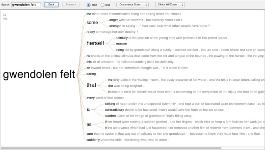
I began with one of the Word Tree visualizations in Many Eyes.

As before, feel free to click on the caption and play with the Visualization in Many Eyes. You can type anything you want into the search box and the word tree will move to show you all the sentences in the text that have that phrase and how they “branch” off. This dynamic visualization is eminently useful as a way to think about characters and get a quick glance at the different traits associated with them. I chose Gwendolen because the impression I got of the novel while reading it was that her feelings were the most interesting. And here they are.

Now I wanted to explore what exactly it was that Gwendolen felt. To do that, I returned to the one form of text analysis with which I think we’re all familiar; the “Find” function in Microsoft Word. I took all the sentences in the text where either “Gwendolen felt” or “She felt” in relation to Gwendolen appeared. I then sorted them into those sentences that used “felt” to refer to emotions or those that used it differently, such as referring to actual contact between two people. Then I color-coded each sentence based on whether the emotions were positive, negative or neutral/unclear.

The Good:

Gwendolen felt ready to manage her own destiny? Gwendolen felt daring. Gwendolen felt some strength.  She felt well equipped for the mastery of life. She felt quite sure of herself. She felt assured that she could act well. She felt satisfied with her prospects at Offendene. She felt kindly toward everybody and was satisfied with the universe. She felt as if she were reinforcing herself by speaking with this decisiveness to her uncle. She felt prepared to hear everything. She felt equal to arguing with him about her going on the stage. She felt able to maintain a dogged calm in the face of any humiliation that might be proposed. She felt an equal right to the Promethean tone. She felt at this moment that it was not likely she could ever have loved another man better than this one. She felt the more assured that her expectations of what was coming were right. 

The Bad:

Gwendolen felt the bitter tears of mortification rising and rolling down her cheeks. Gwendolen felt some anger with her mamma, but carefully concealed it. Gwendolen felt herself painfully in the position of the young lady who professed to like potted sprats. Gwendolen felt that the dirty paint in the waiting – room, the dusty decanter of flat water, and the texts in large letters calling on her to repent and be converted, were part of the dreary prospect opened by her family troubles; and she hurried away to the outer door looking toward the lane and fields. Gwendolen felt every word of that speech. Gwendolen felt that she was being weighed. Gwendolen felt a sinking of heart under this unexpected solemnity. Gwendolen felt a sudden alarm at the image of Grandcourt finally riding away. Gwendolen felt herself stricken. Gwendolen felt suddenly uncomfortable, wondering what was to come. She felt passionately averse to this volunteered love. She felt anew current of fear passing through her. She felt herself very far away from taking the resolve that would enforce acceptance. She felt shaken into a more alert attention, as if by a call to drill that everybody else was obeying. She felt a sort of numbness and could set about nothing. She felt a retrospective disgust for them. She felt compelled to silence. She felt her heart beating with a vague fear. She felt herself in an attitude of apology. She felt bashful about walking up to him and letting him know that she was there,.  She felt a peculiar anxiety to-day. She felt sick with irritation. She felt a little dispirited. She felt them to be insulting. She felt like a shaken child – shaken out of its wailing into awe. She felt some tingling bashfulness at the remembrance of her behavior towards him. She felt a rising rage against him mingling with her shame for herself. What she felt beside was a dull despairing sense. She felt her habitual stifling consciousness of having an immovable obstruction in her life. She felt herself reduced to a mere speck. She felt a peculiar vexation that her helpless fear had shown itself, not, as usual, in solitude, but in well-lit company. 

The Neutral:

Gwendolen felt this lot of unhoped-for fullness rounding itself too definitely. Gwendolen felt an inward shock. Gwendolen felt a contradictory desire to be hastened. Gwendolen felt as if her heart were making a sudden gambol. She felt quietly, unargumentatively sure. She felt something very far from indifference as to the impression she would make on him. Was it triumph she felt most or terror?

You can see several interesting things from these phrases. One is that Gwendolen is not a happy person. Two is that she is most definitely the “Spoiled Child” Eliot names her. The act of going through the text and pulling out these quotes one by one was fascinating. The process didn’t provide a whole new view of Gwendolen’s character, but it did create a portrait of her that seemed come to life differently than the one that appears over the course of the novel. It’s a slightly altered picture of both her vulnerabilities and her determination, especially as it takes no notice of any changes in her over the course of the novel. Though you might not get the same sense of her as you would if you read the book; this is more like a character sketch. They say a picture is worth a thousand words.

I was trying to figure out how to present this data other than using the link to the Many Eyes tree above and was inspired by Meaghan’s post with the images and texts. I couldn’t do that, but I wanted to try something similar.

For any of you suffering under the mistaken impression that I can freehand this, I should mention that I traced over the actress Romola Garai’s silhouette. As she played Gwendolen in the BBC miniseries adapted from Daniel Deronda, it seemed appropriate. (All work was done in Adobe Photoshop CS5.1, which I do not own, but which the Transcriptions lab at UCSB does.)

I think I will call this my ludic interpretation. Next to the Many Eyes Word Tree, it seems rather less informative, yet having gone through the process of visualizing it, I feel as though I have learned more than I would have simply by looking at the word tree.

As a personal project and a way to learn about a text and formulate views of characters, this was a great exercise. But how do I make it useful for anyone other than myself? I benefited from the process; the end result is interesting, but the true value lies in enacting. So how can we make visualizations that are as useful to our viewers as they are to us?

Can you see me?

DFW Pale King Excel Sheets

This link will allow you to download my spreadsheets, I think, so check it out! Please comment if you have any other ideas about how to mess around with Excel that might be interesting for the project.

the poster post.

I like school.  I’ve always liked school (which explains, incidentally, why I’m still in school).  Recently, I’ve had the opportunity to work on a poster, which immediately has taken me back to third grade book reports.  Ok, so, granted, my poster will not look like my third grade report on The Giver, (though Mrs. Burns, my 3rd grade teacher, did give me an A and a gold star), but it brings back the joy that is found in combining all of your research and presenting it in an aesthetic manner (which plays into our pretty/useful dichotomy).  It’s a chance to talk about all the things you find interesting and to exhibit your results of study.  ForThe Giver  I had a crayon drawing in the center in black and white with a red apple in the middle.  Surrounding the apple, I put quotes I found important that fell under one theme or another.  I think I also used glitter.  Third-grade Claire liked glitter.  I’m sure this poster is still in my parent’s basement.  This year’s poster, a mere 20 years later, will have less crayon and glitter (sadly); but plenty of visualizations.  I have included the color deformance of the novel, a few word trees (from Many Eyes), and a cool Phrase Net (also from Many Eyes, that I have yet to post on this site).  The poster is not done yet, I have two pending visualizations: 1) a timeline (I plan to post it once I finish it) and 2) a network graph that will be my “useful” visualization (more on this to come!)

Poster sessions are fairly new (to my knowledge) in the humanities.  I know many of my engineering friends frequent them at national and international conferences, and each time they talk about their posters, I still can’t get the glittered and construction papered images of my previous posters out of my head, despite the fact that their posters might be a bit more complex than those my 9 year-old self designed.  I see the introduction of poster sessions to many humanities conferences as a positive movement.   It creates an opportunity for more students to present and supports a more comfortable environment for communication and discourse.  It could be just my own work, but I feel there has been a shift towards a visual culture.  Because of this, the visualizations are not just ludic devices, but necessary for current study.


My poster is for the research slam (that Meaghan just posted about).  It is this Friday.  If you’re in the area, come see us!


(I make no promises about whether or not my poster will have glitter.  Some habits die hard.)

Excel-lent

Sorry about my title. I’ve been playing with Excel a lot this week, most significantly because my Text Art aspirations hit some major walls in terms of time and knowledge constraints. However, amazingly, my Excel products are not only USEFUL, but seem to be as visually EXCITING (okay, ALMOST) as the text art I was imagining I might create. And it was all an accident. The only lingering frustration is that the final product of my Excel work this week is going to be difficult to share online. I will talk about it now, show my exciting product at the research slam on Friday, and work on figuring out ways to add it to this sight in something other than screen shot form. Let me tell you about my process.

If you are a good reader of the blog, you already know that I initiated my exploration of Excel because it seems like the “useful” tool par excellence, and I envisioned being able to do interesting things with spreadsheets because I’ve used them before in very different contexts, like real jobs and such. However, any potential interesting experiments or visualizations had to wait for me to copy and paste the chapter of The Pale King, sentence by sentence, into a spreadsheet. I found the slow, meticulous, brainless work very enjoyable and it proved to be a much needed break from my extreme workload that should abate by the end of this week. Fast forward some hours, and the Excel sheet was ready to go. And then, I pushed the dollar sign button, because it was the first button that amused me, and immediately broke my spreadsheet. I have since learned that it is in fact possible to recover a spreadsheet even if it has not been saved, but I didn’t know this last week. So, copy and paste and repeat. This next time, after maniacally saving the spreadsheet three or seven times, I began to push other buttons on the top panel of the program. As most spreadsheets contain data that is numerical, using the same functions on a text spreadsheet either transformed most of the text into illegible symbols, or deleted large parts of what I had entered in the rows. That said, I tried out all of the functions, tried unsuccessfully to have Excel create any graphs for me, and then stopped.

I have to admit here that I came into the Excel experiment with some theories, and a certain motivation as well. I admit this because what I have described up to this point was play. Fun play, certainly, but I wanted to move toward an idea suggested to me by Claire earlier this quarter. Because The Pale King is an unfinished work, whose organization into what was published was implemented by an editor, I was initially very interested in making a larger network visualization of the different components of the text and proposing other forms of organization. That said, for the purpose of the current project, I felt compelled to limit myself to one chapter of the novel, and it turned out to be a chapter that encourages a similar investigation of order and organization. Within this chapter, there are transcriptions of a number of unnamed characters being interviewed by the IRS, in which each character is identified only by social security number. I decided that looking at the lengths of the sentences might be a way to examine the differences in speech pattern in the separate interviews. The first spreadsheet of the text, organized in chronological order (taken directly from the novel) already demonstrates speech patterns within the interviews and makes the different characters more visually distinguishable than they are within the text. The first deformance of the text I performed was to rearrange the text alphabetically. This was not difficult, since there are buttons in Excel that alphabetize automatically. More interesting visually and technically was the next experiment. I wanted to organize the spreadsheet according to how many characters were in each line, which meant searching the internet for formulas to throw into the graph. I assume this part would have taken anyone truly proficient in Excel less than five minutes. I won’t tell you how long it took me to write a correct formula, but it was longer than five minutes. The searching was worth it, however, when the spreadsheet was transformed into a shape that was very exciting on a large screen. I headed to a print shop (two, actually) to create tangible visualizations of these spreadsheets. With these printouts, I’ve created visuals for Friday’s slam, and I will do my best to figure out a way to share them with you as well. This may be material for another post, but what I am most interested in doing with these visuals at the slam is raising questions like:

-Can these visualizations stand alone? Do they always need a narrative to explain them to others?

-Aside from the speech pattern visualization described above, how else are these visuals interesting, helpful, attractive?

-How do these visualizations interact with our questions about usefulness, and beauty? (I find these visuals to be very exciting to look at, I could see blowing them up and putting them on a wall, even!)

In any event, my next move is to figure out Photoshop. Ha! We will see if it can help me advance with my word art plans.

Animation and Information

So I have found myself increasing drawn to the idea of these phrase nets. There’s something about the way they ask me to engage with the text on a decontextualized level that I love. Certain specific words make me wonder about how they are being used in the text and I try to remember when they might be deployed, but others just distract me and intrigue me.

Like the networks of body parts here. Perhaps if I animate it… (click image for animation)

Animated Phrase Net

I suppose my question here is “What is the difference between the animated version and the earlier ones?” Is there something more compelling about a dynamic visualization? On the simplest level, I find myself spending more time staring at things that move, but does that make this a “better” visualization if I don’t even know what I’m trying to convey with it? Then again, the reason I don’t know what it means is because I haven’t returned to the text yet to think about it. If visualizations are a tool for analysis as well as a form of…art, I suppose (My artistic skills leave what to be desired, but art nonetheless), then I need to think about their implications. Or perhaps I don’t. Perhaps my next read-through of Daniel Deronda will be more illuminating even if I’m not directly thinking about this network. Perhaps someone else will see a connection. Or perhaps this gif will just reman here, fading slowly into color.

Questions of usefulness bring me to my second point, which is an article I saw that I felt resonated with something Meaghan had brought up before. There are several people in the field of Digital Humanities, Stephen Ramsay comes to mind immediately, who are insisting that you cannot be a digital humanist if you do not know how to code. (Full disclosure–I can handle basic html and have once or twice actually uttered the phrase “Stand back, I know regular expressions“.) But aside from the fact that this more or less relegates people working with Facebook and Twitter and doing really interesting things with technology in the classroom to something else (and maybe they should have a different title, but they seem to be part of the club these days), I am bothered by this assertion and have spent some time trying to work out why…other than the fact that I find marginalization disturbing especially when aimed at me. Then a friend of mine posted the following article to his Facebook page and I got it.

Please Don’t Learn to Code

The author makes several good points, chief among them is that we don’t need any more (bad) code in the world and, I have to be honest, most of the software I’ve seen produced by those in the humanities has been just that. We don’t need “good enough” coding, we need excellent coding done by professionals who are willing to share and maintain and update their software so that we, as scholars, can have equally excellent results. Which is not to say that Digital Humanists shouldn’t know a bit about code or shouldn’t decide to make it their “skill” and become just as good as a professional. I have met amateurs in almost every field who can beat the pants off the professionals, but still only do what they do as a hobby. And if you’re that good, please go for it! But here’s my plea. If you’re just going to learn enough to hack something together to get you through a project, a clunky thing that needs you to coax it along and that can’t really be used with any reliability by your colleagues, then perhaps you should think about whether the discipline as a whole will benefit more from your code or from you teaming up with someone who really knows what they’re doing.

Beautiful.

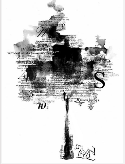
Liz’s post, especially the Craig Zeta text graphs, really intrigued me. I am moving toward thinking about ways to make the text into art, on the one side of my project, and found some examples of what I would want to do in an ideal world where I have way more technical knowledge than I do in this world. 

These two images, taken from DESIGN M.A.G., are clearly too far out of my league, but have gotten me to thinking what types of images I might create from the text I am currently using. I am looking further into this idea this weekend, so we will see whether or not I can actually make anything like this.