Sefaria in Gephi: Seeing Links in Jewish Literature
How do you visualize 87,000 links between Jewish texts?
The answer, at least when one is working on an ordinary iMac, is very slowly.
The better–by which I mean more accurate and productive–question is: How do you meaningfully visualize the relationships between over 100,000 individual sections of Jewish literature as encoded into Sefaria, a Living Library of Jewish Texts?
The key term for me is meaningfully – working at this scale means I have to get out of my network comfort zone and move from thinking about the individual nodes and their ego networks towards a holistic appreciation of the network as a structural entity. I’m not able to do that quite yet, at least not in this post. This is the first post in a series of explorations – what kinds of graphs can I make with this information and what information can I get from it (or read into it)?
This project and, perforce, this series is another side of the research questions that I’m currently grappling with – how do the formal attributes of digital adaptations affect the positions we take towards texts? And how do they reorganize the way we perceive, think about and feel for/with/about texts?
Because this is Ludic Analytics, the space where my motto seems to be “graph first, ask questions later,” it seemed an ideal place to speculate about what massive visualizations can do for me.
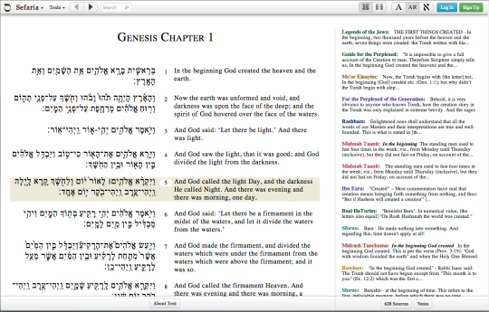
Let’s begin with a brief overview of Sefaria. Sefaria is a comparatively new website (launched in 2013) that aims to collect all the currently out-of-copyright Jewish texts and not only provide access to them through a deceptively simple interface, but also crowd-source the translations for each text and the links between them. For example, the first verse of Genesis (which we will return to later) is quoted in the Talmud (one link for every page that quotes it), has numerous commentaries written about it (another link for every commentary), is occasionally referenced in the legal codes and so on. Here’s a screenshot of the verse in Sefaria.
You can see, along the sides, all the different texts that reference this one and, of course, if you visit the website, you can click through them and follow a networked thread of commentaries like a narrative. Or like a series of TVTropes articles.
Sefaria did not invent the hyperlinked page of Rabbinic text. Printed versions of the Bible and the Babylonian Talmud and just about every other text here–dating all the way back to the early incunabula–use certain print conventions to indicate links between texts and commentaries, quotations and their sources. The Talmud developed the most intricate page by far, but the use of printing conventions such as font, layout and formal organization to show the reader which texts are connected to which and how is visible in just about every text here.
What Sefaria does (along with any number of other intriguing things that are not the topic of this post) is turns print links into hyperlinks and provides a webpage (rather than a print page) that showcases the interconnectedness of the literature. Each webpage is a map of every other text in Sefaria that connects to the section in question, provided that someone got around to including that connection. Thus we see both the beauty and the peril of crowdsourcing.
So the 87,000 links to over 100,000 nodes that I was given (thank you @SefariaProject!) are not exactly a reflection of over 2,000 years of Jewish literature as such, but a reflection of how far Sefaria has come in crowdsourcing a giant digital database of those 2,000 years and how they relate to one another. That caveat is important and it constrains any giant, sweeping conclusions about this corpus (not that I, as a responsible investigator, should be making giant sweeping conclusions after spending all of two weeks Gephi-wrangling). Having said that, the visualizations are not only a reflection of Sefaria’s growth, but also a way to reflect on the process of building this kind of crowd-sourced knowledge.
But before subsequent posts that analyze and reflect and question can be written, this post in all its multicolored glory must be completed.
To return to my very first question, how do you visualize 87,000 links?
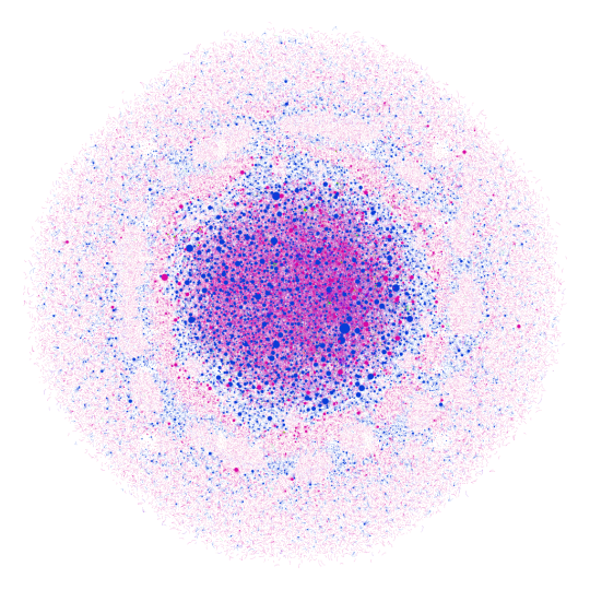
Like this:
This is Sefaria. Or a cell under a microscope. It’s hard to tell. Here’s the real information you need. This graph was made using the Gephi plugin for OpenOrd graphing, a force directed layout optimized for large datasets.* The colors signify the type of text. Here’s the breakdown.
Blue – Biblical texts and commentaries on them (with the exception of Rashi). Each node is a verse or the commentary by one author on that verse.
Green – Rashi’s commentaries. Each node is a single comment on a section
Pink – The Gemara. Each node is a single section of a page.
(Note – these first 3 make up 87% of the nodes in this graph. Rashi actually has the highest number of nodes, but none of them have very many connections)
Red – Codes of Law. Each node is a single sub-section.
Purple – The Mishnah. Each node is a single Mishnah.
Orange – Other (Mysticism, Mussar, etc.)
The graph, at least as far as we can see in this image, is made up almost entirely of blue and pink nodes and edges. So the majority of connections that Sefaria has recorded occur between Biblical verses and the commentaries, the Gemara and Biblical references and the Gemara referencing itself.
Size corresponds to degree – the more connections a single node has, the larger it is. The largest blue node is the first verse of Genesis.
On the one hand, there is an incredible amount of information embedded in this graph. On the other hand, it’s almost impossible to read. There are some interesting things going on with the patterns of blue nodes clustering around pink nodes (the biblical quotations and their commentaries circling around the pages of the Gemara that reference them, perhaps?), but there are so many nodes that it’s hard to tell.
There’s also a ton of information not encoded into the graph. Proximity is the biggest one. There is absolutely nothing linking the first and second verses of Genesis, for example. Arguably, linear texts should connect sequentially and yet the data set I used does not encode that information. So this data set conveys exclusively links across books without acknowledging the order of sections within a given book.
But, as I told my students this quarter, the purpose of a model is not to convey all the information encoded in the original, but to convey a subset that makes the original easier to manage. This model, then, is not a model of proximity, It is purely a model of reference. Let’s see what happens when we look at it another way.
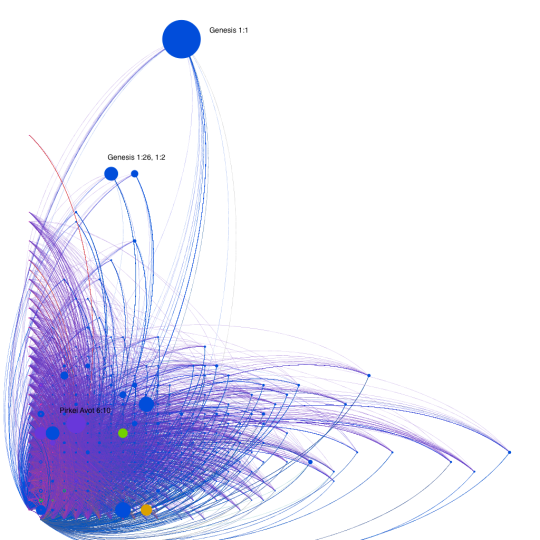
Gephi does not come with a spatial layout function, but there are user-created plugins to do this kind of work. This is the same dataset as above, except arranged on a Cartesian plane with the X axis corresponding to In Degree (how many nodes have that node as a target for their interactions) and the Y axis corresponding to Out Degree (how many nodes have that node as a source for their interactions).** The size corresponds to a node’s Betweenness Centrality – if I were to try and reach several different nodes by traveling along the edges, the bigger nodes are the nodes I am more likely to pass through to get from one node to another.
The outlier, obviously, is Genesis 1:1. It has far and away the most connections and, especially based on its height, is the source for the greatest number of interactions. (That probably means that, out of all the information Sefaria has collected so far, the first verse of Genesis has the most commentaries written about it). It’s not the most quoted verse in Sefaria, that distinction belongs to Exodus 12:2 (the commandment to sanctify the new moon, for those who are wondering). Second place goes to Deuteronomy 24:1 (the laws of divorce) and third goes to Leviticus 23:40 (the law of waving palm branches on Succot).*** So for this data set, most quoted probably signifies most often quoted in the legal codes in order to explicate matters of law. And while the commentaries tend to focus on some verses more than others, the codes seem to rely almost exclusively on a specific subset of verses that are related to the practices of mitzvoth. I think I was aware of this beforehand, but the starkness of the difference between Genesis 1:1 and Exodus 12:2 is still surprising and striking.
Working with Betweenness Centrality as a measure of size was interesting because it pointed towards these bridge texts – statistically speaking, Genesis 1:1 is the Kevin Bacon of Sefaria. You are more likely to be within 6 degrees of it than anything else.
There are a few other interesting observations I can make from this graph. The first is that the Gemara is ranged primarily along the Y axis, suggesting that the pages of the Gemara are more rarely the target for interactions (which is to say that they are not often quoted elsewhere in Sefaria) ,but more often the sources and, as such, quote other texts often and have substantial commentaries written about them. Because one of the texts quoted on a page of Gemara is often another page of Gemara, you do see pages along the X axis, but none range as far along the X axis as along the Y. While there are texts that are often the target of interactions, the Gemara is, overall, the source.
This is in contrast to the Biblical sections, which occupy the further portions of the X axis (and all the outliers are verses from the five books of the Torah). So the graph, overall, seems to be shading from pink to blue.
Which brings me to another limitation in my approach. Up until now, I have been thinking about these texts as they exist in groups, using that as a substitute for the individual nodes that would ordinarily be the topic of conversation. So what happens when I create a version of the graph that uses color to convey a different kind of meaning and no longer distinguishes between types of texts?
Sefaria, taste the rainbow.
In this graph, color no longer signifies the kind of text, but the text’s degree centrality. The closer to the purple end of the rainbow, the higher number of connection the node has. Unsurprisingly, Genesis 1:1 is the only purple node.
It’s interesting to note that the highly connected nodes on the right of the graph are all connected to a large number of lower level nodes. There are no connections between the greens and yellows near the top of the page and the blues down on the right. Why is there such a distinction between nodes that reference and nodes that are referenced? Why is the upper right quadrant so entirely empty? Does this say something about the organization of the texts or about the kinds of information that the crowd at large has gotten around to encoding? Or is it actually a reflection of the corpus – texts that cite often are not cited in turn unless they are in the first book of the Torah?
If you have any questions, thoughts, explanations, ideas for further research with this data set or these tools, suggestions for getting the most out of Gephi, please leave your comments below.
Coming soon (more or less): What happens when we look at connections on the scale of entire books rather than individual verses?
Bonus Graph: A Circular graph with Genesis 1:1 as the sun in what looks like a heliocentric solar system. Why? Well, it seemed appropriate.
One note on this graph. You can see the tiny rim of green all around the right edge – those are the tiny nodes that represent Rashi’s commentaries and make up more than 1/3 of all the nodes in the graph. The inner rings, at least what we can see of them, tend towards Biblical verses and their commentaries. The Gemara is almost all on the outside. Of course, those distances are artifacts of deliberately placing Genesis 1:1 at the center, but they are interesting nonetheless.
—
*Force directed, to provide a very brief summary, means that the graph is designed to create clusters by keeping all the edges as close to the same length as possible. Usually it works by treating edges as attractive forces that pull nodes together and the nodes themselves as electrically charged particles that repulse one another.
**At least in this data set, the source is the text under discussion, so if one were to look at the connection between Genesis 1:1 and Rashi’s commentary on Genesis 1:1, the Biblical verse is the source and the commentary the target. Conversely, if one were looking at a quotation from Genesis in a page of the Gemara, the page of Gemara would be the source and the verse in Genesis the target.
***Based on further explorations of the data set according to less fine-grained divisions, I am convinced that anything having to do with the holiday of Succot is an outlier in this dataset. More on that in another post.


